

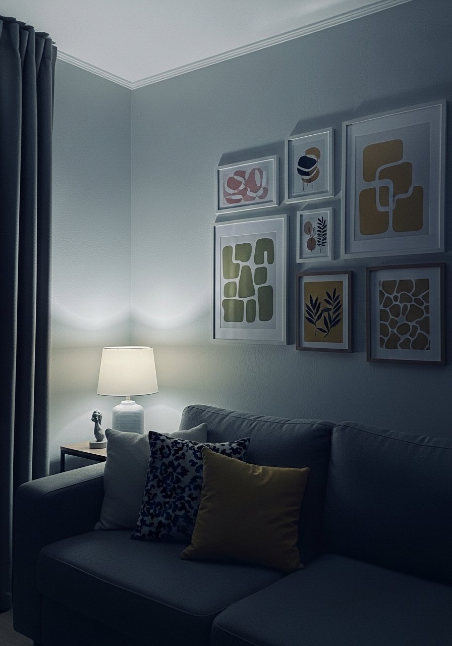
My living room had nice furniture and decent lighting but it still felt like a waiting room. Took me embarrassingly long to figure out it was missing texture. Every surface was smooth, every color was flat, and nothing invited you to actually sit down. Hanging a mixed pastel vintage gallery wall fixed that odd, restless feeling in one afternoon.
These ideas lean soft vintage with modern touches. Most items are under $50, with a few splurge pieces around $100 to $150. They work for living rooms, bedrooms, entryways, and any narrow hallway that needs personality. Most folks pull off a full gallery under $150 if they skip matching sets. Close to half go eclectic now, grids feel too stiff. Over half of renters stick to no-damage hangs and never look back.
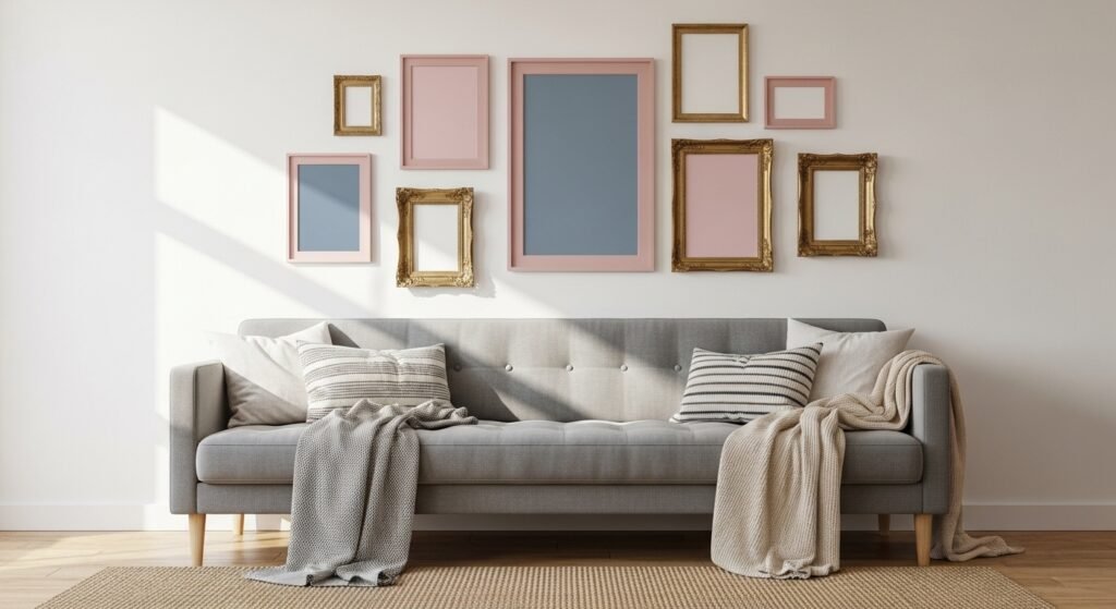
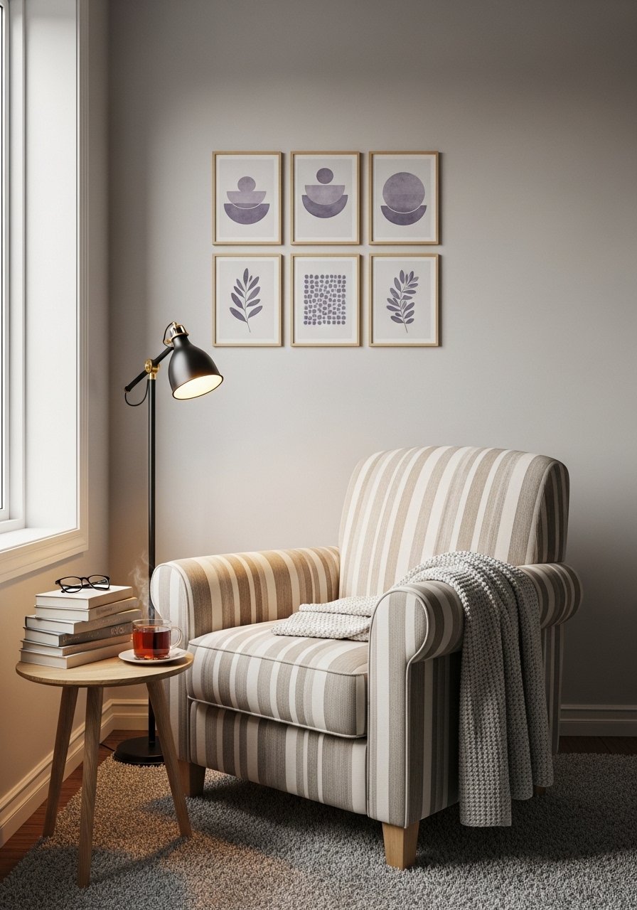
Muted Pastel Botanical Mix for Living Rooms
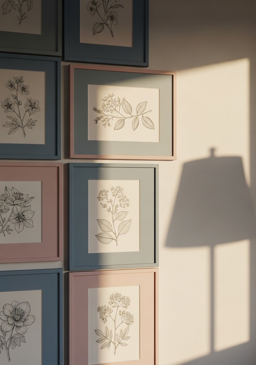
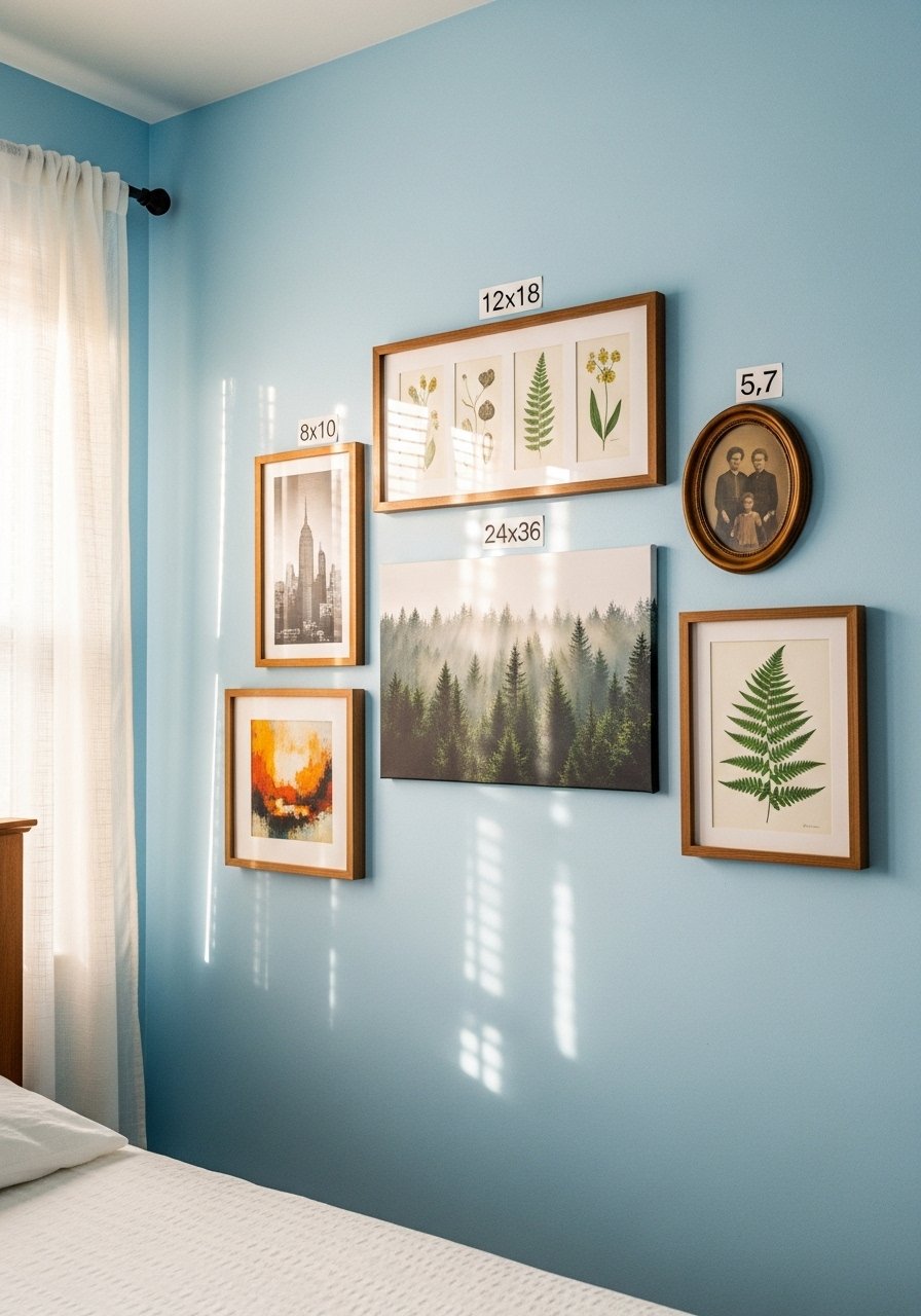
Start with six to nine botanical prints in pale pinks and dusty blues. The softness keeps the cluster romantic without feeling overly themed. Use gray wood frames for most pieces and add one brass ornate frame to avoid a matchy look. I swapped in dusty blue botanical prints for under $15 each and the wall stopped reading flat. Common mistake is using only one size. Aim for a 7 to 12 frames mix, spaced 2 to 3 inches apart. If you rent, use removable hooks for the larger pieces so nails are optional.
Sepia Photo Cluster with Olive Green Accents
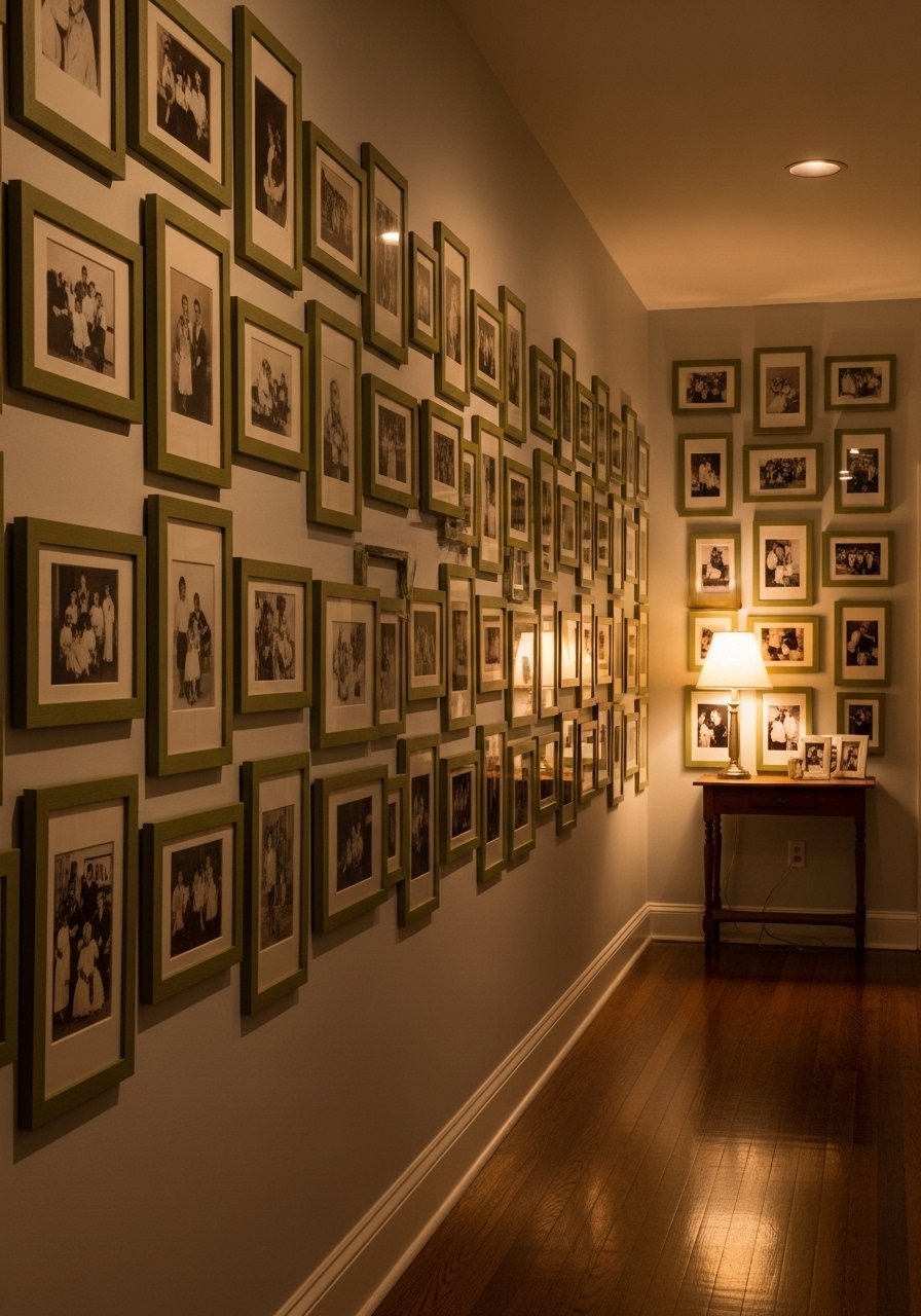
Turning family photos to sepia instantly made them feel like heirlooms. I printed most photos at 8×10 and filled four larger frames with 11x14s so the eye has anchors. Olive green frames ground the warmth and stop everything from feeling shiny. I used olive green picture frames that were inexpensive and light enough for adhesive hangers. A mistake is hanging everything at the exact same height. Start with the largest piece dead center then build out asymmetrically so the wall reads collected, not catalogued.
Gray Wood and Brass Medley for Dining Nooks
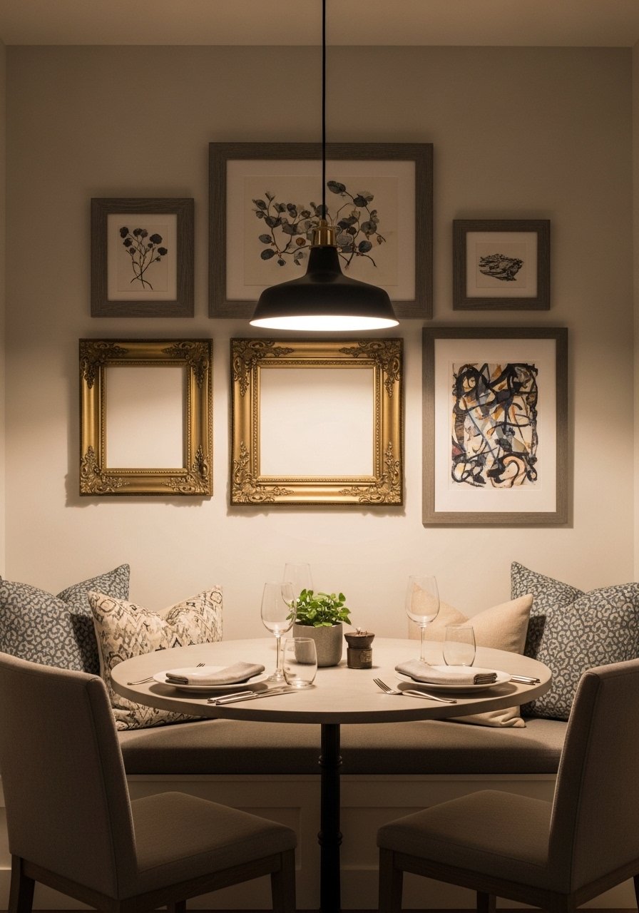
The contrast between gray wood and two brass frames gives a dining nook some gravitas. Gray hides chips from daily life better than orange-toned wood. I mixed frames in three sizes and kept 80 percent neutral frames, 20 percent brass accents to avoid shine overload. Pick a largest piece around 24×36 inches to anchor. I used gray wood picture frames and swapped in brass pieces found online. People often forget to measure the wall first. Sketch on graph paper to map placement and avoid extra holes.
Graph Paper Planned Eclectic Layout for Sloped Walls
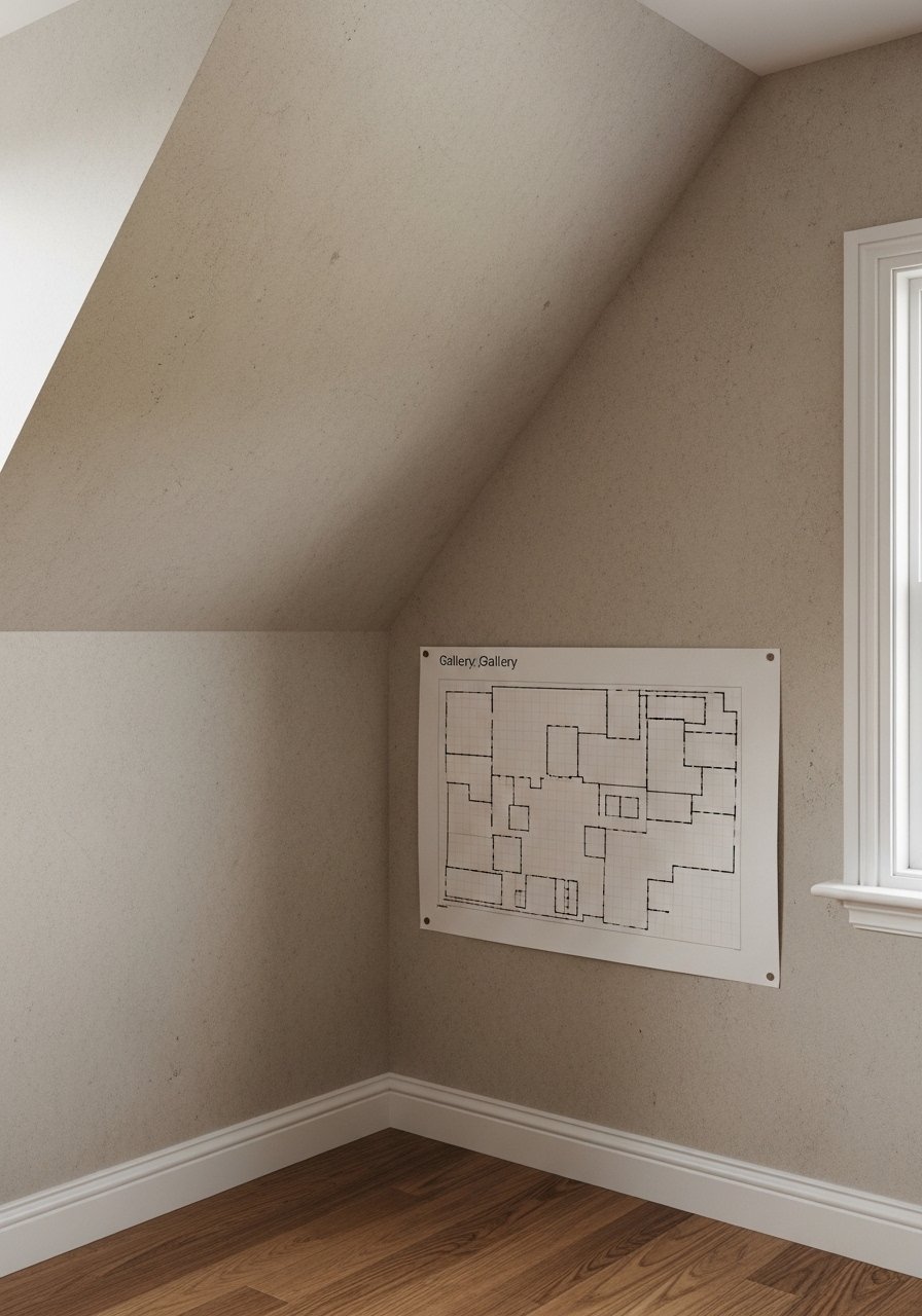
If your ceiling slopes, lay everything out on graph paper to scale before you touch the wall. I made each square represent one inch and taped scaled paper frames to the wall. That saved my landlord from extra holes and saved me one painful return trip. The layout works well with a mix of sizes, 7 to 12 frames total. For renter-friendly options try brass picture ledges so you can swap without extra drilling. A detail people miss is buying 20 percent extra frames so you can adjust while you hang.
Deep Teal Pop in Neutral Entryways
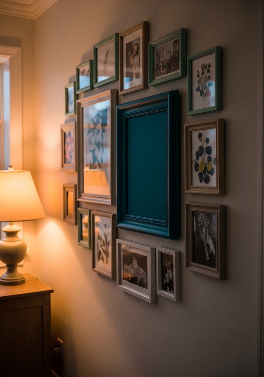
A single deep teal frame among dusty pastels gives an entryway punch while keeping things vintage. Use muted art inside the teal frame so it feels grounded, not neon. I balanced one teal piece with several dusty pinks and pale olives using the 80/20 rule. Deep teal picture frames are cheap and make a small wall read intentional. People grab bright frames without considering light. In low light, deep teal reads richer, not aggressive.
Sepia Family Photos with Vintage Frames for Stairwells
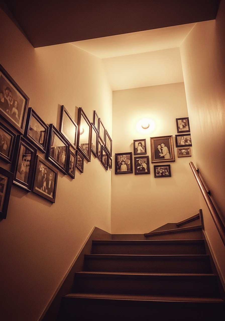
Stairwells look made when photos follow the angle of the stairs. I printed photos in sepia tones for 40 to 60 percent of the frames so the group reads warm, not stark. Mix carved wood frames with a couple of small brass pieces and space everything 2 to 3 inches apart. For renters try renter-friendly hanging kits that secure lackluster drywall. A common error is aligning frames to the stair line instead of the eye level of someone standing at the bottom. Start with a center anchor and work outward.
Asymmetrical Large-to-Small Buildout for Small Walls
Small walls feel bigger when you start with a large central piece and add smaller frames around it. I began with a 24×36 print and added eight smaller ones in varying shapes. Keep frame finishes to two or three types and leave 2 to 3 inches between edges. For swaps, mixed metal picture frames let you experiment without committing. A mistake is trying to use only small frames. One large anchor avoids the "stuck-on" look.
Earth Tone Anchored Pastel Frames for Low-Light Rooms
Low-light rooms need earth tones to avoid washed-out pastels. I pair 80 percent muted backgrounds with 20 percent warmer accents like mustard or olive. Using gray wood frames helps hide scuffs from daily life. Swap in mustard yellow vintage art prints sparingly to boost contrast. A generic article misses this: sepia photos often glow in dim light while cool blues can look flat. Keep more sepia or warm tones in low-light collections.
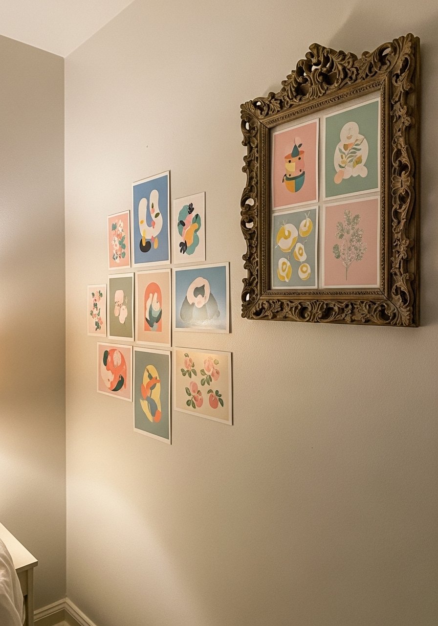
Ornate Gold Mix in Wood Neutrals for Formal Studies
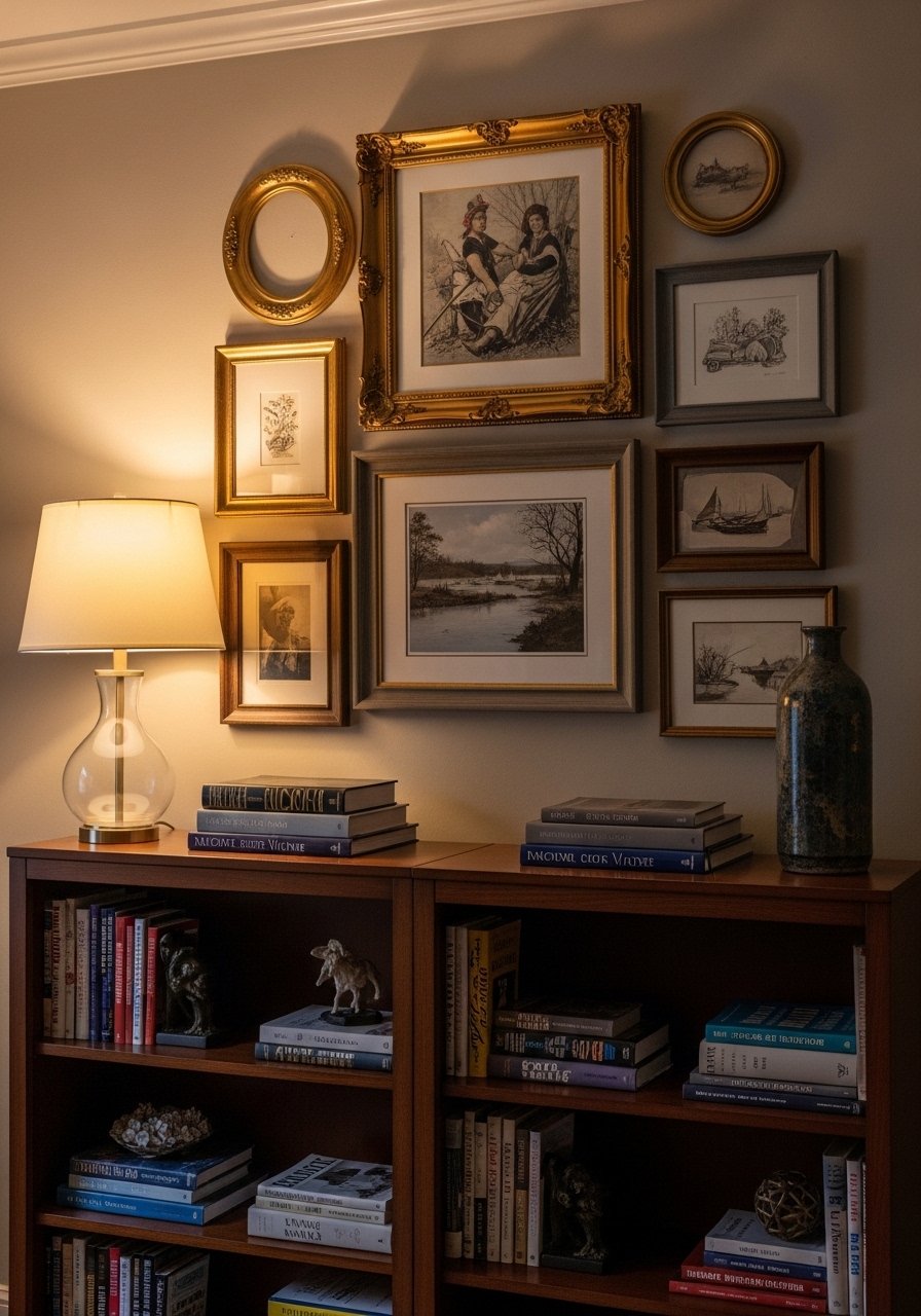
Ornate gold frames bring an heirloom feel when mixed into wood neutrals. I used two carved gold pieces among a set of gray frames to break uniformity. Use larger gold pieces sparingly so they read intentional. I bought a pair of matt brass ornate frames off a sale and the space felt older, not overdone. People often match every frame which makes walls look like a store. Limit metallics to two or three pieces.
Moulding-Detail Wood Frame Cluster for Bedrooms
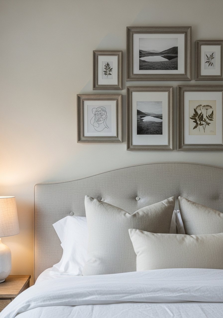
Moulding-detail frames add texture so you do not rely solely on the art. I used several moulded wood frames in light gray to create depth and paired them with botanical prints. It makes a bedroom feel like it has layers without extra textiles. Gray moulding frames were inexpensive and durable. A mistake is hanging frames too high above the bed. Keep the lower edge within 6 to 10 inches of the headboard for a balanced look.
Vintage Plate Hangers for Texture in Kitchens
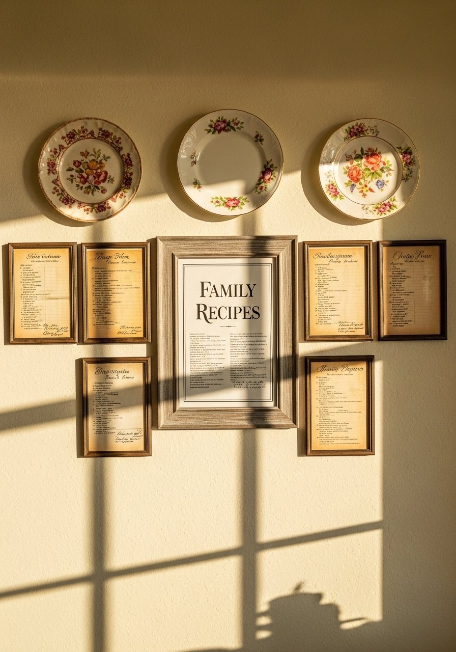
Adding vintage plates is a simple way to introduce 3D texture into a flat gallery. I hung three plates with antique-style plate hangers interspersed with small framed recipe prints. It breaks monotony and is kitchen-appropriate. I used antique plate hangers that held the plates securely and kept the layout renter-friendly. People treat plates as afterthoughts. Scale them to the frame sizes and keep them at eye level for the best impact.
Dusty Lavender Botanical Layers for Reading Nooks
Lavender tones soften spaces near a light source. I layered lavender botanical prints with two sepia photos so the grouping felt both airy and grounded. For a reading nook, use smaller frames and keep the spacing tight at 2 inches. I bought a set of lavender botanical prints and the nook suddenly read intentional. Common error is picking too many pastels in the same tone. Mix in sepia or olive to avoid an overly sweet result.
Mustard Yellow Art in Teal Frames for Dim Hallways
Mustard yellow inside deep teal frames gives dim hallways life. The yellow reads vibrant while teal keeps it vintage. I used three mustard pieces spaced evenly and surrounded them with smaller neutral prints. For impact pick one color combination and repeat it three times. I ordered mustard yellow prints and paired them with teal frames. People often scatter color choices. Repeating a color tie keeps an eclectic wall feeling cohesive.
Mix of Personal Ephemera and Vintage Finds for Entry Tables
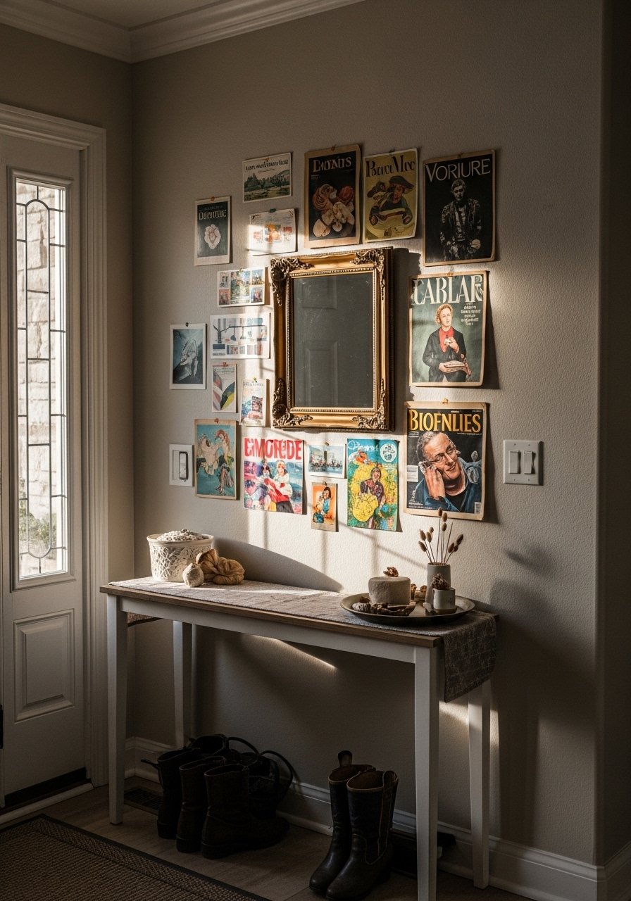
I turned postcards and a vintage magazine cover into framed art and the entry table finally had a backstory. Mix paper ephemera with two solid prints and use shallow frames so items sit flush. For easy framing try mixed paper frame kits that include mats and backing. A common mistake is assuming everything must be art-grade. Casual paper pieces layered with proper mats read intentional. Pair this with the plate hanger idea for kitchen-adjacent entries.
Minimalist Pastel Grid with Vintage Touches for Small Apartments
If you like a cleaner look, a loose grid keeps order without feeling like a shop. I used nine frames in varying pastel tones, kept spacing at 2 inches, and added one ornate frame to break the uniformity. Many people try a perfect grid and it ends up sterile. Rather than perfect symmetry, let one frame be larger to add personality. For renter-friendly hanging try removable picture hanging strips. This idea is small-space friendly and budget conscious.
Your Decor Shopping List
Textiles
- Honestly the best $40 I have spent. Chunky knit throw in cream (50×60 inches) to drape over a sofa arm.
- Velvet pillow covers, set of 4, 22-inch linen-feel, mix dusty blue and pale pink. Similar at Target.
Wall Decor
- Gray wood picture frames, assorted sizes for the base of most gallery walls.
- Matt brass ornate frames, set of 2 to scatter as accents.
Hanging Supplies
- Removable picture hanging strips for renters, holds up to medium frames.
- Brass picture ledges (~24 inches) to swap prints without new holes.
Budget Finds
- Lavender botanical prints, set of 6 for small walls.
- Antique plate hangers, pack of 6 to add 3D to kitchen galleries.
Plants and Lighting
- Artificial fiddle leaf fig, 6-ft for height without the fuss.
- 8×10 jute area rug to anchor gallery walls in living rooms.
Shopping Tips
White oak beats dark wood in 2026. Design feeds have shifted completely. These white oak floating shelves look current, not dated.
Grab velvet pillow covers for about $12 each. Swap them seasonally and the whole room feels different.
Curtains should puddle or kiss the floor, never hang halfway up. These 96-inch linen panels work well for standard 9-foot ceilings.
One large plant beats five tiny succulents. This 6-foot fiddle leaf fig gives height and drama with minimal work.
If you are renting, use removable picture hanging strips. Over half of renters stick to no-damage hangs and never look back.
Frequently Asked Questions
Q: How many frames should I start with for that collected look?
A: Aim for 7 to 12 frames so the wall reads intentionally collected. Start with one large anchor, then add smaller pieces. Buying 20 percent extra frames in different sizes saves a store run.
Q: Can I mix sepia photos and colored prints?
A: Yes. Use sepia in 40 to 60 percent of frames to add nostalgia without losing color. Sepia warms low-light rooms better than stark black and white.
Q: Are command strips safe for heavier frames?
A: For medium frames they are fine. For large 24×36 pieces use a combo of removable hooks and a small nail or a renter-friendly hanging kit to be safe. Removable picture hanging strips are a good start.
Q: How far apart should frames be spaced?
A: Keep frames 2 to 3 inches apart edge to edge. That tight spacing reads curated and avoids the "floating pieces" look.
Q: What if my wall is sloped or awkward?
A: Sketch everything to scale on graph paper. Each square equals one inch. Tape scaled paper frames to the wall before drilling. That trick stops wasted holes and wasted time.
Q: Should I match frame finishes or mix them?
A: Mix finishes but limit yourself to two or three types, for example gray wood plus one metallic. Too many metals or finishes makes a wall feel chaotic.
Q: Will pastel colors look dated quickly?
A: Muted pastels like dusty blue and pale pink are trending now and feel less dated than bright primaries. Anchor them with earth tones or sepia to increase longevity.
Q: How do I prevent my gallery from looking like a store display?
A: Vary frame sizes and finishes, stagger heights, and include personal ephemera. Odd numbers of pieces and asymmetry make it feel collected rather than matched.
