

My living room had nice furniture and decent lighting but it still felt like a waiting room. Took me embarrassingly long to figure out it was missing texture. Every surface was smooth, every color was flat, and nothing invited you to actually sit down. Painting in a soft pastel fixed half of that problem and a few well-placed textiles finished the rest.
These ideas lean toward modern cottage and relaxed transitional. Most picks are budget friendly with a few splurges around $80 to $150. They work for living rooms, bathrooms, bedrooms, and small spaces that need a softer, fresher backdrop. You get about 9 out of 10 right with good scans. Most fails come down to wrong light testing.
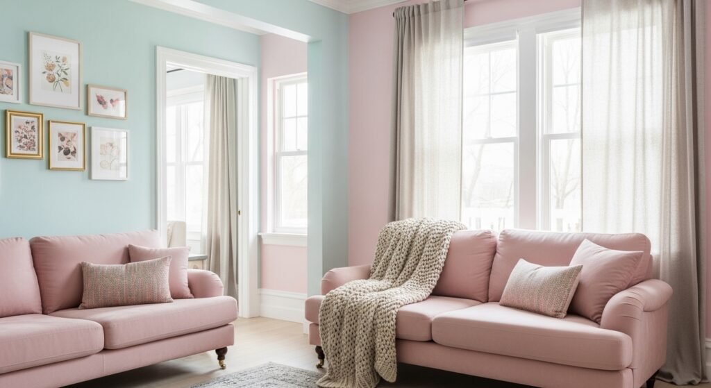
Blush Pink Bedroom With Layered Neutrals

The moment I painted a blush pink wall behind my bed, the whole room stopped feeling flat. Blush reads warm but still acts neutral when paired with natural linen and a 22-inch down-filled pillow in cream. For bedrooms, aim for a pastel with low chroma so it behaves like a soft backdrop, not a candy color. Budget for this paint and two fabric swaps is about $80 to $150. I used paint sample pots first and pinned them to the wall for three days, because you must live with a color before committing. For a quick textile update buy 22-inch linen pillow covers and a chunky knit throw. Common mistake is grabbing the swatch under store lights. Instead, tape samples next to the bed and check them under your bedside lamp.
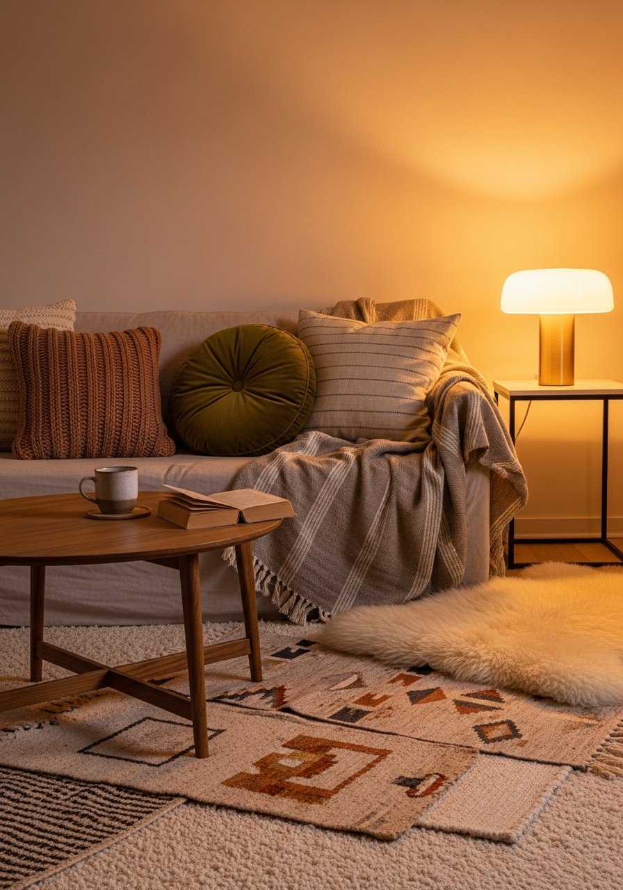
Powder Blue Living Room Accent With Wood Tones
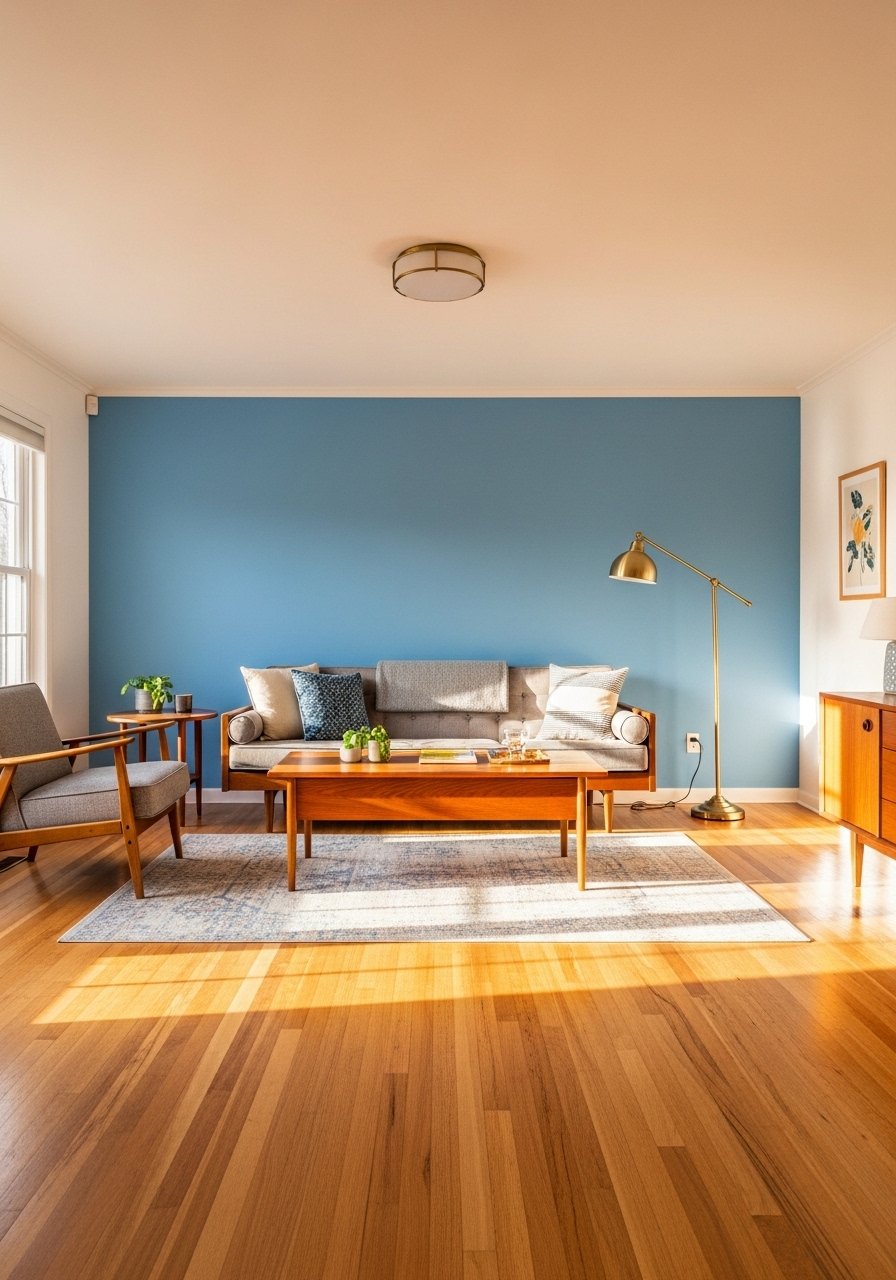
Powder blue calms a living room without sinking it. The trick is using it on one wall and introducing warm wood tones so the blue reads intentional. For a 12 by 14 living room, a single 8-foot wall painted in a pastel blue plus a new coffee table runner and throw will run about $60 to $120. I like matching the paint undertone to one material in the room, so if your floor leans yellow pick a blue with a green bias. Pigment bias matters. If you ask the paint desk they often can find a cross-brand match because paint desks have rival recipes ready to go. Try testing three 4×4-inch squares painted on poster board and move them around the room for two days. I use poster-boards-foam-core to compare samples without marking walls.
Sage Green Kitchen Cabinets For Calm Function
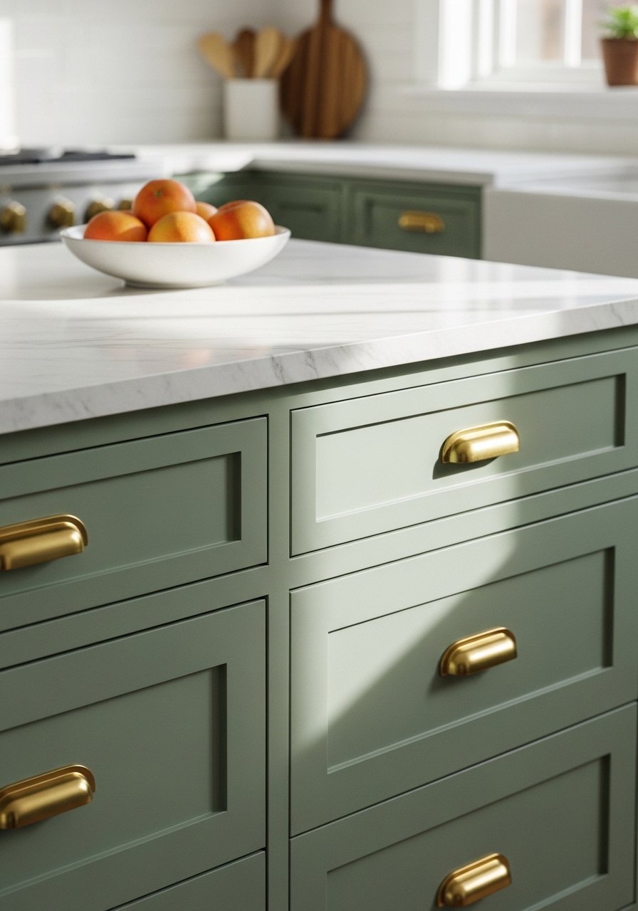
Sage works in high traffic areas because it hides smudges and plays well with brass. I painted my lower cabinets sage instead of gloss white to add personality while keeping resale neutral. Budget for cabinet paint and hardware is usually $150 to $400, but you can save by ordering a competitor formula at your local store. Paint desks have rival recipes ready to go, so ask for that if you prefer a different base. Match sheen exactly, otherwise new cabinet doors will read cheaper. One detail people skip is testing the sheen on a scrap of the cabinet, not just a chip. I keep satin cabinet paint sample pots for that reason. Mixing a tiny bit of gray can mute the sage so it does not appear green under fluorescent kitchen lights.
Lavender Hallway To Ease High Traffic
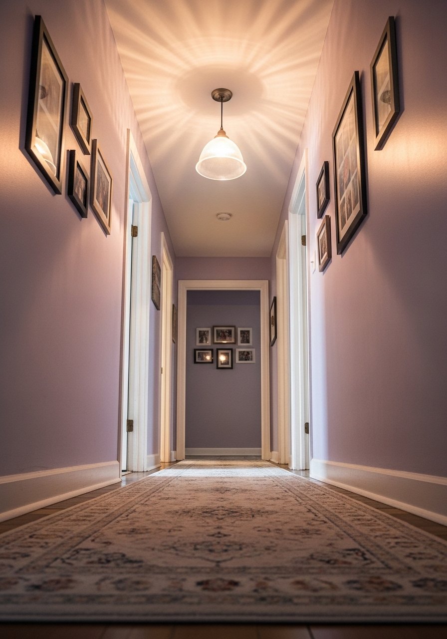
Hallways often feel utilitarian. Lavender softens them without feeling fussy. I used a pastel lavender that leans slightly gray to avoid the neon hallway effect. For narrow passages, reduce saturation by about 20 percent compared with a full-size room swatch. A practical move is painting three 12-inch wide vertical stripes of sample color on the wall and living with them for 48 hours to watch color shift from morning to evening. Most fails come down to wrong light testing. You can also add a runner and swap light bulbs to control temperature. I grabbed a muted-runner-rug-2×8 for under $80 and the hallway went from corridor to curated.
Pale Peach Dining Room That Plays With Wood Grains
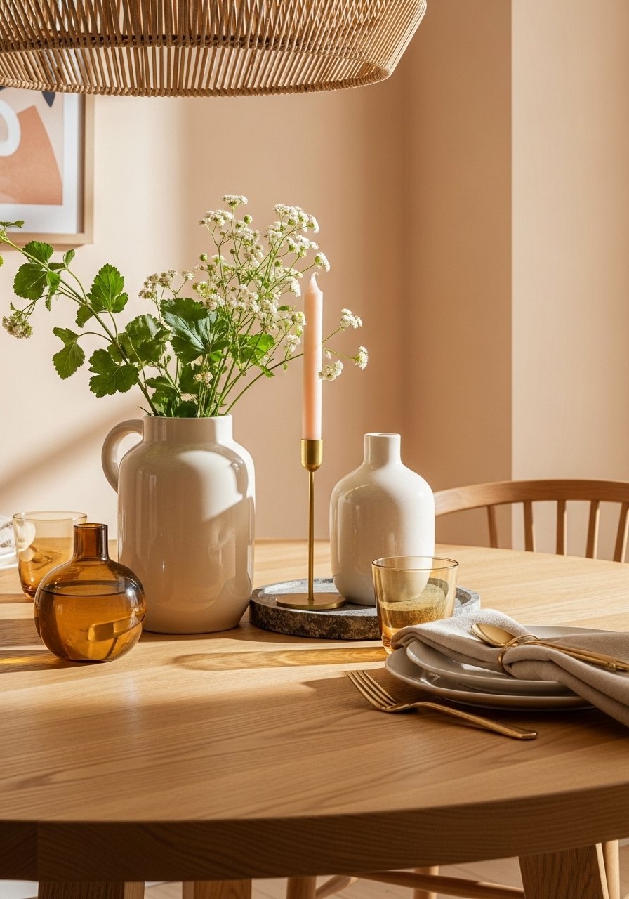
I used a pale peach to warm up a dining space with white trim and oak furniture. Peach works because it mirrors wood undertones. A small but very specific trick is matching the paint to the dominant wood grain value, not the wood color. Take a 2-inch square sample of your table to the color desk if you can. If you cannot, test three shades on foam board next to the table edge. Budget wise, paint and a new pendant run $120 to $300. I paired the walls with linen-table-runner and woven-pendant-light. A common mistake is picking peach that has too strong a pink bias, which fights oak. Swap to a yellow bias if the table has more golden tones.
Muted Lemon Entryway For A Sunny Welcome
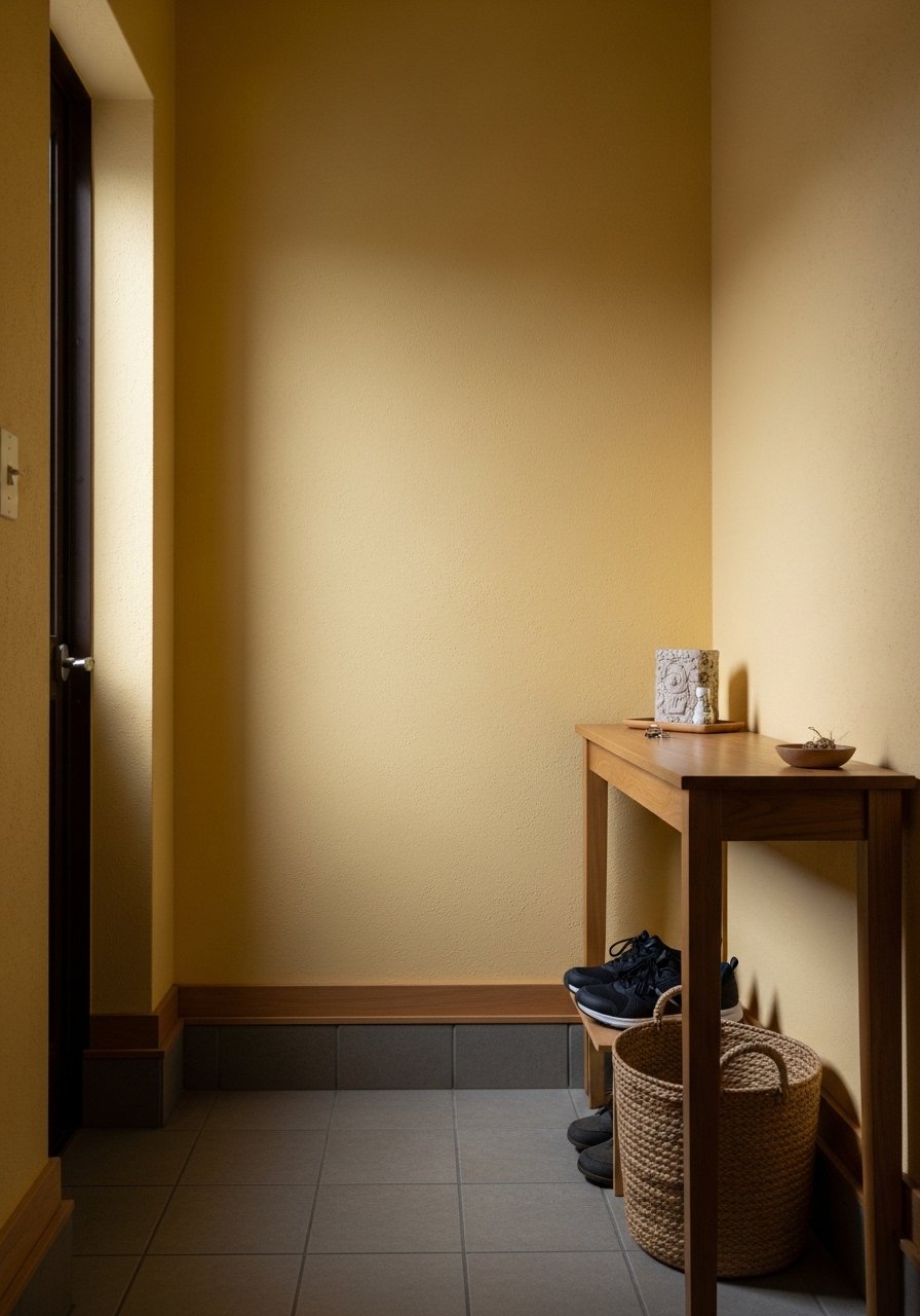
Muted lemon can be bold without yelling at visitors. Keep the saturation low and add natural fibers so the color feels collected, not loud. I painted my narrow entry in a lemon pastel, then used a console mirror to bounce light. A detail many guides skip is the 80/20 ratio for accents, meaning keep 80 percent neutral and 20 percent color. For this space, that means pale yellow walls and neutrals on the floor and furniture. Try small-console-table and wicker-basket-shoe-storage. Test samples on both the wall and the console surface to see how the color plays with your finishes.
Dusty Lilac Accent With Mixed Metals

There is a quiet maturity to dusty lilac. In my office it reads grown-up and relaxed. Pair it with mixed metals to avoid the color feeling too saccharine. I used three metal finishes—brass, brushed nickel, and matte black—and it looked intentional. A mistake is matching everything in one metal. Mixes add depth. Budget for paint and a lamp is $80 to $200. I shopped for brass-desk-lamp and matte-black-frame-set. Remember pigment bias. If your lilac skews purple under your LED bulbs, tweak in small batches toward gray until it reads dusty instead of neon.
Seafoam Bathroom For Coastal Minimalism
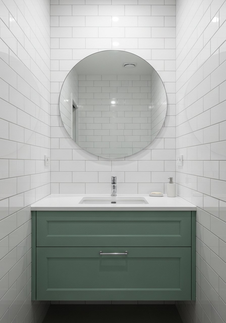
I swapped a stark white vanity for seafoam and it made the bathroom feel like a tiny coastal retreat. Pastels in bathrooms are tricky because tile and grout reflect light. My tip is to paint one surface first and live with it by taping a 12-inch square board painted in your chosen color to the mirror for a week. You get about 9 out of 10 right with good scans, but always follow with live testing. For renters, use a peel-and-stick sample or a removable panel like peel-and-stick-paint-testers. Match gloss level to your vanity hardware, not the tile, because sheen reads heavier than color.
Pale Mint Nursery With Textured Accents
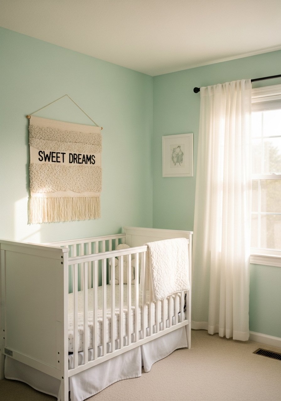
Pale mint is forgiving in a nursery because it reads soft and cheerful without being sugary. When I painted my niece's room I tested three tints on poster board and rotated them through daylight, lamp light, and evening lamp. Most fails come down to wrong light testing. Add texture in throws and a wall hanging that reads larger than it is, and spend modestly on textiles rather than paint. I used sheer-curtain-panels-84-inch and a soft-play-rug-4×6. A small extra detail is to tint the trim with one shade lighter to make the wall color float instead of feel boxed in.
Pale Gray With Pastel Undertone For Open Plans

If your rooms flow together, try a pale gray that has a whisper of pastel undertone so the whole plan reads cohesive. I used a gray with a soft blue-pink bias so the color adjusted slightly across different rooms. A pro trick is to scan a fabric swatch with a desk spectrophotometer if you want a precise bridge between textiles and paint. You get about 9 out of 10 right with good scans, but expect to tweak by eye. For testing, paint three 12×12 boards, call them A, B, and C, and watch them for two days. I paired the walls with modular-sofa-slipcover and wood-floor-friendly-area-rug-8×10. A common mistake is picking gray that has a green bias when your floors are warm, and then the whole space fights.
Warm Beige Pastel Base For Layered Textures
A warm beige with a pastel whisper is my go-to when I want a neutral that still feels soft. It lets you layer textiles and color accents without the walls competing. For a living area aim for a base that reads 60 percent warm and 40 percent cool among accents. One detail many articles miss is measuring the wall's reflectance in direct sun versus shadow. I taped a painted sample in the sunny and shaded parts of the room to see how much it shifted. For small budgets, change pillows and one rug first. I used velvet-pillow-covers-set-of-4 and neutral-area-rug-5×8. Avoid glossy trims unless you test sheen first.
Your Decor Shopping List
Textiles
- Honestly the best $40 I have spent, velvet pillow covers, set of 4 in two colors for a layered look
- Chunky knit throw in cream (~$35-55). Drape over the sofa arm for instant texture
- For the curtain trick in idea above, you need length. 96-inch linen panels (~$30-50 per panel)
Wall Decor
- Found these while looking for something else. Matte black frame set (~$20-40) lets you swap prints easily
- Mixed metal picture ledges (~$18-25) for rotating art without new holes
Lighting
- Brass desk lamp to layer metals in workspaces
- Woven pendant light to pair with pale peach dining rooms
Budget Finds
- Poster boards foam core set for sample testing, very renter friendly
- Peel and stick paint testers when you cannot mark walls
Plants & Greenery
- Faux fiddle leaf fig 6ft for height without maintenance
- Wicker basket storage for entryway drop zones
Shopping Tips
White oak beats dark wood in 2026. Design feeds have shifted completely. These white oak floating shelves look current, not dated.
Grab these velvet pillow covers for $12 each. Swap them every three months and the whole room feels different.
Curtains should puddle or kiss the floor, never hang halfway up. These 96-inch panels are right for standard 9-foot ceilings.
Everyone buys five small succulents. One single 6-foot fiddle leaf fig has ten times the visual impact.
Mix budget paint samples with a premium sample for cross-brand matches. Portable color spectrophotometer tools can help if you want quantifiable data.
Frequently Asked Questions
Q: How do I test pastel paint before committing to a whole room?
A: Paint three 12×12 boards and move them around your room for two to three days, morning and evening. Check them under the bulb types you use and near furniture. Using poster boards avoids wall damage for renters.
Q: Can I match paint to a fabric or couch color?
A: Yes. Scan a fabric swatch at the paint desk or use a portable spectrophotometer if you want numbers. Paint desks have rival recipes ready to go. After a scan, always tweak with live room samples because you get about 9 out of 10 right with good scans.
Q: My pastel looks different in every room. What did I do wrong?
A: Most fails come down to wrong light testing. Test samples in all the rooms where the color will appear and during various times of day. Also check sheen, because sheen can make the same color read wholly different.
Q: Are pastels okay in small spaces?
A: Absolutely. Pick lower saturation pastels and pair them with a light-reflective trim or mirror. For very small rooms, tint the trim slightly lighter than the wall to make the wall float visually.
Q: Should I worry about sheen when switching brands?
A: Yes. Match the finish, not just the color. A semi-gloss versus a matte will change how saturated the paint looks, so test a sheen sample on a scrap surface.
Q: Can renters test colors without painting?
A: Yes. Use peel-and-stick paint testers or painted poster boards you can prop up. Peel and stick paint testers are the easiest route for short term trials.
