


My living room had nice furniture and decent lighting but it still felt like a waiting room. Took me embarrassingly long to figure out it was missing texture. Every surface was smooth, every color was flat, and nothing invited you to actually sit down.
These ideas lean modern farmhouse with a neutral, slightly warmed palette. Most tweaks are under $75, with a few splurges around $150. They work for built-in libraries, reading nooks, home offices, or any shelf-heavy corner that needs personality.
Layered Neutrals With One Warm Accent for a Cozy Library
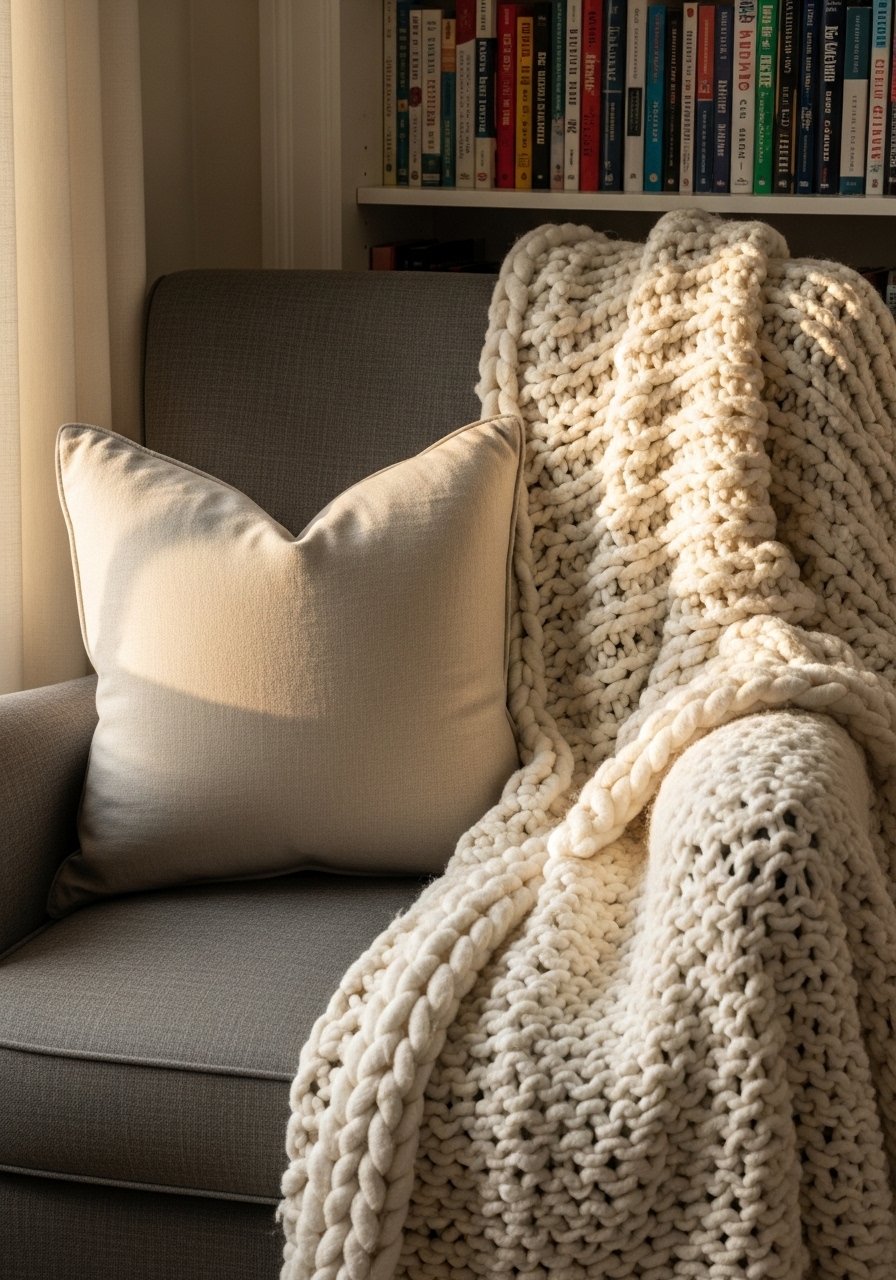
The moment I draped a chunky knit throw over the arm of my gray sofa, the whole room stopped looking flat. In a neutral home library design this one warm accent, like a rust or terracotta pillow, gives the space focus without derailing the calm palette. Aim for a 70/20/10 balance where 70 percent is your base neutrals, 20 percent mid-tone surfaces like wood, and 10 percent that warm pop. I used 22-inch linen pillow covers in stone and a chunky knit throw in cream. Common mistake is choosing an accent so saturated it reads like a different room. Keep the accent small and repeated in two or three places.
White Oak Shelving for a Light Modern Library
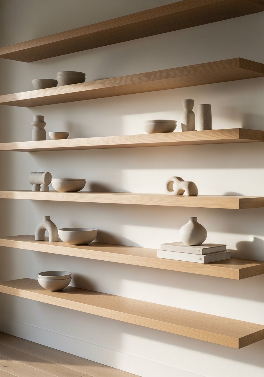
White oak shelves make a neutral library feel current and airy. I swapped in white oak floating shelves and the room finally felt grounded. White oak beats dark wood in 2026. Design feeds have shifted completely. White oak floating shelves around 10 to 12 inches deep are perfect for standard novels and decorative pieces. A common mistake is shallow shelves that force cluttered stacks. Use the rule of thirds when styling each shelf: one anchor object, a book stack, and one small grouped item like two candles. If you have a renter situation, look for peel-and-stick shelf brackets to avoid new holes.
Built-In Nook With Layered Lighting for Night Reading

There is something about a reading nook with layered pillows that makes you want to cancel your plans. Layered lighting matters more than you think. Combine overhead can lighting, LED strip under shelves, and a directional lamp for task light. I used a brass adjustable reading lamp to avoid glare on pages. Test lights with the exact bulbs you plan to use at home because Tech bumps match accuracy way up over just eyeing it. A common error is relying on a single overhead fixture that flattens faces when you read. Aim for 3000K warm bulbs for a neutral, inviting glow.
Built-In Ladder and Tall Shelving to Use Vertical Space

Stacking shelves up to the ceiling gives an instant library feeling, and a sliding ladder keeps upper shelves useful. Use tall shelves when your ceilings are 9 feet or higher. My ladder cost under $200 and made the top shelves accessible so they stopped becoming dust traps. A frequent mistake is leaving the top shelf as overflow of random items. Instead dedicate the top shelf to decorative boxes or archived books. Measure shelf spacing at 10 to 12 inches for paperbacks and 12 to 14 inches for hardcover coffee table books. Sliding library ladder kit saved us a lot of hauling step stools.
Neutral Gallery Wall Above a Console for Library Atmosphere

I found these brass picture ledges on Amazon for under $20 and they solved my gallery wall commitment problem. A gallery wall in neutral frames ties the library into the rest of the house and gives you a place for art without loud color. Mix black and brass frames for a cohesive, collected look. Mixed metal frames in assorted sizes allow swapping art without new holes. The mistake people make is hanging frames too high. Keep the center of the composition at eye level, around 57 inches from the floor. Pair this with the curtain idea below for vertical balance.
Floor-to-Ceiling Curtains to Add Height and Softness

Most people hang curtains right at the window frame. That is why their rooms look shorter than they are. Hang panels 4 to 6 inches above the trim and extend the rod 6 to 12 inches past the window on each side. For 9-foot ceilings, 96-inch linen panels are the right call. Curtains add necessary softness in a neutral home library design, especially when paired with a jute rug. A common error is buying panels that are too short. Let them puddle slightly or just kiss the floor depending on your style.
Mix of Open Shelves and Closed Cabinets for Hidden Clutter
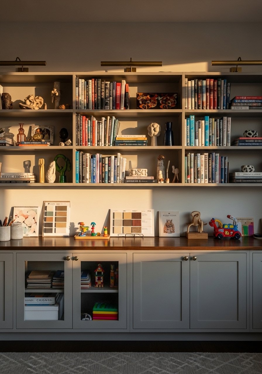
My entryway used to be a dumping ground for keys and shoes. One cabinet changed everything. In a library, closed cabinets below eye level hide the practical stuff and open shelves above display the styling. I installed lower shaker cabinets with 18-inch deep shelving and kept decorative storage boxes inside. For renters, use furniture with drawers or a freestanding console instead of built-ins. A mistake is leaving open lower shelves that scream clutter. Shaker cabinet doors kit is a handy upgrade that hides mess and keeps the neutral look.
Neutral Rug Layering to Define a Reading Area

Rug sizing trips people up all the time. Bigger is better. I started with an 8×10 jute rug as the base and layered a 5×7 wool rug where the chair sits to add softness. For a reading nook, the chair and ottoman should sit entirely on the top rug. This 8×10 jute area rug is neutral and tough for high traffic. A common mistake is buying a rug that is too small so the arrangement feels disjointed. Layering textures keeps a neutral palette from feeling boring.
Curate Books by Spine Tone for a Calm Backdrop
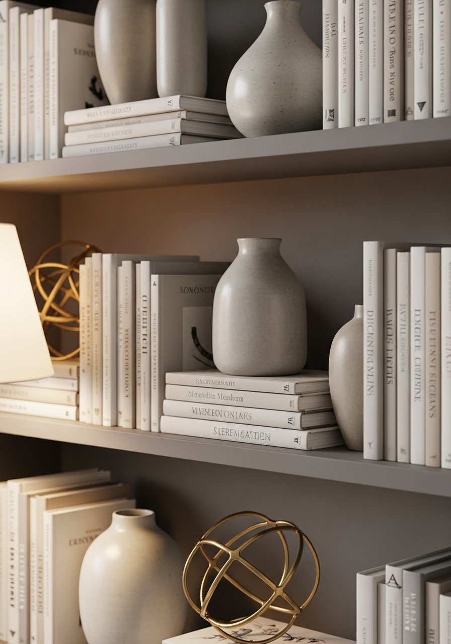
I once thought book organization was purely functional. Then I tried sorting spines by tone and the shelf looked styled without any extra accessories. Arrange books in horizontal stacks and vertical rows, alternating every third section with a decorative object. An easy product for styling is a set of ceramic bookends in matte white. A mistaken move is lining every shelf with identical rows. Break the rhythm with objects and at least one small plant per shelf for life.
Low-Sheen Paint and Base Selection for True Neutral Walls

Pick the right base or bust. I used the Base 1 for the light beige walls above and it read clean, not muddy. Match LRV to how much natural light the room gets. Pick the wrong base and a quarter of custom paints flop. Test large painted poster boards in different spots in the room at morning and evening light. A common mistake is assuming store lighting equals home lighting. Try a spectrophotometer scan for tough matches, or rent a portable unit if you need pro-level accuracy. For touch-ups I keep a small tester pot on hand so fading or week-one surprises are easy to fix.
Add a Tall Plant and Textured Planters for Scale and Life

Everyone buys five small succulents. One single 6-foot fiddle leaf fig has ten times the visual impact. Plants add scale and soften straight shelving lines. If you do not want live care, an artificial option still raises the room's energy. I used a 6-foot faux fiddle leaf fig in a woven seagrass planter. A common error is clustering plants of the same size. Vary heights and pot textures instead. Keep pets and humidity in mind and choose species or faux options accordingly.
Mixed Metals and Small-Scale Brass Details for Warmth
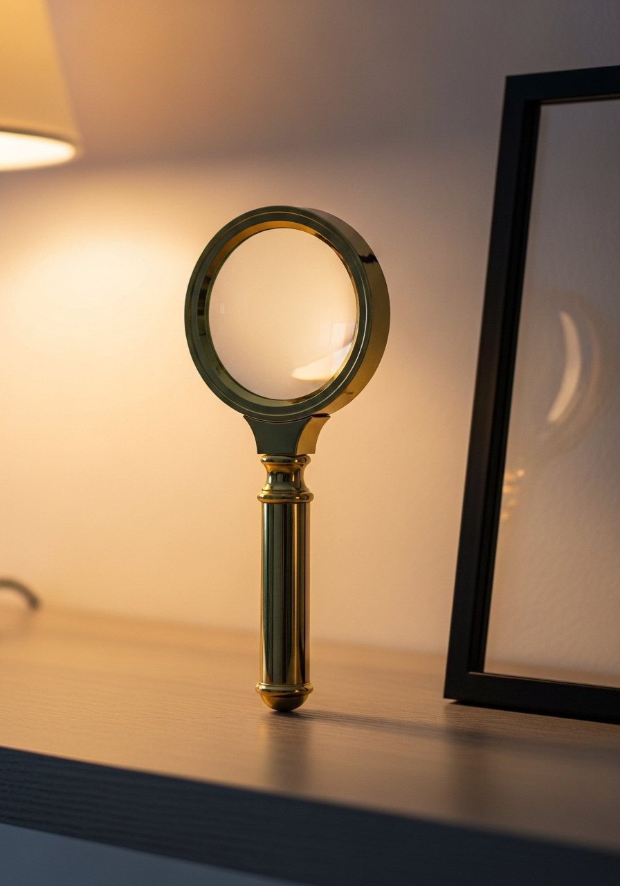
I was convinced all metals had to match. Mixing brass, black iron, and soft nickel made the shelves feel intentional and collected. Little accents like a brass magnifying glass or picture frame warm up gray shelves. Brass picture ledges work well for swapping prints. Avoid matching every piece in the same finish. Instead spread brass in one or two spots and balance with black frames elsewhere. This subtle mix reads like layers of time and keeps a neutral home library design from feeling flat.
Small-Space Tricks: Narrow Ladder, Slim Desk, Compact Seating

In tight rooms you need to think depth. I swapped 12-inch deep shelves for 9-inch versions and suddenly the narrow room felt usable. Use a 36-inch slim desk against a shelf wall and a slipper chair instead of a full armchair. A common mistake is forcing full-scale furniture into a small footprint. For renters, choose freestanding pieces and lightweight ladders that can be removed. Try a slim 36-inch writing desk to keep the library functional without crowding. Small libraries need every inch to count.
Your Decor Shopping List
Textiles
- Honestly the best $40 I have spent. 22-inch linen pillow covers in stone set the neutral tone.
- Chunky knit throw in cream (~$35-55). Drape over a chair arm for instant texture.
- 5×7 wool rug in soft gray for the top layer.
Wall Decor
- Mixed metal frames, assorted sizes (~$25-45). Swap art without new holes.
- Framed print reading "Home Sweet Home" for the gallery vignette.
Shelving & Furniture
- White oak floating shelves 48-inch for a light look.
- Sliding library ladder kit to access top shelves safely.
Lighting & Plants
- Brass adjustable reading lamp for task light.
- 6-foot faux fiddle leaf fig for low maintenance height.
Budget Finds
- Shaker cabinet doors kit for hidden storage.
- Similar alternatives at Target or HomeGoods usually exist for frames and small planters.
Shopping Tips
White oak beats dark wood in 2026. Design feeds have shifted completely. White oak floating shelves look current, not dated.
Grab velvet pillow covers for $12 each. Swap them every season and the whole room feels different.
Curtains should puddle or kiss the floor, never hang halfway up. 96-inch linen panels are right for standard 9-foot ceilings.
Lead with durability for lower cabinets. Shaker cabinet doors kit keeps toys and paper out of sight and saves styling time.
One tall plant beats multiple small ones for scale. 6-foot faux fiddle leaf fig adds height without the care.
If you are unsure of paint, test large poster boards and move them around the room. Tech bumps match accuracy way up over just eyeing it. Rent a portable spectrophotometer if you need a pro-level match.
Frequently Asked Questions
Q: What size rug do I actually need for a small reading nook?
A: Bigger than you think for cohesion. For a small nook an 8×10 base rug with a 5×7 layered on top works, or a single 6×9 depending on furniture scale. Keep the main seating on the rug.
Q: Can I mix boho textiles with modern furniture without it looking messy?
A: Yes. Anchor modern lines with neutral colors and add two boho textiles max, like a Moroccan pillow and a handwoven throw. Repeat a color from each textile elsewhere to tie the look together.
Q: How do I avoid paint that looks different at home than at the store?
A: Test large painted poster boards in the room at different times of day. A huge chunk of repaints happen because the match looked good at first but bombed later. Also, match base to LRV and test finishes.
Q: Should I get real plants or faux for a library with little light?
A: Faux is fine for low light and low maintenance. For real plants pick snake plants or pothos that tolerate shade. If a real fiddle leaf fig is your dream, map its sun path carefully first.
Q: How should I style shelves without making them look staged?
A: Alternate books vertical and horizontal, add one anchor object per section, and tuck in a small plant or two. Leave negative space so each vignette breathes. Curate by spine tone if you want a calm backdrop.
Q: What is a common shelving mistake that makes libraries look cluttered?
A: Shallow shelves and overstuffing. Use at least 10 to 12 inches for paperbacks and 12 to 14 inches for hardcovers. Give each object some breathing room and group in odd numbers.
Q: Is a paint spectrophotometer worth it for matching old colors?
A: For tricky or historic shades it helps a lot. Tech bumps match accuracy way up over just eyeing it. If you cannot access one, ask the store to do a sample tint and test on-site for several days.
