

I used to stand in front of a blank wall and feel unsure where to start. Frames online looked perfect, but once they were on my wall the room still felt unfinished and cold.
Making simple DIY frames at home fixed that. It’s about creating a warm, lived-in moment—not perfect symmetry.
How to Make DIY Photo Frames at Home
This is the method I use every time a room feels unfinished. You’ll learn how to pick one main frame, build a supporting group, and style them so the wall reads like part of the room. It’s approachable and works with organic modern or Japandi palettes.
What You'll Need
- Solid oak picture frame, 8×10 (~$25–45)
- Linen mat board, white, 8×10 (~$6–12)
- Archival photo paper, 8.5×11, 50-pack (~$12–22)
- 36" natural wood floating picture ledge (~$35–70)
- Gallery wall hanging kit, picture wire & hooks, 5-pack (~$8–15)
- Black metal tabletop easel, small (~$10–20)
- Acid-free photo storage box, 8×10 (~$20–35)
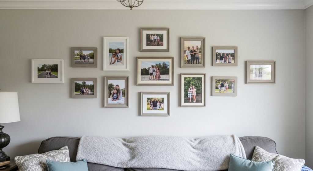
Step 1: Pick a single focal frame to anchor the group
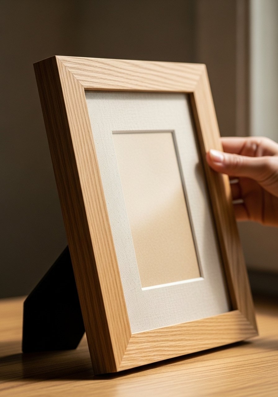
I always start by choosing one frame that will act as the anchor. For me that’s usually a natural oak 8×10 with a linen mat. It gives the eye a comfortable place to land and sets the tone—warm and simple.
What changes is the room’s weight distribution. The anchor makes other pieces feel intentional instead of scattershot. One thing people miss: pick a frame that echoes another element in the room (wood, brass, black metal). Small mistake to avoid: choosing an anchor too small for the space; it then reads like an afterthought.
Step 2: Create a clear visual hierarchy with two or three supporting frames
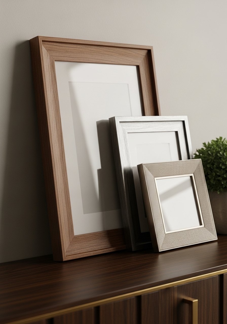
After I have the anchor, I add two supporting frames. I keep their sizes different and their spacing relaxed. The goal is balance, not symmetry. The smaller frames should nod to the anchor—same wood tone or a matching mat.
Visually the group becomes layered and calm. People often forget to vary orientation; one vertical, one horizontal creates gentle movement. Small mistake: crowding frames too close together. Give each piece breathing room so the group looks intentional and lived-in.
Step 3: Mix materials for texture and warmth
I like to mix wood, linen, and a touch of black metal. Those textures stop a wall from feeling flat. If your room leans organic modern or Japandi, the linen mat and natural wood make the frames feel like furniture, not decorations.
This step changes the wall from “gallery” to “part of the room.” One insight I use: repeat a material elsewhere—wood on the coffee table or a black lamp—so the frames belong. Mistake to avoid: too many glossy metals or overly bright frames; they distract instead of blending.
Step 4: Anchor the group to furniture, not the wall center
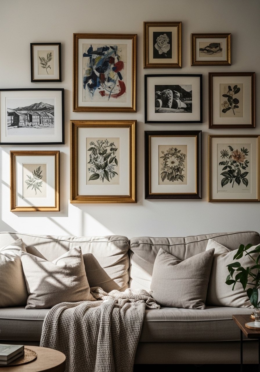
I always place frames in relation to the nearest furniture line—a sofa, console, or shelf. The composition should feel connected, like it’s resting on the furniture rather than floating in the middle of the wall.
Visually this keeps the room grounded and comfortable. People usually misplace frames by centering on the wall rather than the furniture. Small mistake: hanging too high above a sofa so the wall feels disjointed; aim for the whole vignette to read together.
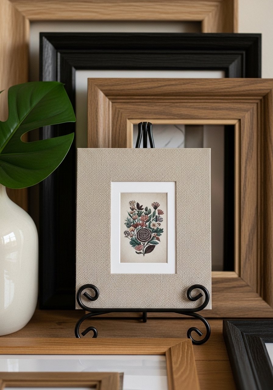
Step 5: Layer, lean, and edit for a lived-in finish
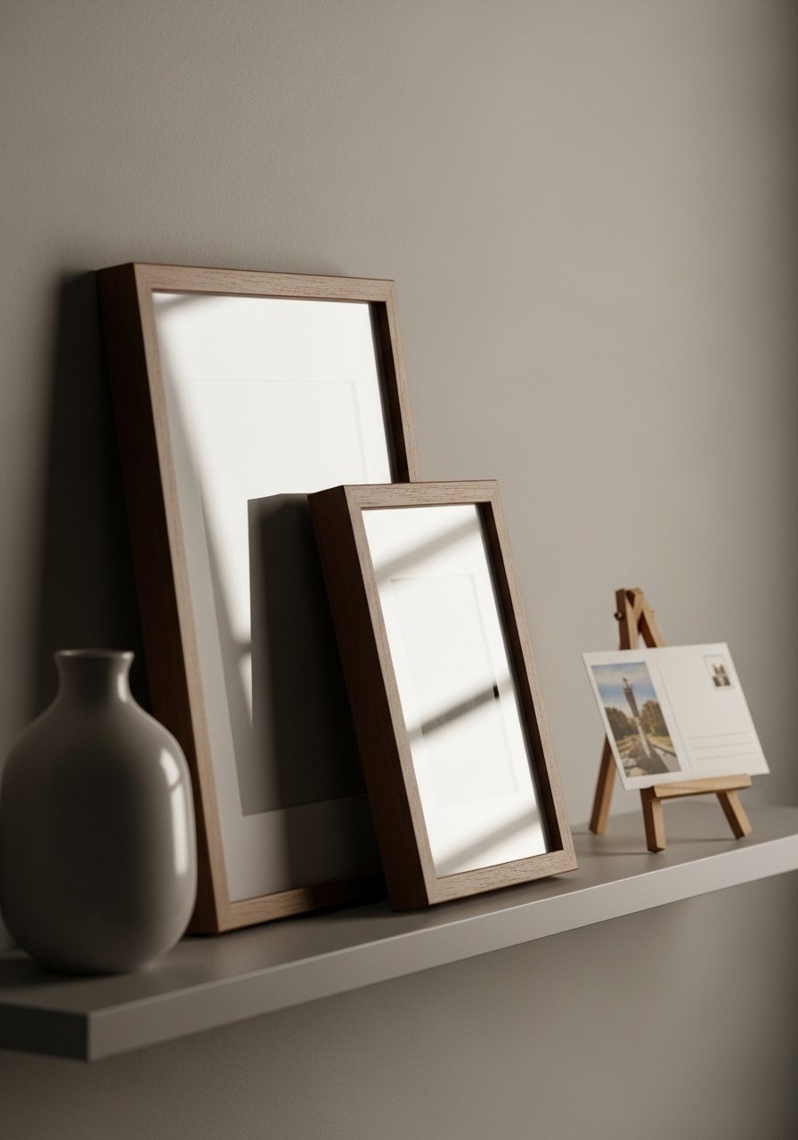
Finally, I layer one or two frames on a ledge or let a smaller frame lean in front of a larger one. I add a small object—vase, book, or plant—to break the visual plane. This creates the comfortable, edited look I want.
What changes is the room’s personality. It reads as curated and lived-in rather than staged. An insight: rotation keeps things fresh—swap a print seasonally. Mistake to avoid: over-accessorizing the ledge; one or two extras are enough.
Common mistakes and how to fix them
I see three mistakes more than any others. First, people use too many identical frames; the result is flat. Second, they ignore furniture lines and hang pieces randomly. Third, they cram frames with little negative space.
Quick fixes:
- Use one strong anchor frame and vary two supporting sizes.
- Align groups with furniture or architectural lines.
- Leave 2–4 inches between frames; let negative space breathe.
Adapting this approach for size and budget
I work the same way whether I have a tiny apartment or a large living room. Scale down the anchor to 5×7 for narrow walls. For budget-friendly choices, I use a simple oak-look frame with a DIY linen mat.
Budget tips:
- Start with one floating picture ledge rather than a full gallery.
- Print at home on archival paper for short runs.
- Use one decorative object from what you already own to pull the vignette together.
Mixing the frames with what you already own
I always look around the room before I pick frames. If you have warm wood furniture, mirror that tone in your frames. If your sofa is black or charcoal, pull in a slim black metal frame to echo it.
How I blend styles:
- Organic modern + vintage: add a small brass object or an older print.
- Japandi: keep lines clean, use natural wood and linen mats.
- Eclectic: keep one consistent element (mat color or frame finish) so it reads cohesive.
Final Thoughts
Start with one oak frame and a linen mat—small and low-stress. I promise it’s enough to change how the room feels.
Work in layers, edit as you go, and lean one frame for that lived-in look. Small changes make a room feel intentional and comfortable.
