

A real, lived-in living room showing the final result of styled DIY mason jar decor on a mantel and shelf. Natural daylight, soft shadows, layered textures. The scene feels intentional but not staged. Wide angle showing balance and flow. No text overlay.
I hate when a room looks almost finished but something's missing. Empty corners and lonely shelves make a home feel cold and half-done.
Small, intentional mason jar vignettes fixed that for me. They add texture, soft light, and a lived-in quality without fuss. You can do it in an afternoon.
How to Make DIY Mason Jar Crafts for Decor
This is the method I use every time a room feels unfinished. I’ll show how I get three simple looks—soft-lit jars, greenery bundles, and mixed-height clusters—that read intentional in organic modern or farmhouse-leaning rooms. It’s low-effort and feels calm, not fussy.
What You'll Need
- Set of 12 wide-mouth glass mason jars, 16 oz (~$12–22)
- Matte chalk paint, 8 oz, soft white (~$6–12)
- Natural jute twine, 200 ft (~$4–8)
- Battery-operated tea lights, set of 24, warm white (~$10–18)
- Warm white micro LED fairy lights, 10 ft with battery pack (~$8–15)
- Faux eucalyptus stems, set of 6, muted green (~$12–24)
- Small wooden tray, acacia, 12×8 inches (~$18–35)
- Small neutral ceramic vase, 4 inch, matte beige (~$10–20)
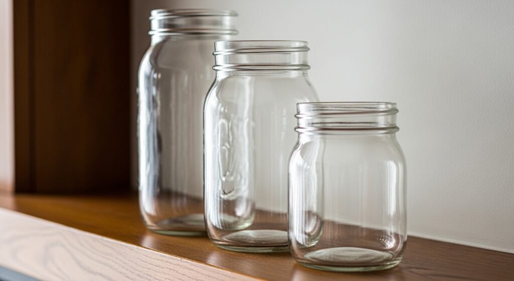
Step 1: Gather and group mason jars by size for balanced clusters
I start by pulling jars into groups of three. I mix one tall, one medium, and one short jar so the cluster reads intentional from a distance. The variety in height creates a mini skyline that anchors a shelf or mantel.
Most people miss the power of negative space. I leave breathing room around the group so the jars don’t fight other decor. Small mistake to avoid: lining up identical jars in a row—flat and boring. The height mix keeps the eye moving.
Step 2: Add subtle finishes for texture, not drama
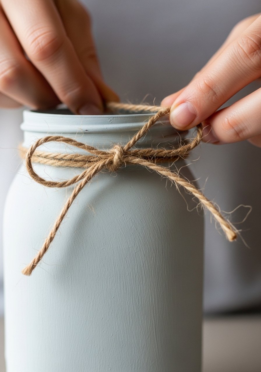
I tend to add one tactile finish—chalk paint, a wash of color, or a simple twine collar. That soft matte surface reads handmade without shouting “project.” A light whitewash or soft cream nods to organic modern and natural farmhouse palettes.
People often overwrite: too many finishes make jars feel busy. My insight is to choose one texture per jar. Small mistake: painting every jar the same solid color. Mixed finishes give depth and keep the display relaxed.
Step 3: Plant simple greenery or a single stem for an effortless look
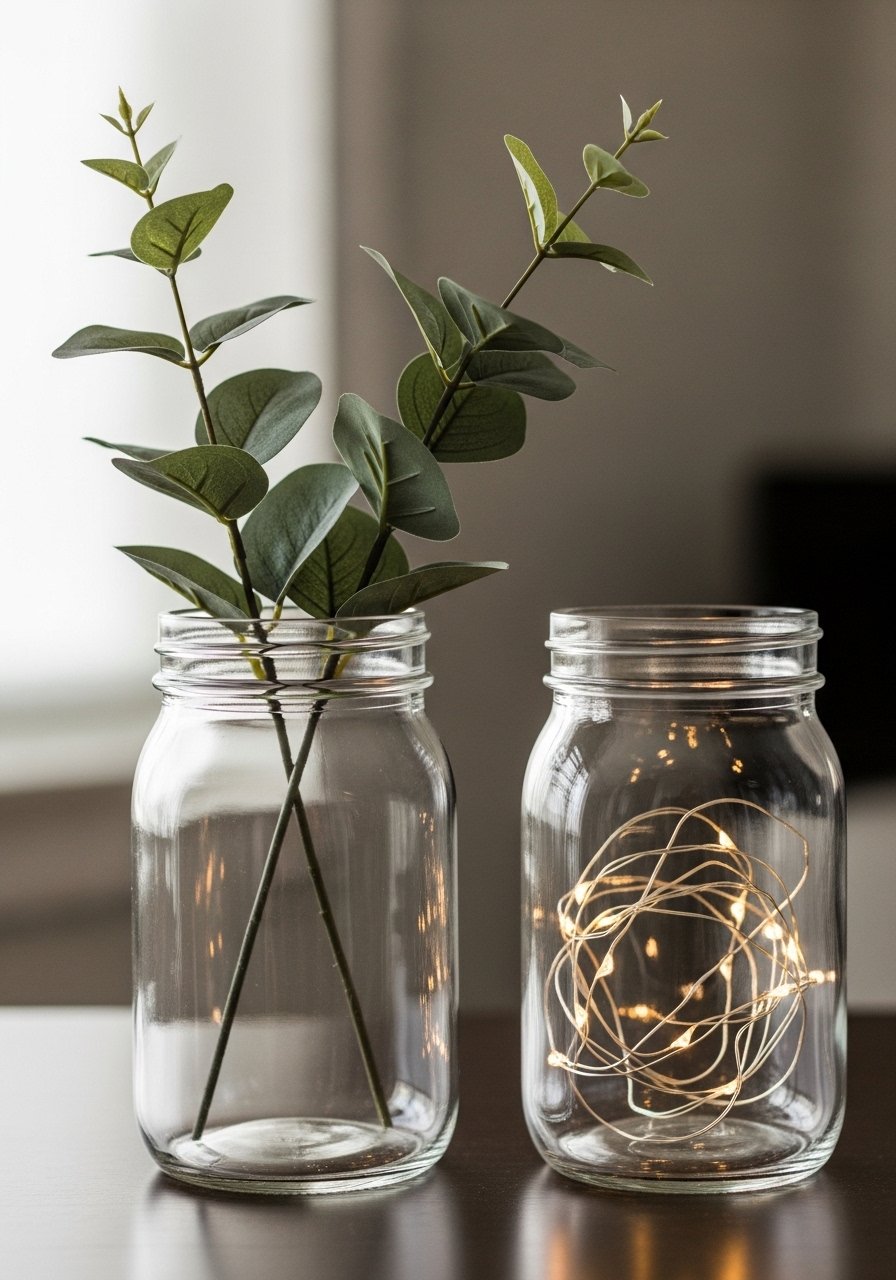
I use one or two faux eucalyptus stems for an easy, clean look. A single stem leans casual and modern; a small bundle reads more traditional. The muted green keeps the palette calm and pairs well with linen, wood, or neutral ceramics.
One insight I learned: odd numbers feel more natural. I’ll place three stems across three jars, not two and two. Mistake to avoid: using stems that are too tall without trimming. They overpower the jar and the surface they sit on.
Step 4: Layer soft light for mood and depth
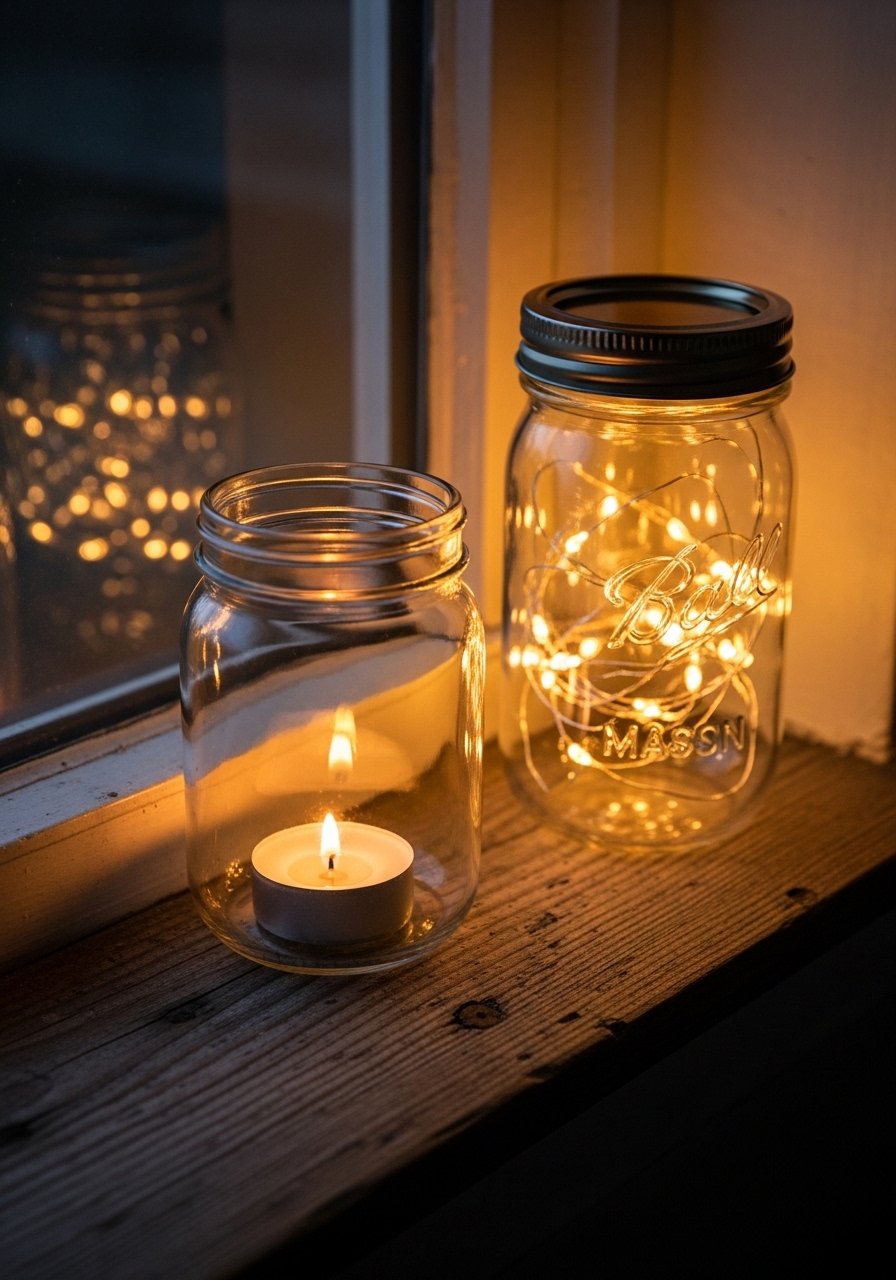
I layer light—battery tea lights inside a jar, or a strand of micro LED fairy lights tucked around stems. Warm white light makes the jars feel cozy at dusk and makes shelves look intentional, not empty.
People underuse light. Even one lit jar changes the whole mood of a mantle. Small mistake: using cool or blue-toned bulbs. That makes everything feel sharp. I stick to warm white for comfort and continuity.
Step 5: Anchor clusters on trays and balance with other objects
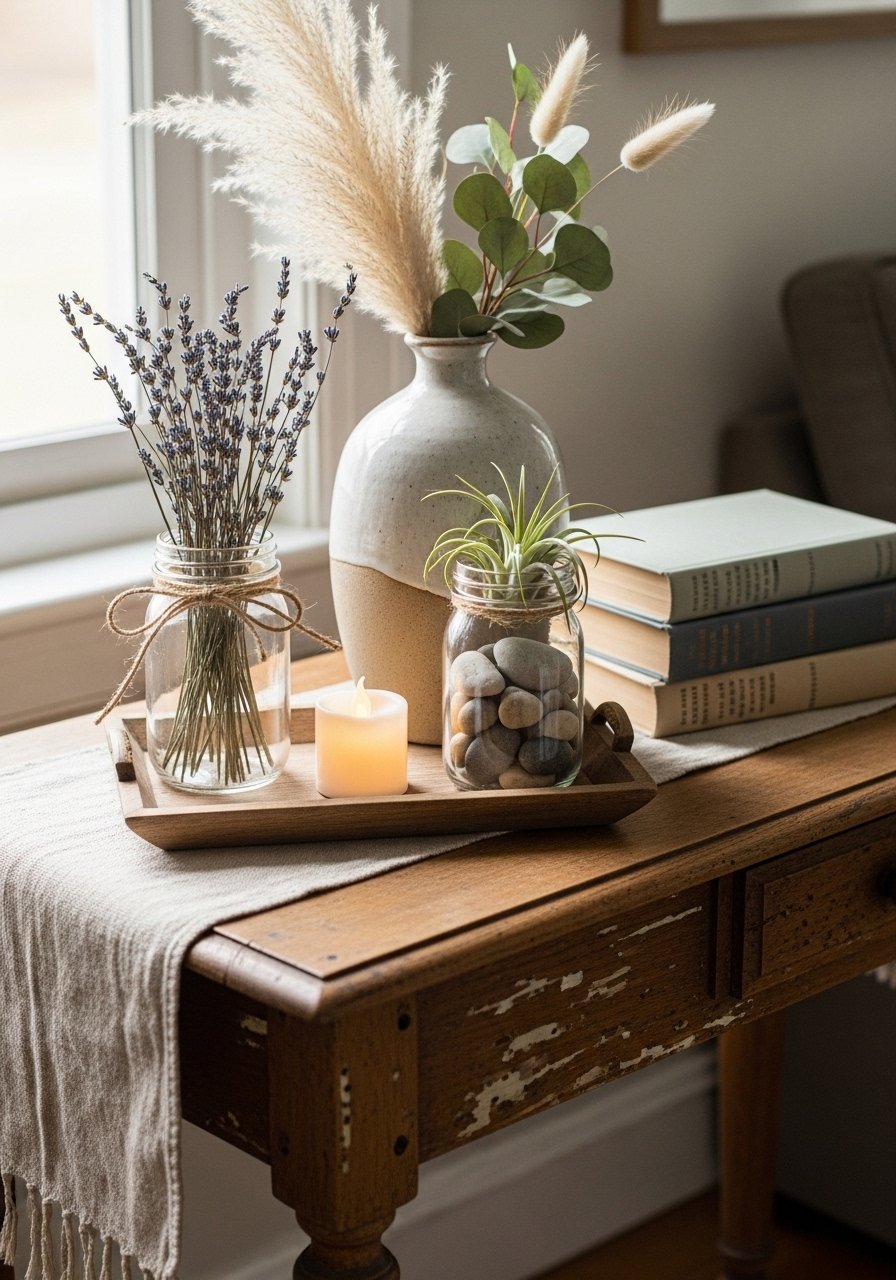
I anchor groups on a small wooden tray or next to a ceramic vase. The tray creates a contained vignette and helps the cluster look collected. I balance the jars with one solid object—like a short ceramic vase—so the eye finds a resting point.
An insight: scale matters. I match trays and vases to the surface size. Mistake to avoid: scattering jars across a long shelf without ties between them. Anchoring keeps the display readable and calm.
Step 6: Swap in seasonal accents for easy refreshes
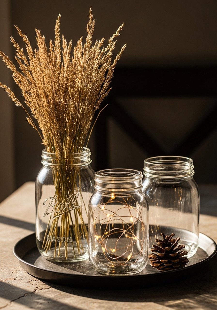
I refresh jars by swapping stems or tiny props with the season—dried grasses in fall, citrus slices in winter, lavender in summer. The core layout stays the same, so the change feels fresh without a full redo.
People think everything must change to feel new. I only change one element at a time. Small mistake: introducing too many seasonal colors at once. I keep a consistent base palette and let one accent shift the mood.
Common mistakes and how I fix them
I see three repeated missteps. First, overcrowding—too many jars or extras makes a vignette feel cluttered. Second, matching everything perfectly—uniform jars lose charm. Third, wrong light temperature—cool bulbs flatten textures.
Quick fixes I use:
- Choose one anchor (tray or vase) to contain the group.
- Work in odd numbers for count and rhythm.
- Stick to warm lighting and a limited color palette for calm, lived-in results.
Adapting mason jar decor for small spaces and budgets
I treat mason jars as budget-friendly texture builders. In a studio or small shelf, I use one jar as a focal point instead of a cluster. That single jar with a stem and a light can read intentional on a narrow sill.
Budget tips I rely on:
- Reuse jars from kitchen stores or leftovers.
- Swap faux stems seasonally rather than buying new decor.
- Use a small tray instead of multiple surfaces to create a sense of purpose.
Mixing mason jar crafts with what I already own
I like to blend jars with existing pieces so the look feels curated, not matchy. Jars sit nicely next to a stack of books, a candle, or a textured throw. The goal is balance—the jars shouldn't be the only thing on a surface.
A short checklist I use:
- Match the jar cluster’s scale to the surface.
- Repeat one color or texture nearby for cohesion.
- Keep one negative space next to the display so it breathes.
Final Thoughts
Start with one jar and one small change—painted finish, a stem, or a light. I find that a tiny vignette makes a room feel considered without much effort.
Keep choices simple and steady. Over time, these small edits add a calm, lived-in layer to any space.
