

A real, lived-in living room showing the final result of a handmade farmhouse sign hung above a mantel. Natural daylight, soft shadows, visible wood grain, layered textures—linen, metal, and greenery. The space feels intentional but lived-in. Wide angle that shows balance and flow. No text overlay.
I hated the empty space above my mantel. It felt like the room was missing a pulse. I didn't want something bought and generic.
Making a simple farmhouse sign fixed that. It added warmth, a little history, and a soft focal point. It’s the small, lived-in touch that makes a room feel finished.
How to Make DIY Farmhouse Signs Easily
This is the method I use every time a room feels unfinished. You’ll learn how to pick scale, choose wording that reads at a glance, and style the sign so it sits naturally in modern farmhouse or cozy neutral rooms. The result feels calm, balanced, and intentionally lived-in.
What You'll Need
- Reclaimed wood plank sign, 12×24, natural (~$20–45)
- Small black metal easel, 8-inch tabletop display (~$12–25)
- Galvanized serving tray, 12-inch round (~$20–35)
- Faux eucalyptus stems, bundle of 6, green (~$10–18)
- Linen throw in oatmeal, 50×60 (~$40–65)
- Vintage mason jar set, 4-pack, clear (~$12–25)
- Woven wall basket, 14-inch natural seagrass (~$25–45)
- Black matte farmhouse lettering stencil, large (~$8–15)
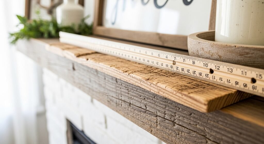
Step 1: Pick the right size so the sign reads like it belongs
I hold the sign up and live with it there for a minute before committing. If it’s for a mantel, I aim for the sign to be about two-thirds the mantel width. That proportion feels balanced without hogging the space.
People miss negative space. Let the wall breathe. A small mistake is picking a sign that’s too small — it reads like an afterthought. Conversely, a sign too wide fights the room. Think conversational scale, not exact math.
Step 2: Choose wording and font for instant readability

I keep phrasing short — one or two words, or a short phrase. Simple sayings read from across the room. I prefer bold, slightly imperfect lettering over thin script for readability in a cozy room.
People often try to cram a paragraph onto a sign. That’s the mistake. One insight: use a stencil or draw with a charcoal pencil first so your eye can judge spacing. If the word needs to feel casual, I let a couple of letters sit a little unevenly on purpose.
Step 3: Finish the surface so it looks handmade, not manufactured
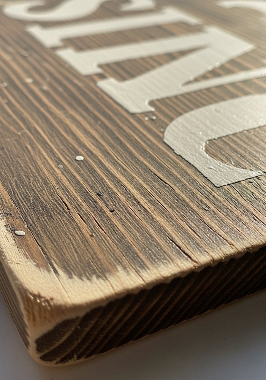
I sand lightly around the edges and wipe a thin glaze into the grain. The goal is subtle age, not a fake antique. A light hand keeps the piece warm and tactile.
A trick people miss is keeping the center slightly cleaner than the edges. The mistake is distressing everything equally — then it reads flat. When you leave the letters crisp and soften the border, the sign still feels intentional and lived-in.
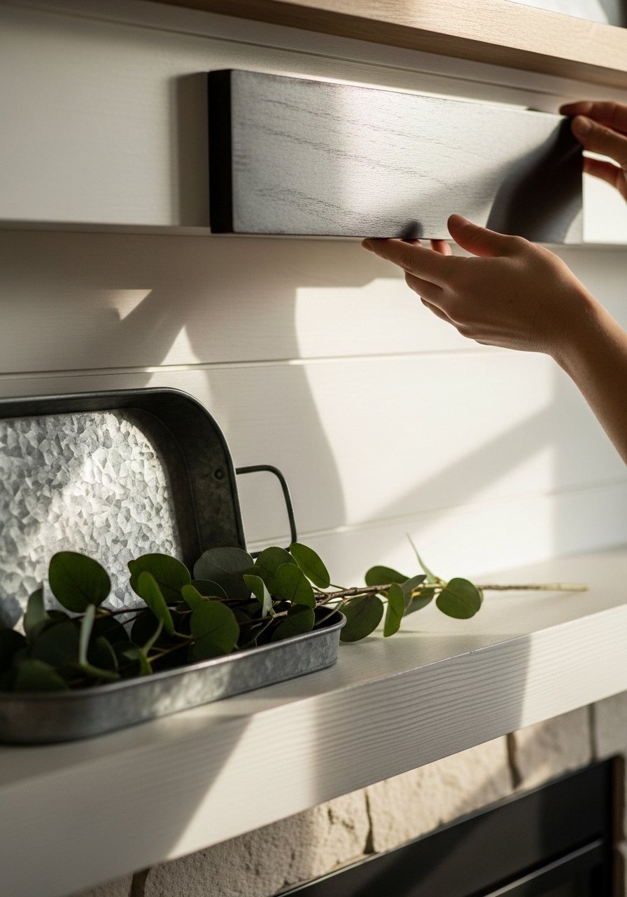
Step 4: Hang or lean with attention to balance
I test both hanging and leaning. Hanging works when the sign’s scale is solid. Leaning feels relaxed and safe for smaller walls or active families. For a mantel vignette, I balance the sign with a low object — a galvanized tray with eucalyptus — so the eye moves naturally.
A common mistake is hanging too high. I place the sign so the bottom edge is about 4–8 inches above mantels or furniture, then step back. If it’s leaning, I keep at least 2–3 inches of breathing room around it so it doesn’t feel boxed in.
Step 5: Style around the sign with simple layers
I avoid symmetry for a cozy look. I layer a tall element on one side (mason jars or taller greenery) and a low, wider piece on the other (galvanized tray or woven basket). The small black easel can keep a sign on a console without drilling.
People often overcrowd the area. My insight: let one object be the quiet hero. The mistake is adding too many competing textures. I usually remove one item and feel instantly calmer.
Common mistakes and how I fix them
I see two repeat issues: wrong scale and cluttered styling. If the sign feels lost, I swap to a larger piece or add a low layer like a tray. If it competes with too many objects, I remove one or two and leave negative space.
Quick checklist I use:
- Step back and view from the doorway.
- Keep wording short and bold.
- Keep edges slightly darker than the center.
- Remove one item if the vignette feels noisy.
Adapting this look for room size and budget
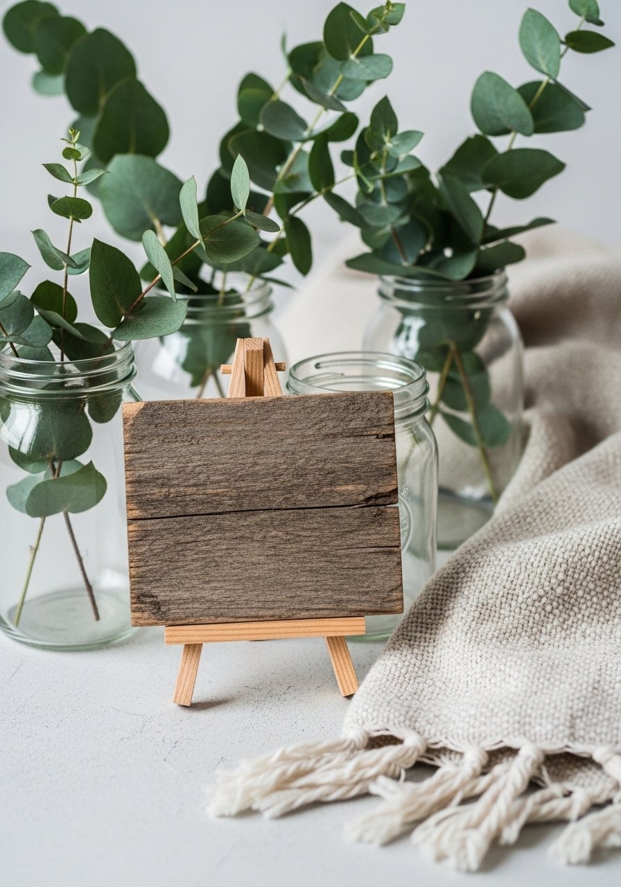
For small rooms, I use a compact sign on an easel or hang a 12×12 with one strong word. It reads like intention rather than clutter. For a tighter budget, I buy a pre-cut raw wood plank and paint a simple word using a stencil — it still feels handmade.
Budget tips:
- Use faux eucalyptus for consistent greenery.
- Lean the sign instead of hanging to avoid extra hardware.
- Reuse trays or jars you already own to anchor the vignette.
Mixing farmhouse signs with what you already own
I don’t try to swap everything at once. A farmhouse sign works with mid-century chairs or modern sconces if I match color temperature and keep scale in check. I look for one material tie — wood grain, a woven basket, or a metal tray — and echo it in other corners of the room.
How I blend styles:
- Match one material: wood, metal, or woven fiber.
- Keep the palette calm: whites, greens, natural browns.
- Use texture to unify: linen throw, mason jars, and a woven basket.
Final Thoughts
Start small. A single 12×24 reclaimed plank on an easel or over a mantel changes the room’s mood without committing to a whole redesign. I find the hardest step is resisting overcrowding.
You can make it feel like your home in an afternoon. Try the small black metal easel first if you want an easy, low-commitment result. It’s an instant, lived-in touch.
