

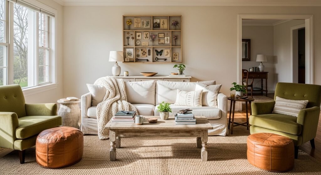
I kept staring at that empty corner and feeling like the room wasn’t finished. Big furniture felt right, but the wall looked flat and apologetic. I wanted something that read thoughtful, not crowded.
A shadow box solved it. It adds depth, a little story, and a calm focal point without shouting. It’s an easy way to make a wall feel purposefully lived-in.
How to Make a DIY Shadow Box for Wall Decor
This is the method I use every time a wall feels unfinished. You’ll learn how to plan the look, arrange pieces so they breathe, and hang the box so it reads like part of the room. The result is a layered, intentional piece that feels warm and simple—great for organic modern or cottage-core corners.
What You'll Need
- Wood shadow box frame, 12×12 inch, black (~$25–50)
- Velvet backing fabric swatch, cream, 12×12 inches (~$8–18)
- Set of 3 small ceramic bud vases, matte white (~$12–25)
- Preserved eucalyptus bundle, natural green, 6–8 stems (~$10–25)
- Mini art print set, 4×4 inch, neutral botanicals (~$8–20)
- Battery LED strip, warm white, 12 inch (~$10–22)
- [Museum putty, small jar (for anchoring)][https://www.amazon.com/s?k=museum+putty+small+jar&tag=craftedbuddy-20] (~$5–12)
- Small brass picture hooks, pack of 5 (~$6–12)
Step 1: Decide the story and scale
I start by saying what I want the box to say—quiet botanicals, travel keepsakes, or layered ceramic shapes. Picking a single theme keeps things calm and avoids a cluttered look. Visually, it narrows choices so the objects relate by color, shape, or material.
People often miss scale: a tiny object in a huge box looks lost. One small mistake to avoid is crowding the center; leave breathing room around your focal piece so the whole arrangement feels balanced.
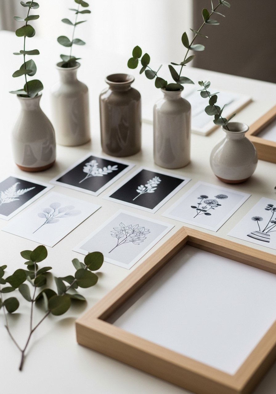
Step 2: Compose on a flat surface first
I arrange everything on the table before committing. This is where I test placement, negative space, and how layers sit against a backing fabric. Move pieces a little at a time—small shifts change the balance more than you expect.
One insight I learned: diagonal or staggered placement reads more dynamic than strict symmetry. Don’t make the mistake of assuming symmetry is always safer; asymmetry often feels more intentional in organic modern rooms.
Step 3: Choose the right backing for mood
I pick a backing that sets the tone. Linen or velvet gives warmth and depth; plain white feels minimal and airy. A soft cream velvet makes colors pop and creates a gentle, cozy backdrop without competing with objects.
People miss texture: the backing can lift simple items. A common mistake is using a busy patterned paper that fights the objects—keep the background subtle so the pieces read clearly.
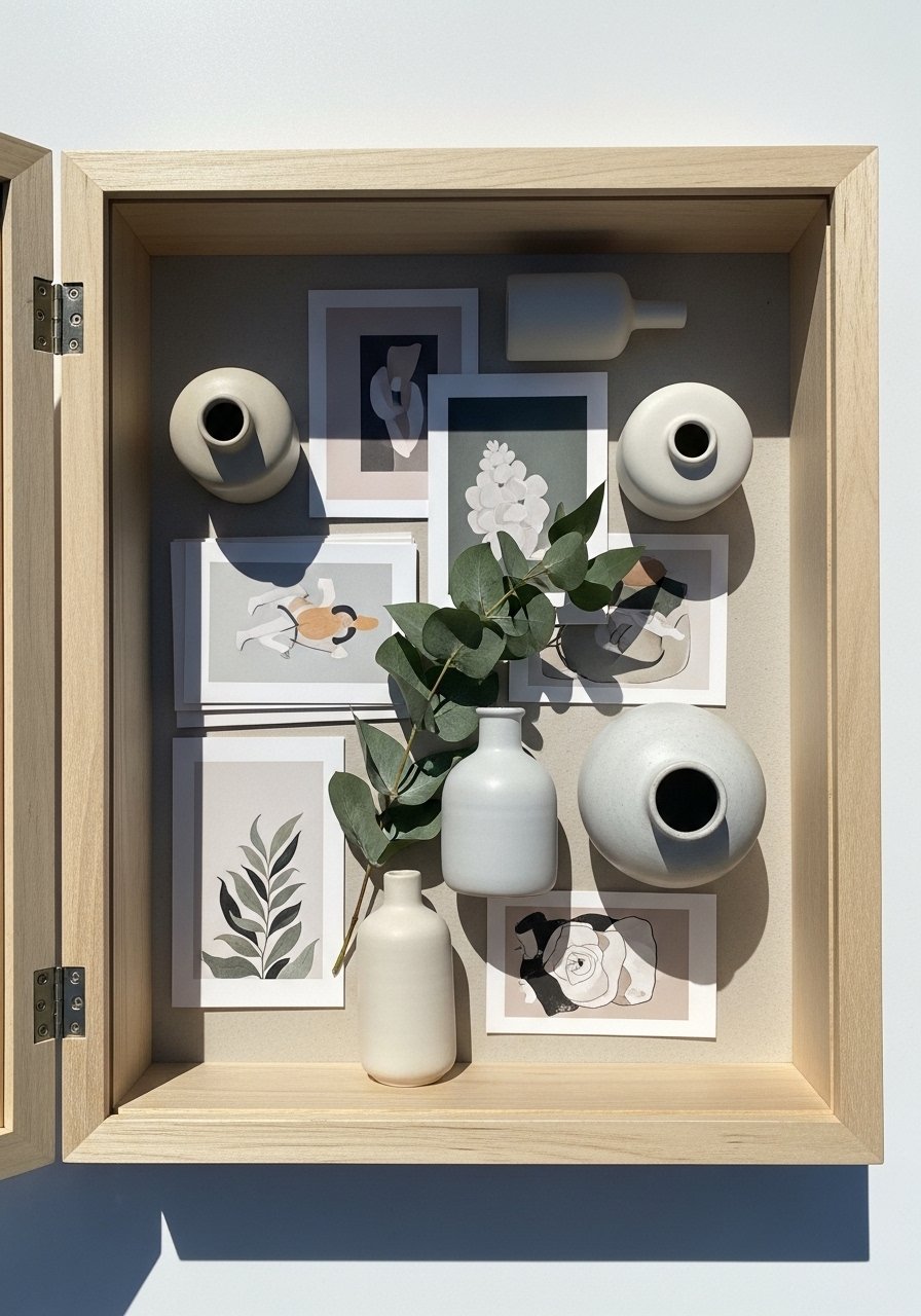
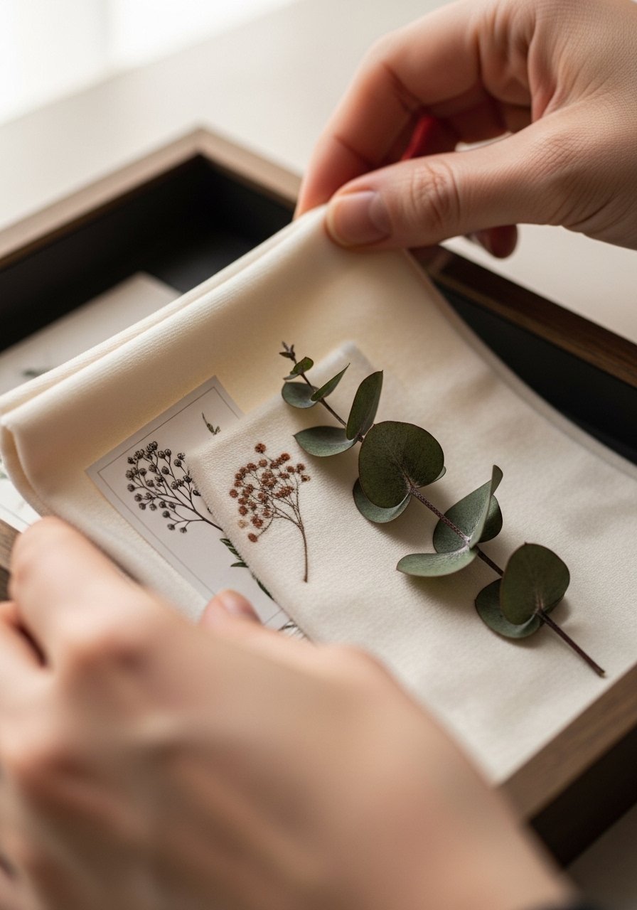
Step 4: Layer and anchor with subtle supports
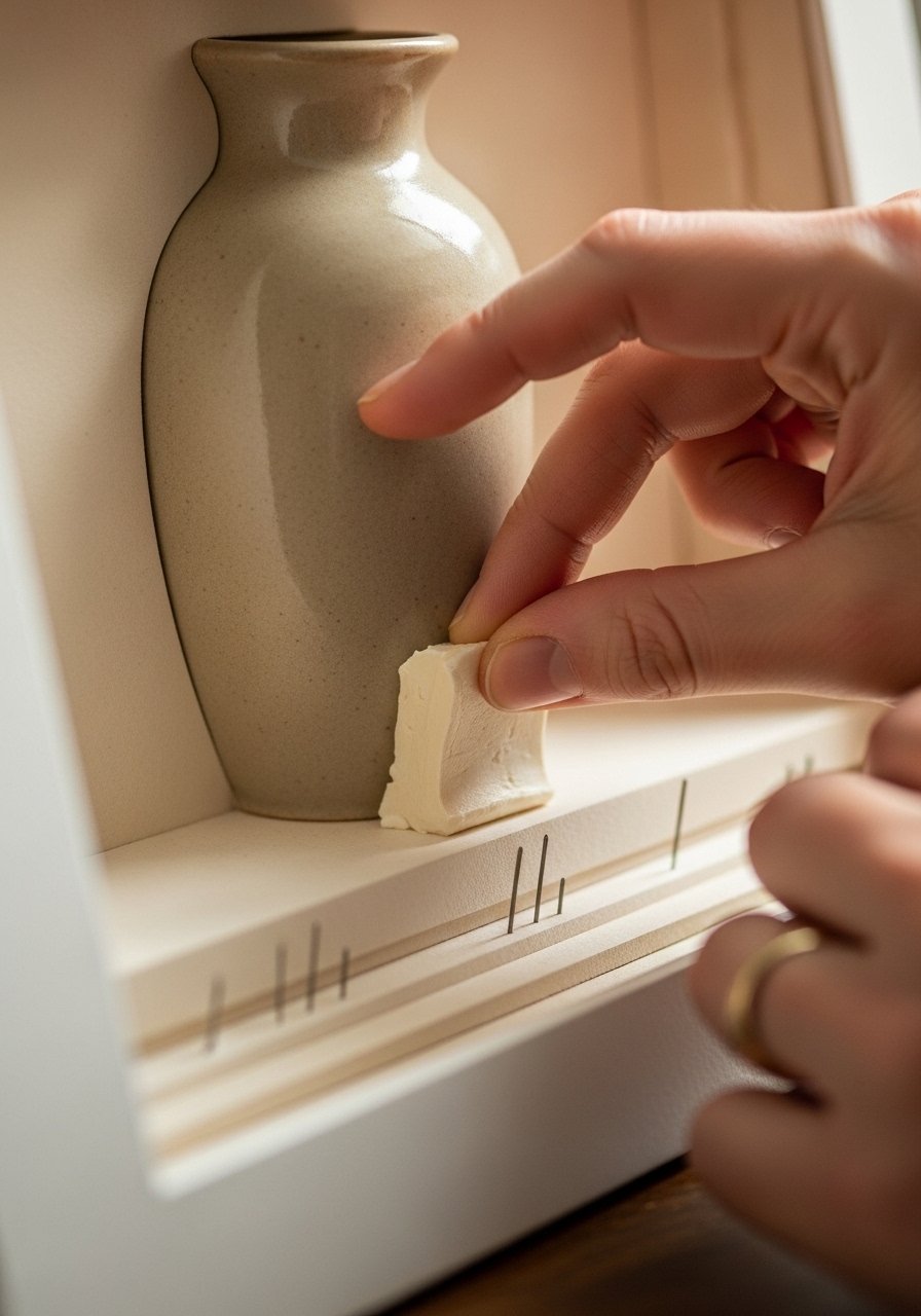
Layering is the quiet magic. I put flatter pieces (prints, pressed leaves) against the backing, then place three-dimensional objects in front. I use a dab of museum putty to anchor fragile items so they don’t shift when the box is moved.
One insight: varying heights (even slight ones) stop the arrangement from feeling flat. Avoid the mistake of over-gluing—use removable supports so you can tweak composition later without damage.
Step 5: Hang it with intent and group if needed
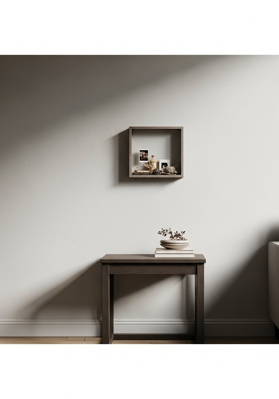
I hang the box so its center sits roughly at eye level or just above a nearby furniture line. If it’s part of a small gallery, I maintain consistent spacing—about 2–3 inches between pieces—to keep a calm rhythm. The box should feel like part of the room, not an afterthought.
People often hang too high. One mistake to avoid is matching ceiling lines instead of human sightlines—aim for the wall to invite you in, not force you to look up.
Common mistakes and how to avoid them
I’ve seen two things wreck a good shadow box: too many themes and too little breathing room. Both make the piece shout instead of whisper.
- Keep to one visual idea—color, material, or memory.
- Leave negative space around the focal object.
- Test the box on the floor before committing to the wall.
If something still feels off, remove one item. The empty space is often the fix.
Adapting the look for room size or budget
I scale the shadow box to the room’s frame: small boxes or a trio work in a cozy nook; a larger single box suits a big blank wall. Materials make budget flexible.
- Small, curated objects can be gathered from thrift stores or travel.
- Use a fabric remnant for an inexpensive, high-impact backing.
- Swap preserved botanicals seasonally to keep the look fresh without spending much.
Mixing your shadow box with what you already own
I treat the shadow box like another layer of styling, not a standalone object. Match one or two elements—finish, color, or texture—to nearby items for cohesion.
- Pair a wood frame with a wooden shelf or table finish.
- Echo a ceramic vase in other tabletop ceramics nearby.
- Let the lighting match the room’s warmth; warm LED strips inside the box help it feel integrated.
Final Thoughts
Start with one small box and a single idea. It’s low-risk and shows you how a little depth changes a wall’s feeling. I’d try a simple wood shadow box with a cream velvet backing first; it fits most rooms and budgets.
Take your time arranging. If it doesn’t feel right, remove one piece and live with the space for a day. Small edits almost always make it feel more intentional.
