

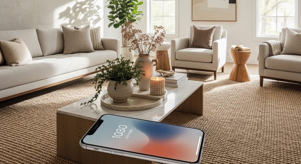
Spent $400 on a coffee table. Room still looked off. Spent $35 on a throw and three candles. Suddenly everything clicked. I felt the same way about my phone months ago, when every wallpaper felt like a tiny poster that fought with my apps. I started treating wallpapers like a mini vignette and it changed how I use the screen.
These ideas lean modern minimalist with warm neutrals and playful color pops. Most folks tweak their phone background every week or so. Over half pick wallpapers by mood first. Dual setups are everywhere now. Budget runs from free templates to small $10 purchases. These work for anyone who spends a lot of time staring at their phone, which is most of us.
Minimalist Quote Gradient For iPhone Lock Screen

The trick is one line of text only, placed in the bottom 20 percent so notifications do not cover it. I used a free Canva gradient and set the font at roughly 32pt to keep the word readable without dominating the screen. This works great for mornings when you want a small reminder. Budget is free to $5 if you buy a premium gradient. Avoid using ornate script because it clashes with small lock screen widgets. If you like matching hardware, grab a matte black phone case to keep the look intentional.
Dual Pastel Abstracts For iPhone Lock And Home

Pairing one bold lock image with a muted home background keeps icons readable and still lets the lock screen have personality. When I set this up I zoom out the home image fully so the depth effect blends the icons into a quieter field. Use opposing pastel tones so the lock pops and the home recedes. Free Wallcraft packs work, or search for pastel blobs. A common mistake is using two busy patterns. Keep one simple and one playful. For on-the-go edits, a tiny tripod helps capture textures, try this compact phone tripod.
Personal Photo With Pet Silhouette For iPhone Home Screen

I love having my dog on the screen but full photos read as clutter. Tracing a silhouette and lowering opacity to 20 percent keeps the pet subtle and lets app icons live. Use a high contrast photo, drop the silhouette to the lower right, and test with depth effect on and off. Tip for small phones like SE models, crop to a square and then place the silhouette at 30 percent from the bottom. If you want to print the silhouette later, save the file and use an easy photo-editing stylus to refine edges.
Vibrant Sunset Layers For Nighttime Scrolls

A stacked gradient of sunset colors reads bold with dark mode icons. I layer one orange band at roughly 40 percent height and a deep purple band at the bottom 30 percent so the clock and widgets sit between them. Use the hue slider in Canva around minus 20 to 30 percent to match your phone’s icon tones. Many people over-saturate sunsets and end up with pixelation. Start with a high resolution base like 1170×2532 for newer iPhones. If you scroll a lot in dim rooms, this one helps your eyes adjust.
iOS Clock-Centric Dark Mode Blend For Evenings
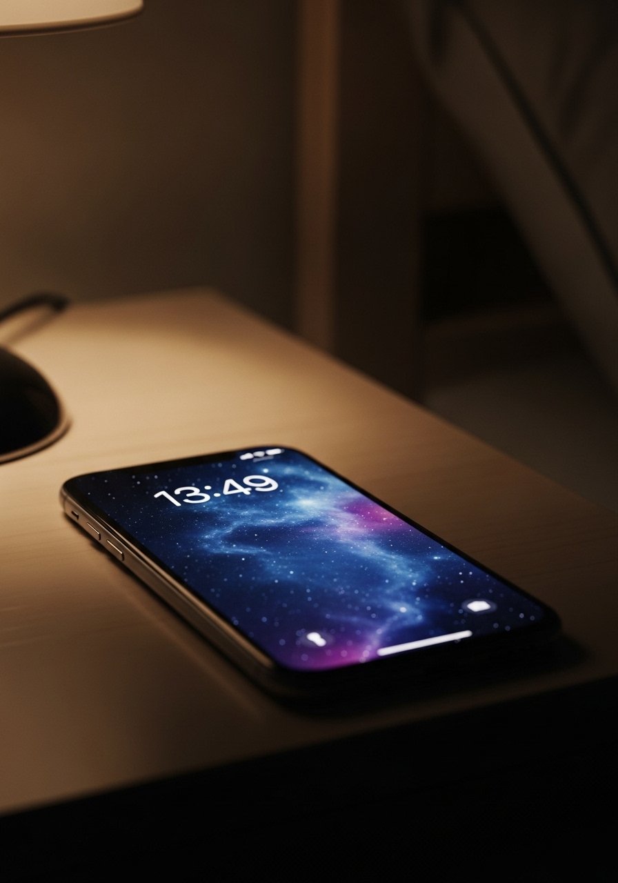
I set my lock image so the clock sits on a darker patch and I nudge the home image to be subtler. Adjust the clock position before you save the wallpaper and test it in Dark Mode. That small move makes notifications sit on clean negative space and prevents icons from looking like they are floating on an image. If you ever feel motion-sick from parallax, toggle the depth effect off and pick a flat image. For quick hands-free charging while you set up, this angled magnetic charging stand is handy.
Monochrome Line Art With A Single Accent For Productivity

Line art reads calm and productive, and adding one accent stroke keeps it from being cold. Use a gray field at 80 percent opacity behind the line drawing so app labels remain legible. A good ratio is 70 percent neutral to 30 percent accent color. Keep text off this one so your calendar and productivity widgets stay visible. I pair this wallpaper with a clean leather desk mat for continuity, like this black leather desk pad I bought last year.
Textured Marble Faux Effect For A Luxe Look
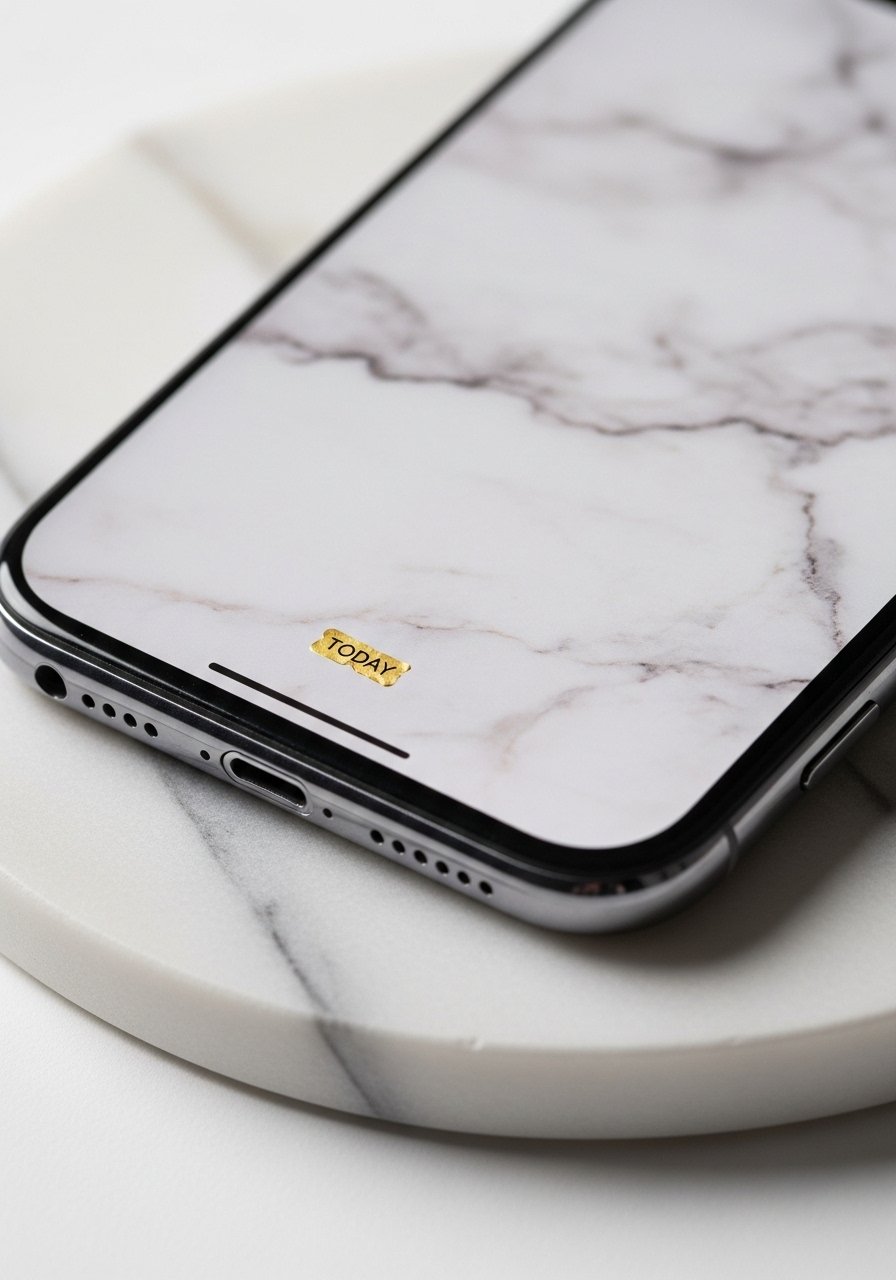
Marble textures read luxe without needing metallic hardware. Use a subtle grain and reduce brightness 10 to 15 percent so app icons do not disappear. A tiny gold foil word works best at about 24pt and placed in the lower center. People often pick ultra-high contrast marbles that make icons vanish. Crop to the phone resolution first, then reduce clarity slightly. If you like the tactile idea, pair the wallpaper with a marble coaster set so the vibe feels whole in real life.
Floral Watercolor Half-Screen For Soft Notifications

Cut the floral into the top half so notifications land on the quieter cream field. I crop the painting to fill the top 60 percent and then match a solid color for the bottom 40 percent. That split keeps the phone from feeling busy when you wake up. People often put florals edge-to-edge which makes small icons hard to read. Use a low-opacity texture behind the flowers, around 10 percent blur, to make the watercolor breathe. For editing, a small LED ring light helps flatten shadows while you crop. I use a tiny LED ring light for phones.
Geometric Earth Tones For Everyday Calm

Terracotta, sage, and cream form a stable palette that tames colorful app icons. Scale the shapes to about 30 to 40 percent of the screen so the pattern reads from a distance but does not overwhelm. I like one large triangle as an anchor and smaller shapes as accents. A common mistake is repeating the same small motif across the whole screen which looks too busy. Try pairing this wallpaper with a physical terracotta plant pot for cohesion, like this terracotta plant pot.
Neon Glow Abstracts For Evening Energy
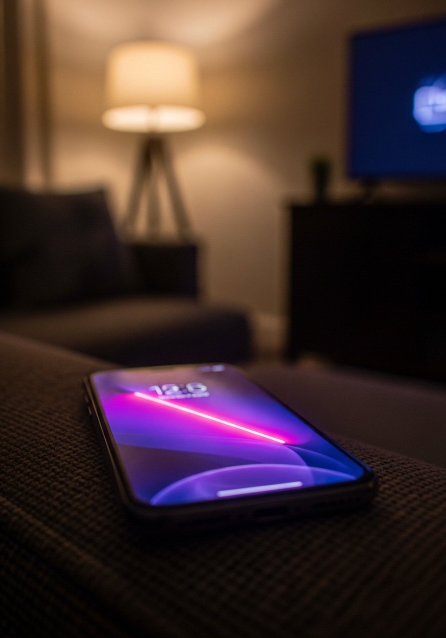
Neon pairs surprisingly well with dark mode and late-night scrolling. Keep the neon strokes thin and limited to 10 to 15 percent of the canvas. That way the glow adds drama without hiding app badges. I usually set depth effect on for this one because the glow creates a nice parallax without being disorienting. If you are sensitive to motion, test it for a day before committing. For a matching accessory, this neon color phone case looks fun on camera.
Vintage Polaroid Collage For a Personal Retro Feel
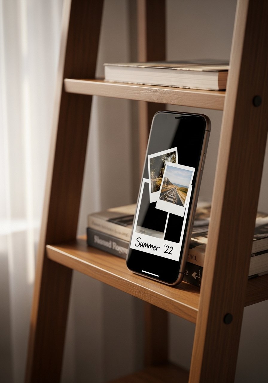
Three small photos rotated slightly read nostalgic without covering the entire canvas. Keep each polaroid to about 20 percent width and offset them so they form a loose triangle. Tilt each by roughly five degrees for authenticity. Avoid using ten mini-images which become visual noise. If you want a cohesive tone, apply the same film filter to each photo before laying them out. For shooting, a slim photo printer tray keeps your prints organized while you plan the collage.
Sage Green Nature Macro For Calming Mornings

A leaf macro is easy on the eyes and helps reduce the jolt of notifications. Blur the edges slightly around 10 pixels so the center leaf reads sharp and the icons sit on softer texture. Sage green works well with both light and dark icons, so you do not have to switch wallpapers between modes. The most common mistake is choosing a macro with too much contrast. Lower contrast by 15 percent and test the home screen. If you want a plant to match the wallpaper, a small potted succulent mirrors the tone.
Bold Typography On Black For Focused Home Screens

Black backgrounds let app icons pop and conserve battery on OLED devices. Use a strong sans serif at 36pt for the single word and keep it centered low so widgets do not cover it. People often pick thin fonts which disappear at a glance. A heavy weight stays readable and gives the phone a steady presence during work hours. If you pair this with a monochrome case, try a simple black leather case for a unified look.
Layered Holographic Foil For Subtle Shine
A holographic overlay looks modern without being loud when used sparingly. Set the foil layer at about 15 to 25 percent opacity so it reads as a sheen rather than a mirror. That keeps icons legible and gives the wallpaper dimension. Older phones can pixelate overly complex overlays, so test the file at your phone resolution first. I usually use this when I want a touch of glamour during evening social time. For touch-ups, a small microfiber cleaning cloth keeps the screen free of distracting smudges.
Soft Gradient With Clock-Friendly Negative Space

Design the gradient so the top third is slightly darker to anchor the clock and the bottom two thirds are lighter for widgets. I set the midpoint at around 35 percent to keep the transition smooth. Many people center gradients which pushes the clock into busier areas. Before saving, move the clock to different corners to see where it reads best. For a simple match to this color palette, I like a peach ceramic coaster set on my desk.
Photo Texture With Low Opacity For Background Depth

A real fabric macro gives depth without pattern noise. I shot a linen sample and reduced opacity to about 80 percent so app labels remain readable. The texture reads like a small vignette in the corner of a room and pairs well with linen throw pillows. Avoid using ultra-fine textures because the compression will make them look grainy. If you plan to photograph textiles yourself, a good mini clamp light helps flatten shadows while keeping true color.
Your Decor Shopping List
Textiles
- Honestly the best $40 I have spent. Velvet pillow covers, set of 4 in two colors for a layered look
- Chunky knit throw in cream (~$35-55). Drape over the sofa arm for instant warmth
Wall Decor
- Found these while looking for something else. Brass picture ledges (~$18-25) let you swap art without new nail holes
- Mixed metal picture frames, set of 3 (~$30) for effortless gallery rhythm
Lighting
- LED ring light for phones (~$20) for flat product shots and wallpaper captures
- Mini clamp light for close texture photography
Plants & Pots
- Terracotta plant pot, 6-inch to match earth tone wallpapers
- Potted succulent for small greenery without fuss
Budget Finds
- Microfiber cleaning cloth, pack of 3 (~$8). Keeps every wallpaper crisp and smudge free
Similar at Target or HomeGoods for frames, pillows, and throws if you prefer in-person shopping.
Shopping Tips
White oak beats dark wood in 2026. Design feeds have shifted completely. These white oak floating shelves look current, not dated.
Grab velvet pillow covers for $12 each. Swap them every season and the whole room feels different.
Curtains should puddle or kiss the floor, never hang halfway up. These 96-inch linen panels are the right call for standard 9-foot ceilings.
Everyone buys five small succulents. One single 6-foot fiddle leaf fig, artificial has ten times the visual impact.
Frequently Asked Questions
Q: How do I stop app icons from ruining my wallpaper?
A: Pair a bold lock screen with a muted home screen and zoom the home image out fully. This keeps icons from sitting on busy parts. Test with depth effect on and off before you commit.
Q: What resolution should I use for new iPhones?
A: For iPhone 15 and 16 models use 1170×2532 pixels. Crop other photos to that size rather than stretching them. That prevents pixelation and odd cuts at the edges.
Q: Can I add text without looking cheesy?
A: Yes. Limit text to one line, keep it in the bottom 20 percent, and use roughly 24 to 36pt depending on the font weight. Stick to one strong sans serif and avoid ornate scripts.
Q: Why does the depth effect make me dizzy and what can I do?
A: Some people are sensitive to parallax. Test the wallpaper for a day with depth on, then toggle it off if it bothers you. Flat images still look great and are easier to read.
Q: How do I include my pet without making the screen chaotic?
A: Make a silhouette of the pet at low opacity and place it in a corner. For small phones like SE, crop differently and move the silhouette up by 30 percent so it does not clash with widgets.
Q: I use free apps but they add watermarks, any workaround?
A: Choose free templates that do not force watermarks, or export a high resolution screenshot and crop to phone specs. A tiny tripod and ring light make DIY textures look professional while staying budget friendly.
