


My living room had nice furniture and decent lighting but it still felt like a waiting room. Took me embarrassingly long to figure out it was missing texture. Every surface was smooth, every color was flat, and nothing invited you to actually sit down. Swapping in a patterned rug and a few wood accents changed everything overnight.
These ideas lean Art Deco with a modern edge, mostly budget friendly with a few splurge pieces around $100 to $400. They work for living rooms, open-plan living dining areas, and even a large bedroom if you want that same black and white punch.
Herringbone Wallpaper for Art Deco Drama
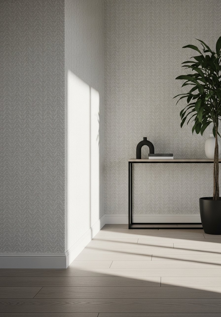
The trick that made my space feel taller was running herringbone wallpaper from floor to ceiling over the focal wall. It breaks up plain white without adding color, and stretched vertically it makes low rooms feel taller. Use a peel-and-stick version if you rent. I put the wallpaper behind my piano and the black case reads as a focal point rather than a wall-sized blob. Budget: $ to $$. Common mistake is centering large furniture on patterned wallpaper so the pattern competes. Keep at least 10 to 20 percent warm wood nearby to stop the palette from feeling clinical. Try peel-and-stick herringbone wallpaper for a renter-friendly option.
Modern Art Deco Black Accent Wall
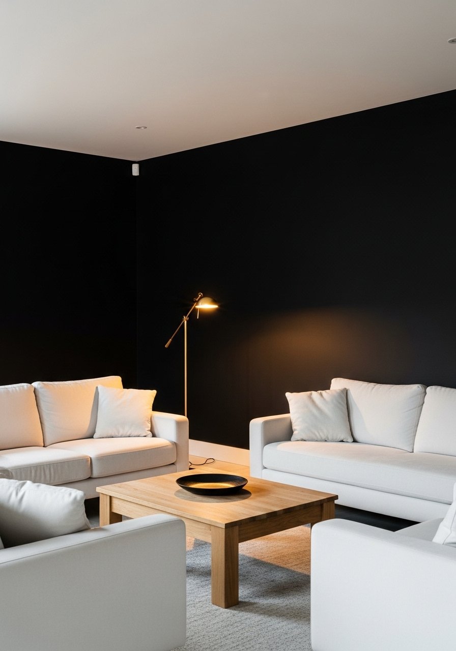
One black wall is the fastest drama hack that does not cave the room in. Paint the farthest wall black and keep the rest white, then place low white seating opposite for contrast. Use a matte black so glare does not read like varnish. Most folks make the mistake of painting two opposite walls and killing natural light. Keep black to one wall and use the 80/20 rule: about 80 percent white base and 20 percent black accents. If you rent, try a temporary black wallpaper or a large black tapestry instead. I used black matte paint swatches before committing.
Textured Rug to Ground Clean Lines
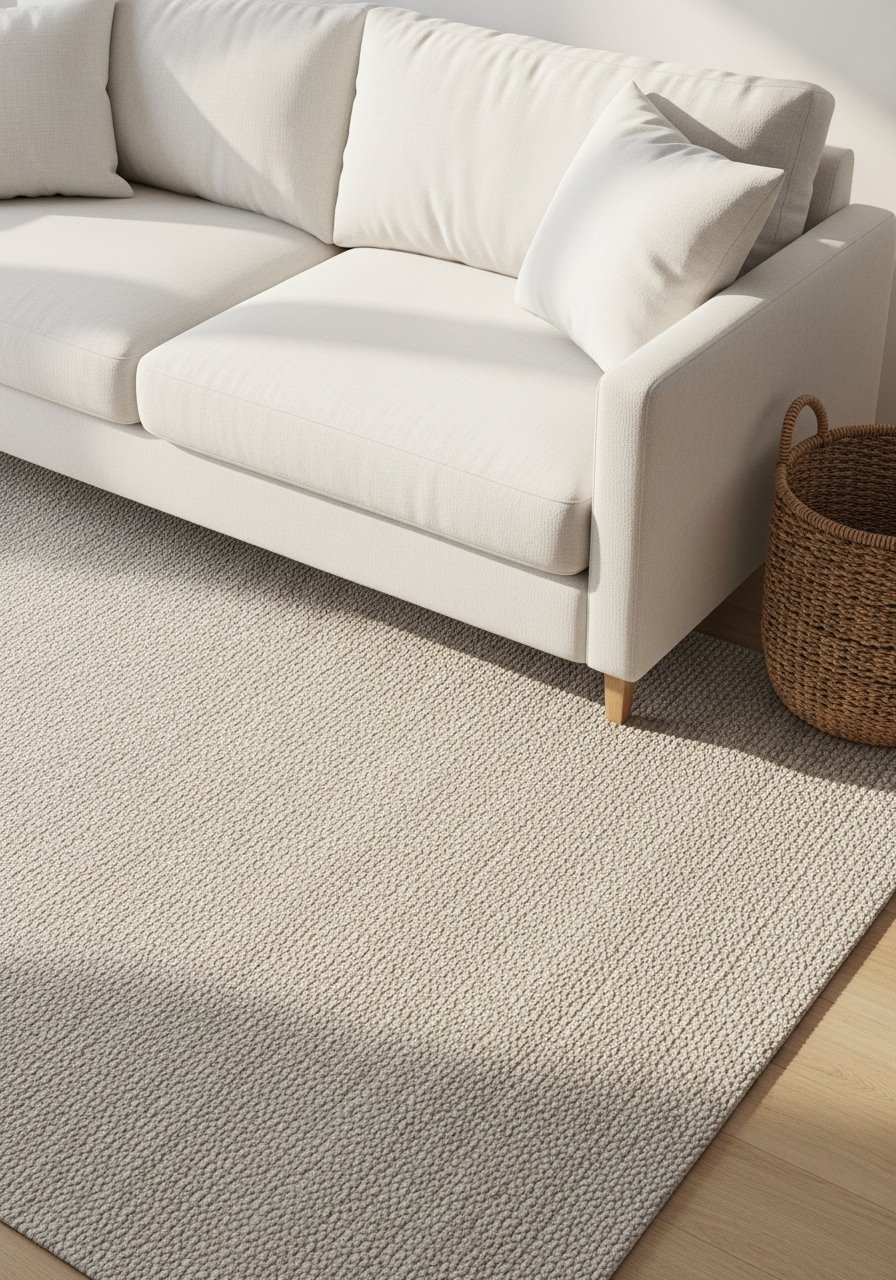
An oversized rug changed how everything sat. For a standard living room go 8×10 minimum so front legs of sofas and chairs rest on the rug. A textured black and white rug keeps crisp furniture from floating and hides the first few spills. People often buy rugs too small or pick slick low-pile options that show footprints. I prefer a jute blend for durability and texture, and I recommend layering a soft rug pad underneath to stop bunching. If you need something kid-proof, pick a tighter weave. Try this 8×10 jute area rug for a grounded base.
Organic Wood Coffee Table with Plants
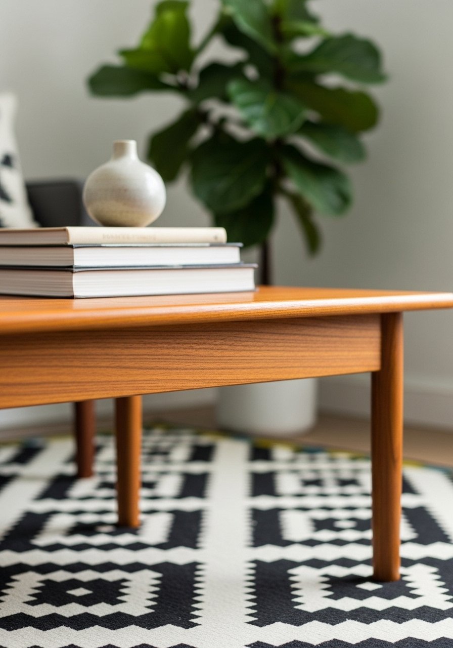
My room felt sterile until I added a low wood coffee table and a big plant. The wood adds 10 to 20 percent organic warmth that prevents black and white from feeling like a showroom. Put the plant on the floor rather than the table so the vertical layers read correctly. A common misstep is choosing a too-tall table that blocks views across the room. Go low and wide, and keep the coffee table within 16 to 18 inches of the sofa for reachability. I use a teak-look table that was a Target find, and a live fiddle leaf for texture. For a similar pick try teak coffee table options.
Bauhaus Black Metal Side Table with Rustic Rug

Sharp metal lines need a soft base. I put a small Bauhaus black metal side table on a rustic rug so the edges pop but the floor stays warm. The contrast reads modern Art Deco, not industrial cold. Avoid matching metal exactly to other fixtures, or the room looks staged. Instead mix finishes and keep metallics under about 5 percent of the visual field so they glint without stealing the show. This pairing works great next to the gallery wall idea below. For an accessible option search Bauhaus side table.
Brass Chandelier over White Sofa for Nighttime Glow
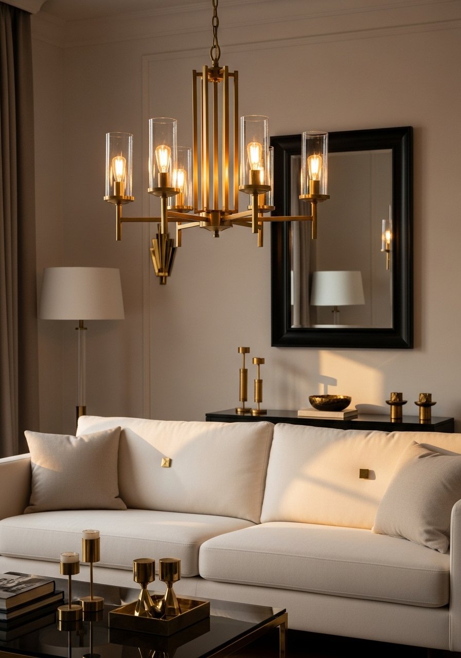
Nighttime is where black and white either sings or looks flat. Adding a brass chandelier above the seating solved my after-dark problem. Brass warms the scene and reflects light into black areas. Keep metallic accents small and deliberate, under 5 percent of the scheme. If you cannot hardwire a fixture, use a stylish plug-in chandelier or a floor lamp with a brass finish. People forget to layer light; one overhead fixture alone is not enough. Pair this with table lamps and a dimmer to keep evenings inviting. I found a mid-price brass fixture that made the room feel intentional. Try brass chandelier options.
Muted Abstracts in Black and White

Big, muted abstracts calm a high-contrast room. I hung a set of three grayscale prints and the visual tension softened instantly. The trick is to keep the art muted in tone, not high-contrast, so the room breathes. A common mistake is using three tiny prints that do not fill the wall. Aim for a group that totals at least 60 percent of the sofa width. Use command-friendly picture ledges if you rent, and rotate pieces seasonally. For similar pieces try black and white abstract prints.
White Walls Punched Up by Black Hardware

Small hardware swaps have outsized impact. Swapping white cabinet pulls for matte black ones gave my built-ins instant definition. It is an inexpensive way to introduce black in a controlled way, and it follows the 80/20 color idea without heavy lifting. Many people change accessories but forget the hardware, which leaves surfaces looking unfinished. If you rent, try stick-on knobs for a no-drill option. I used 1.25-inch knobs on shallow drawers and 2.5-inch pulls on larger doors for scale. Search matte black cabinet knobs.
Light Wood Dining Table to Warm Open Plans
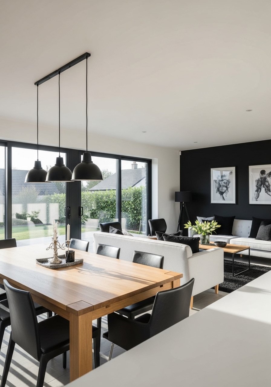
In open plans the living and dining areas read as one, and a light wood dining table ties the spaces together without adding color. I swapped a heavy dark table for an acacia piece and the living room stopped feeling top-heavy. Keep wood in 10 to 20 percent of the scheme so it warms without dominating. A common oversight is picking a table with the wrong scale for the room. Measure clearance so chairs pull out easily, and choose a table that complements the coffee table height. Try light oak dining tables for ideas.
Black Metal Sculptures for Shelf Depth
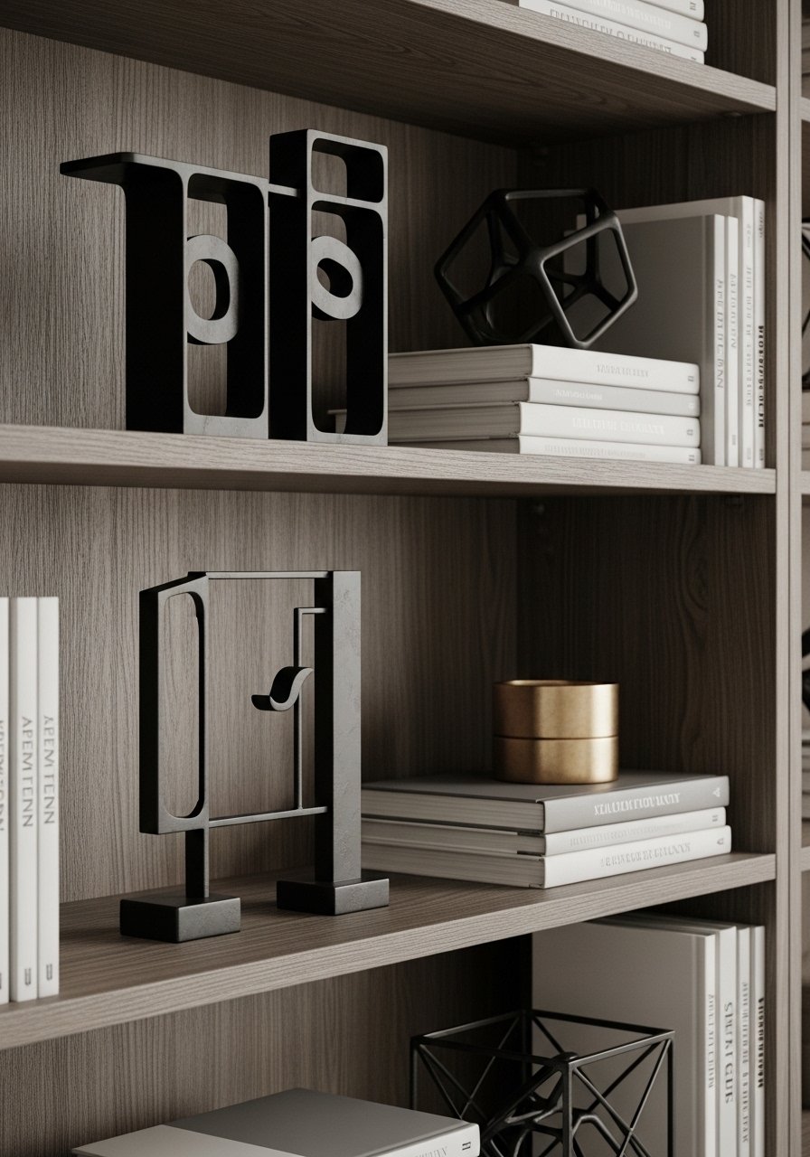
Shelves are where drama can be subtle. I brought in a few black metal sculptures to create silhouette interest without adding color. Put sculptures at varying heights and use odd numbers for better eye flow. A typical mistake is lining everything up symmetrically; the result is flat. Instead, offset a sculpture with a low brass tray or a wood bowl, and leave breathing room between objects. If you want the look without the price, try small black metal bookends as a starting point. For accessible options search black metal sculptures.
Herringbone Rug Paired with Linen Sofa
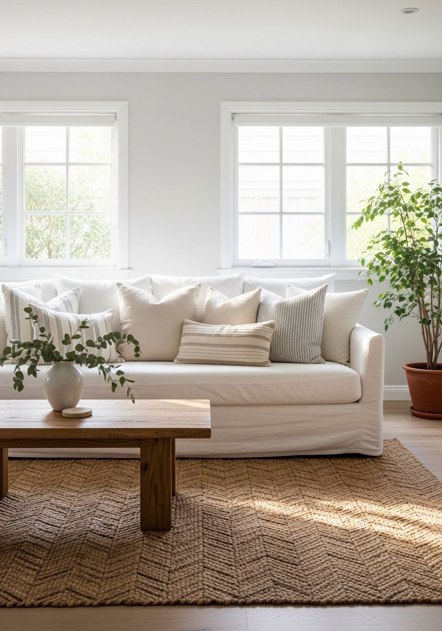
A linen sofa reads lighter than leather next to a patterned rug. I covered my sofa in a washable linen slipcover and the herringbone rug beneath it gave pattern without shouting. The photo-vs-reality detail people miss is that linen wrinkles, and that texture is part of the charm. Choose washable covers for homes with kids or pets. Keep the rug pattern scale moderate so it does not fight the wallpaper idea earlier. For linen covers try white linen sofa slipcovers.
Gallery Wall Using Only Black Frames
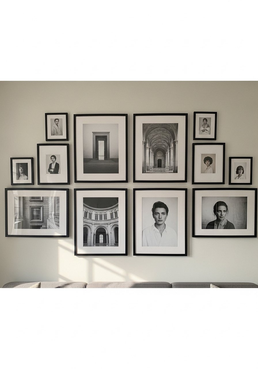
A unified gallery wall with black frames makes high-contrast rooms feel curated and intentional. I used the same frame style in different sizes and laid everything out on the floor first. A common mistake is uneven spacing. Aim for 2 to 3 inches between frames and keep the center of the arrangement about 10 to 12 inches above the sofa back. If you cannot commit to nails use picture ledges or command hooks. This pairs perfectly with the brass chandelier and the textured rug for balance. Try black picture frames set.
Mix Metals for Subtle Art Deco Shine
Mixing metals makes a black and white room feel layered, not matchy. I have chrome, brass, and matte black all in one small grouping and it reads deliberate. Keep metallics to small accents and scatter them so they catch the eye in different moments. The common error is placing all the same metal on one side of the room. Spread them and pair with wood or plant life so the shine feels integrated. If you need a starter piece try a small brass tray. For options, search brass-tray-coffee-table.
Your Decor Shopping List
- Textiles: Honestly the best $40 I have spent. Chunky knit throw in cream (~$35-55). Drape it over the sofa arm for instant warmth
- Rugs: For the rug sizing rule, go big. 8×10 jute area rug durable and textured
- Wallpaper: For the renter-friendly option try herringbone peel-and-stick wallpaper in muted tones
- Lighting: For the evening glow, brass chandelier option mid-price range
- Hardware: Matte black cabinet knobs set of 10 for instant polish
- Coffee Table: Light wood works best. Teak coffee table lookalike
- Art: Black and white abstract prints set sized to cover 60 percent of your sofa width
- Plants: One tall plant beats five small ones. Faux fiddle leaf fig 6ft if you lack natural light
- Shelving Styling: Black metal sculptures set for shelf depth
- Frames: Uniform black frames set save time and measure first
Similar items at Target or HomeGoods are great if you prefer to see scale in person.
Shopping Tips
- White oak beats dark wood in 2026. Design feeds have shifted completely. White oak floating shelves look current, not dated
- Grab velvet pillow covers for $12 each. Swap them every season and the whole room feels different
- Curtains should puddle or kiss the floor, never hang halfway up. 96-inch linen panels are right for standard 9-foot ceilings
- Everyone buys five small succulents. One single 6-foot fiddle leaf fig has ten times the visual impact
- If you are a renter, buy peel-and-stick options like temporary wallpaper and stick-on knobs so you can revert without damage
Frequently Asked Questions
Q: What size area rug do I actually need?
A: Bigger than you think. For a standard living room, go 8×10 minimum so front furniture legs sit on the rug. That avoids the floating furniture look. This 8×10 jute rug works for high traffic and hides early stains.
Q: Can I mix boho textiles with modern furniture without it looking messy?
A: Yes. Keep one pattern family large scale, like a herringbone rug, and layer smaller tactile pieces such as a chunky throw or 22-inch linen pillows. Stick to the 80/20 rule: 80 percent white base, 20 percent black or pattern.
Q: My room gets dark, how much black is too much?
A: Over half mess up with too much black first try. A single accent wall and small black accents around the room keep drama without darkening the space. Add at least one warm wood piece to break the contrast.
Q: Are faux plants acceptable for this look?
A: Both work. If you have low light, use a high-quality faux fiddle leaf in a corner for scale. If you have light, a real fiddle leaf or snake plant gives texture and helps the room feel alive.
Q: How do I hang a gallery wall without holes?
A: Use picture ledges or command hooks rated for the weight. Lay the arrangement on the floor first to get spacing, then transfer to the wall. Keep spacing tight, about 2 to 3 inches between frames, and center the group about 10 to 12 inches above the sofa back.
Q: Most of these ideas are great, but what will not date quickly?
A: Clean geometry, herringbone pattern, and light wood are trending now and feel current. Close to half go for black white drama these days, so this palette is not a fad. Stick to texture and scale rather than trendy color accents and you will be happy years from now.
