
I kept buying small decor and my shelves still looked cheap and cluttered.
I couldn’t get that clean, collected look without spending a lot.
So I learned to edit, layer, and upgrade little Dollar Tree finds. The room now feels intentional and calm. Start small. You don't need to be crafty.
How to Make Dollar Tree DIY Crafts That Look High-End
This is the method I use when a room still reads cheap. I show how to pick Dollar Tree pieces that read richer, how to pair them with one stronger item, and how to place them so the whole vignette reads calm and collected—not busy or cheap.
What This Solves
When my mantel or shelf looked busy but not considered, I felt restless. The method here makes cheap pieces read cohesive and thoughtful.
I keep the budget but lose the clutter. The room ends up feeling balanced, warm, and comfortable.
What You’ll Need
- 8×10 black wood frame (matte finish, wood grain look)
- Small white ceramic bud vase (6-inch)
- Brass round decorative tray (10-inch)
- Faux eucalyptus stems (set of 6, realistic green)
- Textured linen throw pillow cover 18×18 (neutral)
- Natural woven rectangular basket (small)
- Neutral pillar candle set (unscented, 3 sizes)
Step 1: Edit the pile down until each piece earns its spot
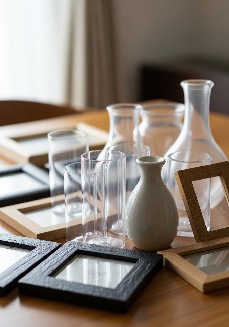
I start by pulling everything out and deciding which pieces have shape, weight, or a simple line. I keep pieces that have a silhouette I like.
Visually, the shelf immediately calms. The reader sees fewer competing materials and more intention.
Many miss that shape matters more than brand. I avoid keeping every small trinket. A common mistake is thinking quantity hides cheapness—too many little things make the whole look cluttered.
Step 2: Give cheap pieces a strong partner
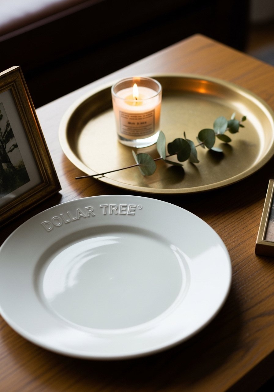
I always choose one quality anchor—like a brass tray or an 8×10 frame—and arrange Dollar Tree pieces around it. The anchor grounds the vignette and sets a material tone.
What changes is the read: the small items suddenly look curated because they’re connected to something with presence.
A detail people miss is matching finish temperature—warm metals with warm tones, cool with cool. I avoid crowding the anchor; overfilling the tray flattens the effect.
Step 3: Make color and finish feel deliberate
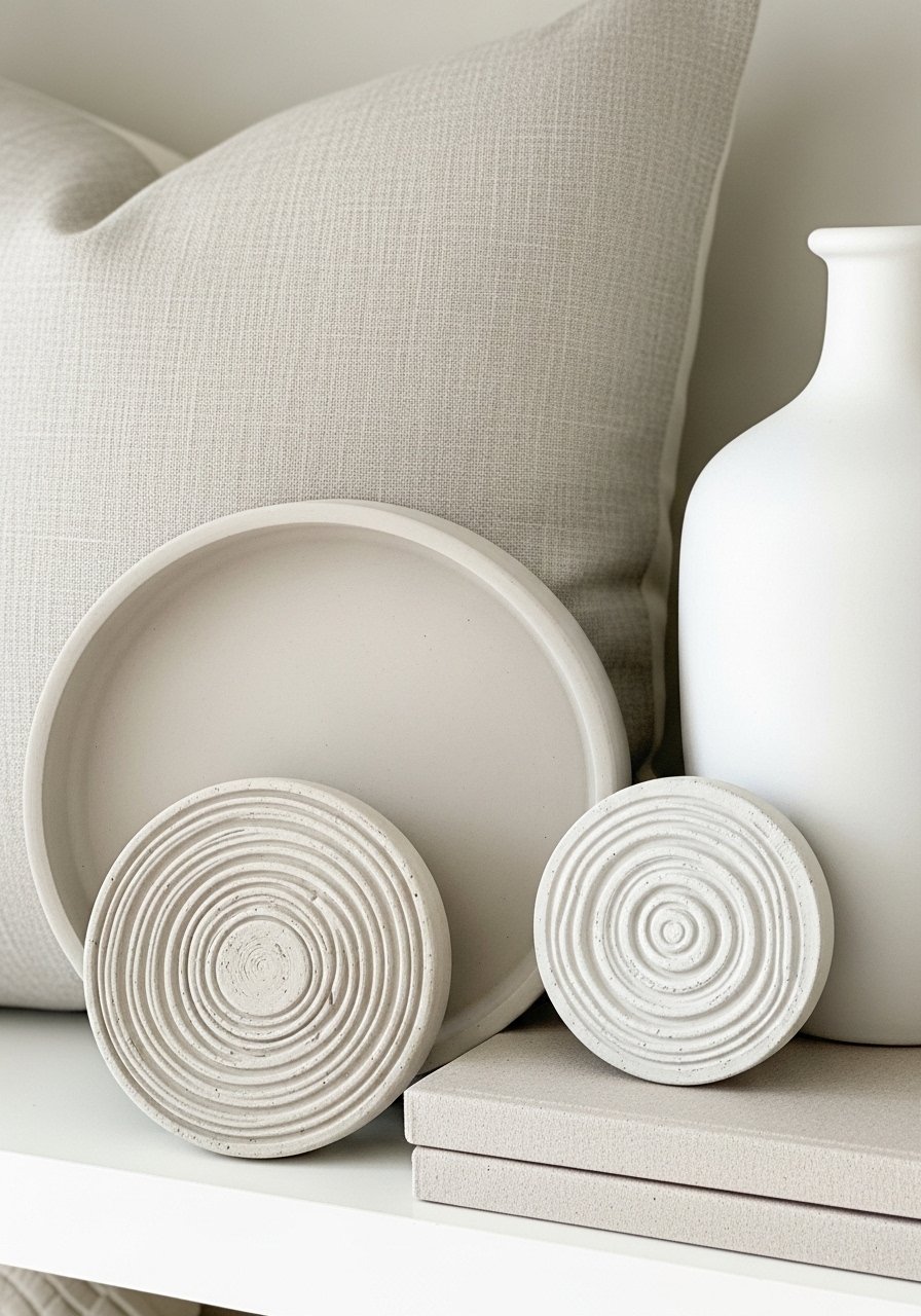
I mute loud colors by grouping them with neutrals and repeating a single finish. If a Dollar Tree item is bright, I place it beside a white vase or on a neutral tray to calm it down. The visual change is harmony—the eye reads a deliberate palette instead of random splashes.
People often miss repeating one color or finish three times across the vignette. A small mistake is mixing too many finishes; that makes the arrangement scream “bits and pieces” instead of “purposeful.”
Step 4: Add greenery and texture with confidence
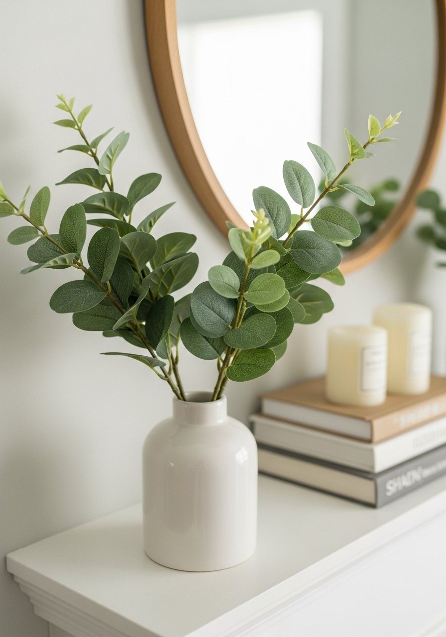
I tuck a few faux eucalyptus stems into a simple vase to add height and life. Greenery gives scale and softens hard lines. The vignette shifts from flat to layered.
An insight I rely on is odd numbers—three stems read more natural than two. A mistake I avoid is making every item the same height; that feels flat. I leave pockets of breathing room so the eye can rest between elements.
Step 5: Anchor with books, candles, and final editing
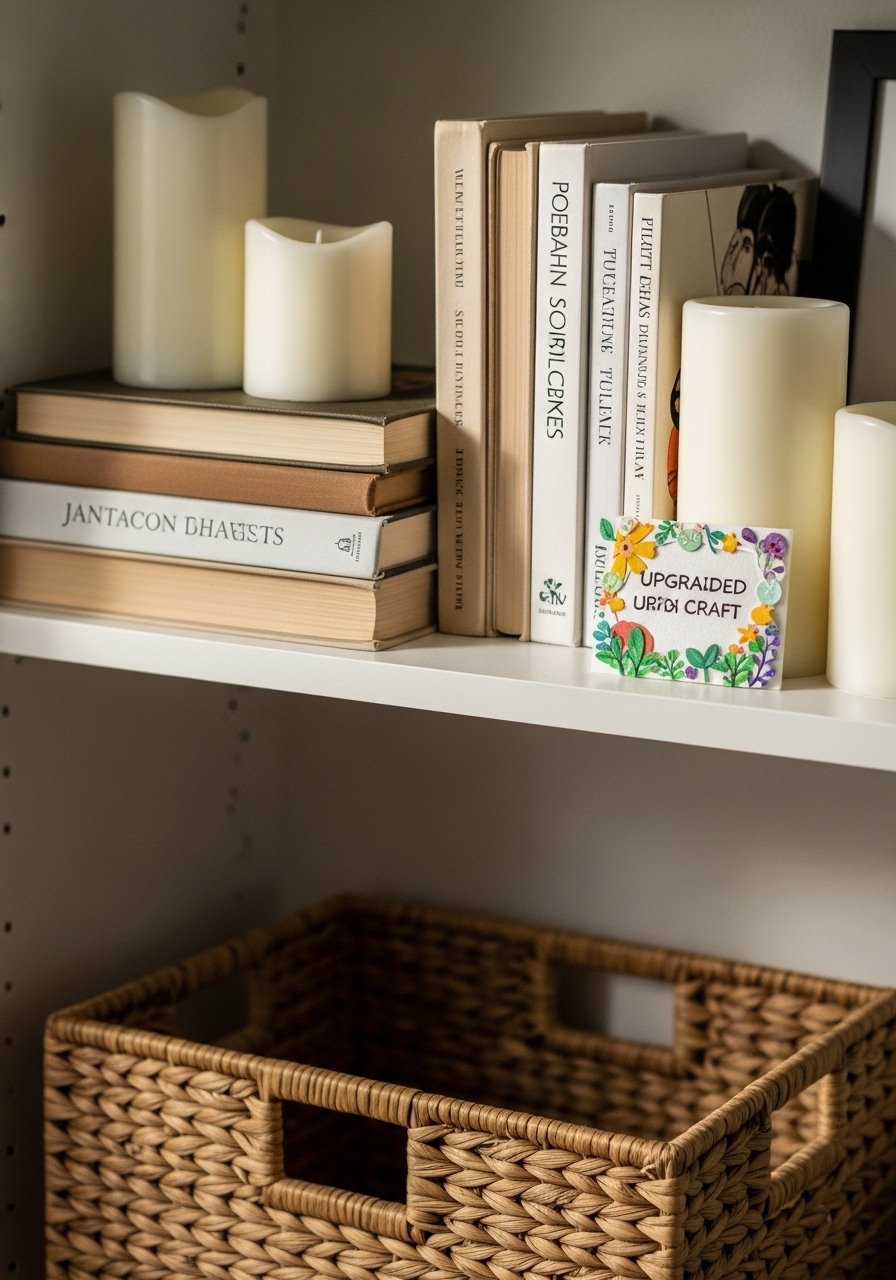
I finish by adding a stack of books and a set of pillar candles to vary heights and give the eye a path. The final edit is ruthless—I remove anything that competes for attention. Visually, the scene gains rhythm and balance.
People miss that spacing matters more than more objects. One small mistake is lining everything flush to the wall; pulling items forward a few inches makes a shelf feel intentional and livable.
Simple Rules I Use Every Time
I rely on a few repeatable habits so styling never feels random. Keep the palette calm, pick one stronger piece, and repeat a finish at least twice.
Bulleted quick rules:
- Work in odd numbers for groupings.
- Anchor with one higher-quality item.
- Leave negative space; don’t fill every inch.
When I follow these, the room reads collected instead of thrown together. The results are always quieter and more comfortable.
Where Dollar Tree Works Best
I save Dollar Tree finds for small accents: single bud vases, little frames, faux books, and small planters. These items add personality without dictating the room.
I pair them with a few sturdier pieces—like a woven basket or a ceramic vase—so the cheaper items feel like supporting notes rather than the headline.
Finishing Touches That Make a Piece Read Pricier
I tweak placement, not manufacture. Tucking stems at an angle, repeating a metal tone, or placing a candle on a small stack of books upgrades the sense of craft.
A few finishing moves:
- Keep metal finishes consistent.
- Use natural textures (linen, wood, woven) for warmth.
- Pull objects away from the wall for depth.
These small choices change the feel without complicated work.
Final Thoughts
Start with one shelf or corner. I begin small and build confidence from a single successful vignette.
The point is not perfection. It’s a calm, comfortable space that reads intentional. I keep editing until the room finally feels like it belongs to someone.
