
I kept walking past the blank wall above my console and feeling the room was unfinished. Small walls can make a space feel cool and empty, even with good furniture.
A simple banner fixed that. It added warmth, texture, and a human scale — the kind of thing that makes a room feel lived-in without changing the furniture.
How to Make a DIY Banner Step by Step
This is the method I use every time a space needs a soft, custom focal point. You’ll learn how to pick scale, layer texture, and hang so the banner reads like it belongs. It’s low-commitment and leans into warm neutrals and natural linen for a calm, collected look.
What You'll Need
- Linen pennant banner kit, natural, 6pcs (~$12–25)
- Pre-cut felt pennants, neutral pack of 10 (~$8–15)
- 36-inch wooden dowel rod, natural (~$6–14)
- Natural leather cord, 5mm x 10ft (~$8–18)
- Cotton tassel garland, cream (~$10–20)
- Iron-on letter set, black, 1-inch (~$6–12)
- Brass wall hooks, small, pack of 2 (~$8–20)
Step 1: Pick the right spot and measure for scale
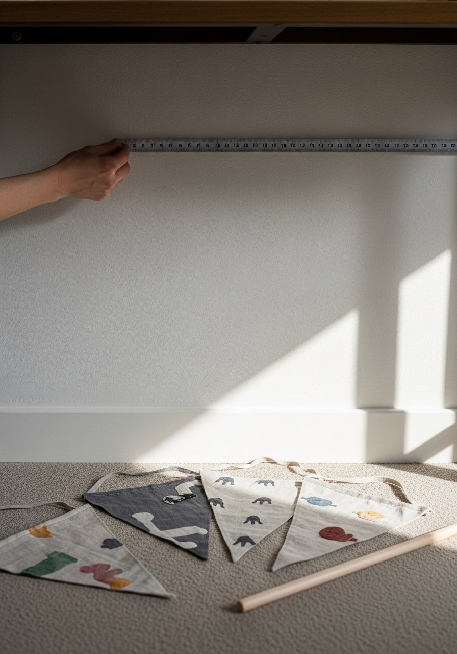
I always start by standing where people will view the banner. Eye level matters: for a console, the bottom of the banner should sit about 6–9 inches above the surface. For a bed, aim for 8–12 inches above the headboard.
What visually changes is the sense of completion. A common miss is making the banner too narrow — it should sit roughly two-thirds the width of the furniture beneath it. Mistake to avoid: eyeballing without measuring; that’s how banners look like they’re floating off-center.
Step 2: Choose a base that matches the room’s feel
I pick linen or felt depending on the room. Linen reads more organic and warm-neutral, which pairs well with Hollywood Cottage or warm neutral living rooms. Felt is cozy and graphic — good if I want stronger silhouettes or color.
Visually, the base sets the banner’s tone: linen softens, felt grounds. One insight people miss is scale of pattern — a small floral pennant on a tiny triangle looks busy. Mistake to avoid: picking a base that fights with nearby textures (like a heavily tufted sofa) instead of complementing them.
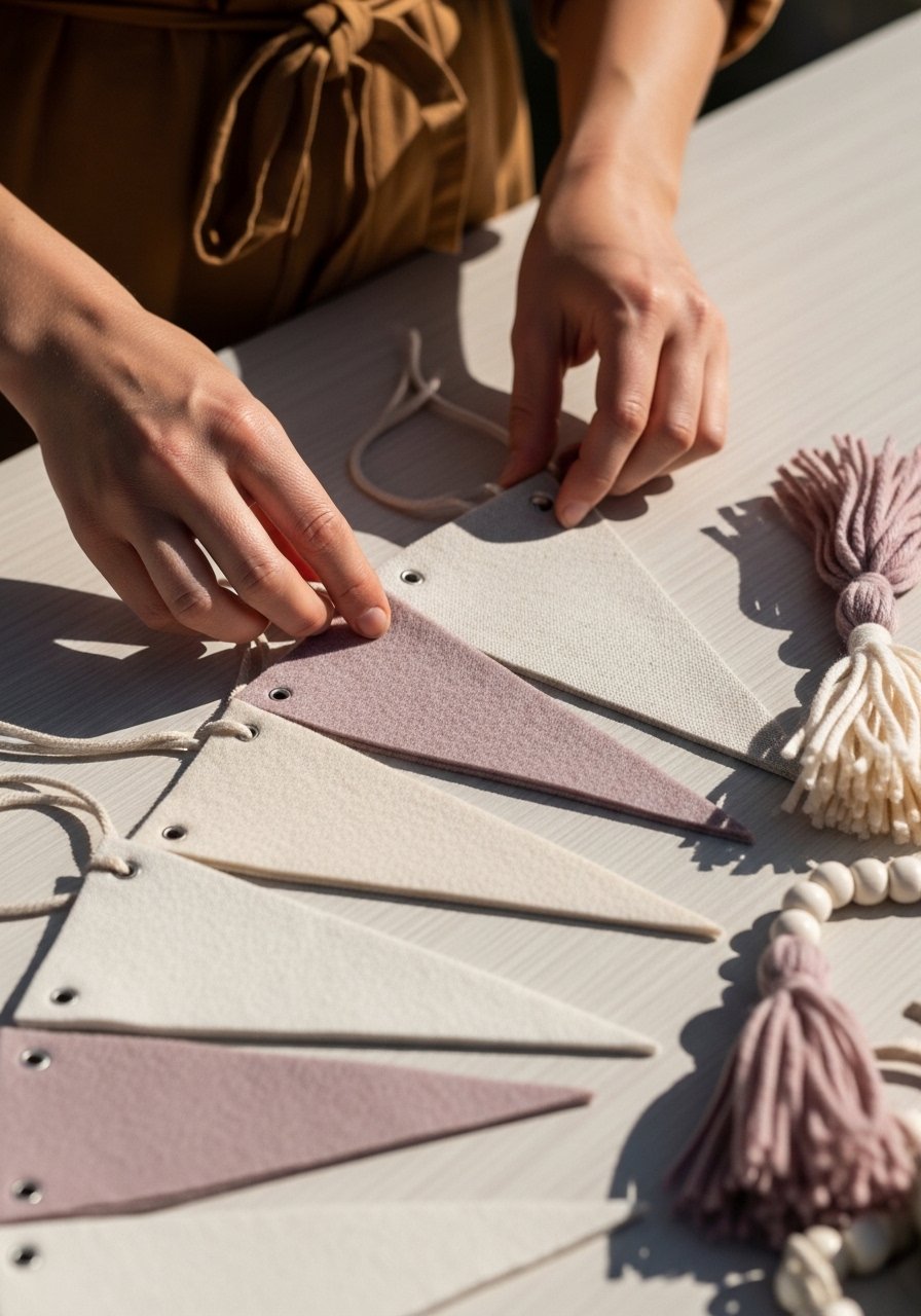
Step 3: Layer texture and trim for depth
I add a single trim — a tassel or small pom-pom — not every pennant screaming for attention. One tassel garland threaded at intervals gives depth and ties into other room textures, like a seagrass rug or a fringed lampshade.
You’ll see the banner go from flat to tactile. People often overdo pattern-on-pattern; instead, balance a textured linen pennant with a single patterned pennant as the hero. Mistake to avoid: too much matching trim — it reads costume-y rather than collected.
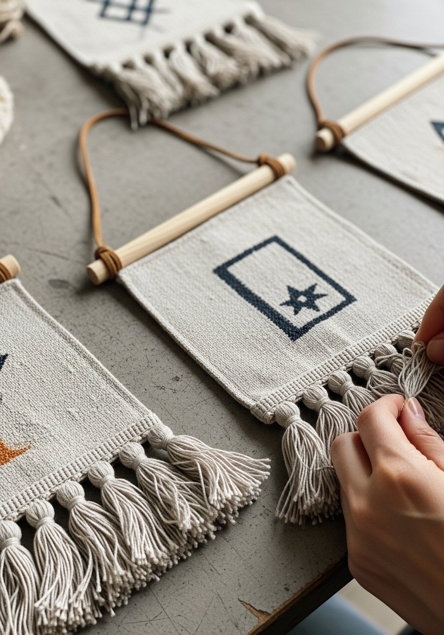
Step 4: Add a motif or simple lettering
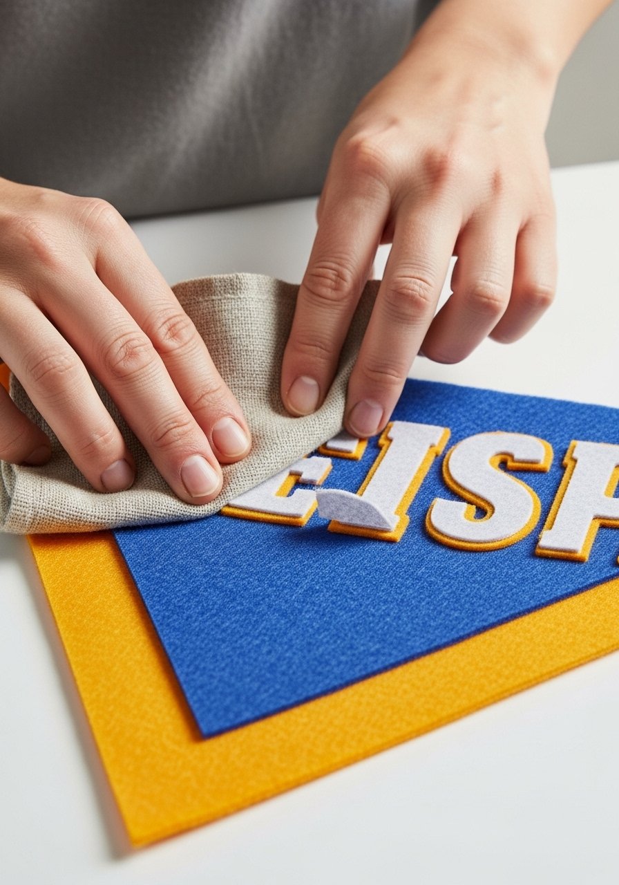
I keep wording short — one word or initials — and place it on the central pennant. Iron-on letters make this quick and neat, and choosing a warm, grounded color (black or deep mauve) keeps the banner calm and readable.
This step converts decoration into personality. Insight: fewer, larger letters are easier to read from across the room. Mistake to avoid: tiny script or too many words; they disappear and make the banner look cluttered.
Step 5: Hang, step back, and tweak the balance

I hang the dowel on two hooks. Then I step back and change spacing between pennants until the rhythm feels right. I often stagger one or two pennants slightly to avoid a rigid, factory-made look.
Visually the banner should read as gentle movement across the wall. Insight: a slight sag in the center often reads better than a perfectly taut line. Mistake to avoid: hanging it too high; that disconnects it from the furniture below and makes it feel random.
Common mistakes (and how I fix them)
I’ve seen banners that feel tacked-on or overly busy. Most of the time it’s scale or repeat pattern choices.
- Too small: Make your banner wider to anchor furniture beneath it.
- Too uniform: Add one contrasting pennant or a single tassel to break monotony.
- Wrong height: Measure; test with painter’s tape before you drill.
When I need cohesion, I echo a color or texture from the room — a linen pennant if there’s a linen couch, or a mauve accent if you’re working with soulful hues.
Adapting banners for small spaces and renters
Banners are great for renters — they’re temporary and low-impact. I use removable brass hooks or Command-style strips for most hangs.
- Small spaces: choose narrower pennants and hang higher so the eye moves up.
- Tight budgets: use pre-cut felt packs and wooden dowels — inexpensive but stylish.
- Kids/pets: choose felt or sturdy linen over delicate trim; it survives life better.
I picture the banner as a layer, not the whole outfit — it should complement pattern-on-pattern pillows or a seagrass rug without competing.
Mixing your DIY banner with current decor trends
I like to let a banner pick up one element from the room’s palette. If your living room follows warm neutral living room ideas, choose natural linen with a brass dowel or leather cord to nod to those finishes.
- For Hollywood Cottage: add soft blue or white accents and a loose, lived-in drape.
- For Organic Modern: keep shapes simple and materials natural — no flashy trims.
- For Modern Maximalist touches: one mauve pennant or a rich jewel-tone tassel adds soulful color.
The goal is cohesion. The banner should feel like it’s been part of the room for a while, not like it was slapped on.
Final Thoughts
Start with a small banner and one neutral material — linen is my go-to for a calm, collected feel. It’s low-commitment and plays well with tufted or fringed textures already in the room.
Make small adjustments after you hang it. That one tweak — spacing, height, or a single tassel — is usually all it takes to make the room feel complete.
