
I always get stuck with a room that feels like it’s missing something. Shelves look sparse.
Corners feel awkward. I’ve spent evenings moving objects and still felt the space was bland. I learned to aim for simple, modern pieces that read expensive together. Now I know what to look for.
How to Create Modern DIY Decor That Looks Expensive
You’ll learn how to choose a few restrained modern pieces, place them for balance, and style the room so inexpensive finds read calm and considered. It’s achievable. The end result is a clean, lived-in space that looks intentional, not fussy.
What You’ll Need
- 5×8 neutral flat-weave jute rug (natural tone)
- Matte white ceramic vase, medium (off-white)
- Natural linen throw blanket, 50×60 (oatmeal)
- Ivory textured lumbar pillow cover, 12×20 (knit)
- Simple black 16×20 wooden frame (matte finish)
- Small brass task lamp (aged brass finish)
- Seagrass storage basket, medium (natural)
- Hardcover coffee table books (design/photography stack)
Step 1: Anchor the space with a neutral rug
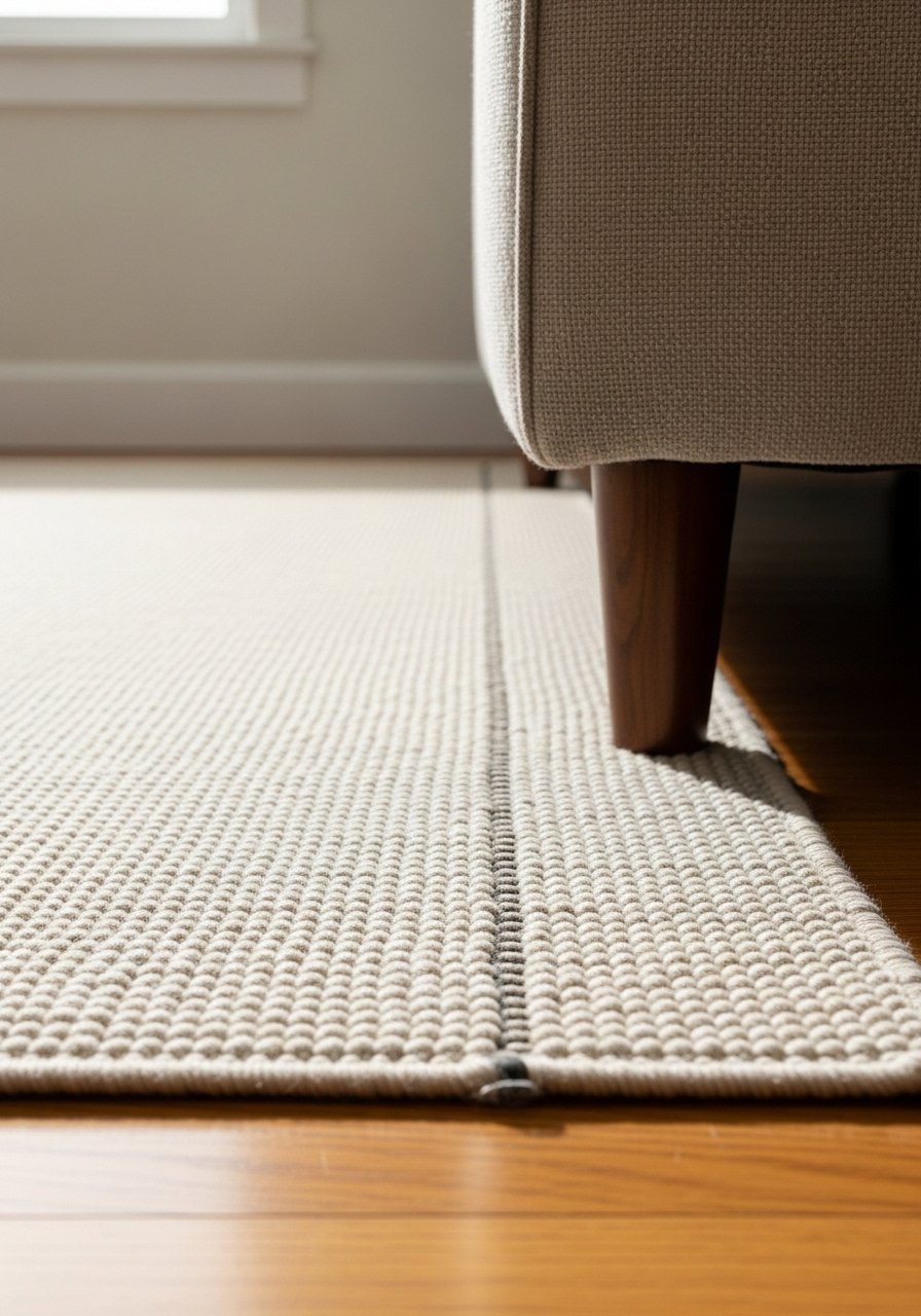
I start with a neutral rug to set scale and color. The rug grounds the seating and makes everything read together. It immediately feels more deliberate when furniture sits on or partly on the rug.
People miss scale here. Too-small rugs make everything look disconnected. A small mistake is centering a tiny rug in a large seating area. I move furniture to meet the rug edge, not chase perfect centering.
Step 2: Place one sculptural object for calm focus
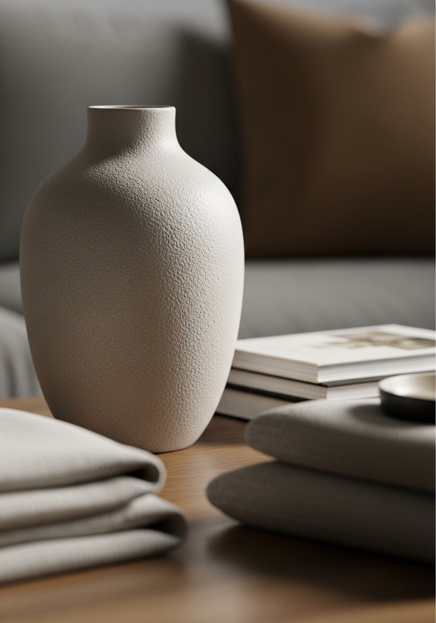
I pick one sculptural vase and give it room. Placed on a low table or shelf, it reads like a single, thoughtful choice. That one object stops the eye from darting.
The visual change is quiet but powerful. The room feels edited. People often cluster many small items; that dilutes impact. Don’t tuck the vase behind other objects. Let its shape breathe.
Step 3: Layer textiles for texture, not pattern

I add a linen throw and a textured pillow to introduce tactile contrast. I keep colors muted so texture becomes the voice, not loud prints. The sofa suddenly looks cozy and intentional.
A common insight is that texture reads expensive. Small mistake: using too many patterns. I limit myself to a single woven texture and a clean solid to avoid visual clutter.
Step 4: Edit and group on surfaces for balance
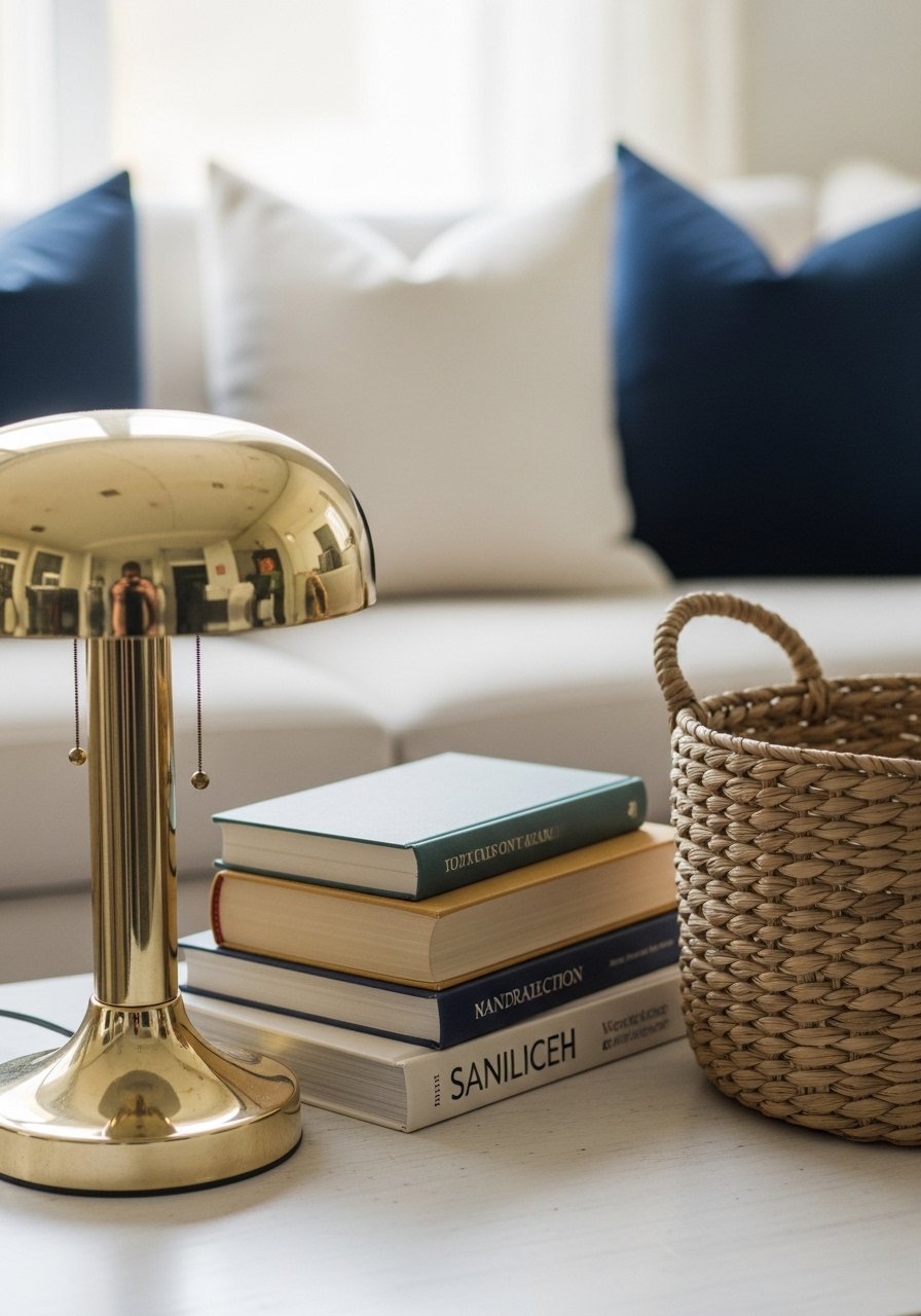
I edit flat surfaces down to a few layered items. I group in odd numbers and leave breathing room around each cluster. The coffee table and shelves then look curated rather than crowded.
What changes is clarity. Your eye moves easily. People often spread items evenly across a shelf. That feels staged. Avoid repeating small objects; instead, group three things of different heights for a calm composition.
Step 5: Finish with simple art and a living element
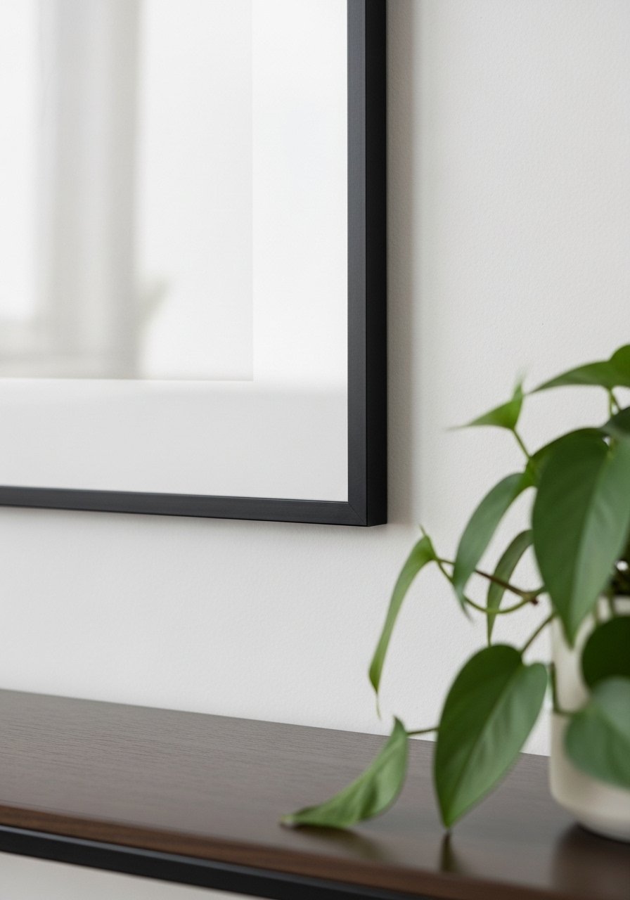
I hang one simple framed piece at eye level and add a plant for life. The art ties the room’s scale while the plant adds movement and warmth. Together they make the room feel used, not posed.
People miss framing proportion. Too-small art disappears. A common mistake is over-accessorizing the console; I leave one side lighter to keep the display balanced.
Balancing Scale and Texture
I always check scale first. Big pieces need room to breathe. Small pieces should be grouped and placed near larger anchors.
I use texture to add richness. A woven rug, linen throw, and ceramic vase layered together read intentional. I avoid competing patterns.
Quick checks:
- If something looks lost, increase its size or place near an anchor.
- If it looks cluttered, remove one item and live with the gap for a day.
Choosing a Muted Modern Palette
I stick to three main tones: a warm neutral, a soft white, and one darker accent. That keeps things calm and cohesive.
I let materials—wood, clay, brass—supply interest instead of bright colors. The result feels modern and comfortable.
Tips:
- Use color sparingly.
- Let materials do the talking.
Working With Found Objects
I mix thrifted or inexpensive finds with a few new pieces. The trick is consistency in finish and scale.
I repaint or matte-finish anything too shiny. A small repair or consistent color unifies mixed pieces.
Practical moves:
- Re-frame cheap art into matching frames.
- Group small finds so they read as one curated set.
Final Thoughts
Start with one anchor piece and build around it. The rest is editing and restraint.
You don’t need expensive items. I focus on scale, texture, and negative space to make things read expensive. Take one small step and live with it a week.
