

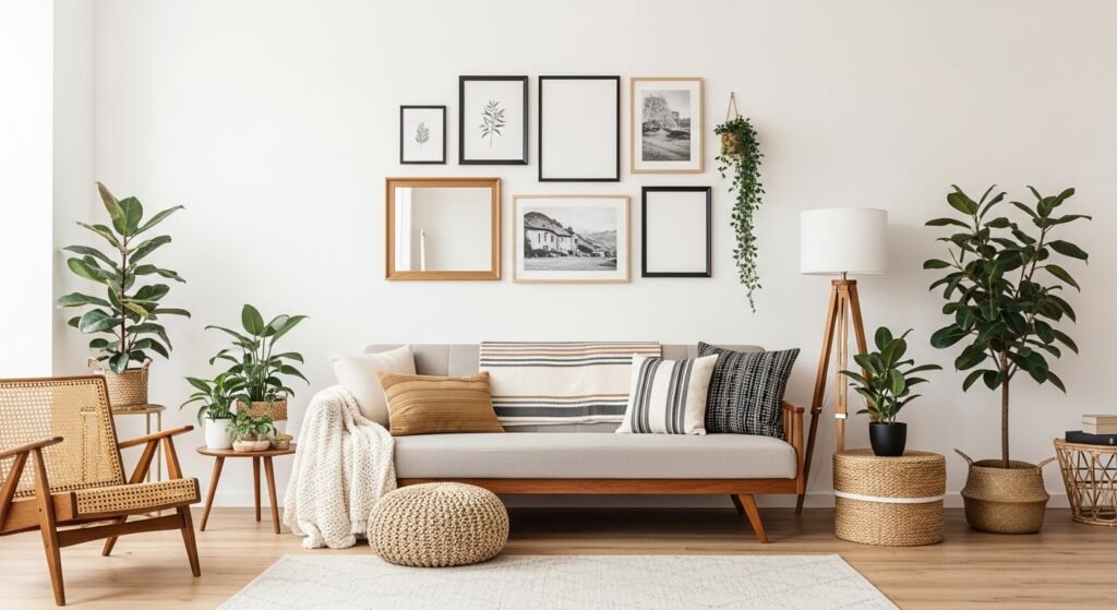
My living room had nice furniture and decent lighting but it still felt like a waiting room. Took me embarrassingly long to figure out it was missing texture and a focal rhythm on the wall. A gallery wall fixed that, but only after I stopped hanging things at random and started treating the whole grouping like one big shape.
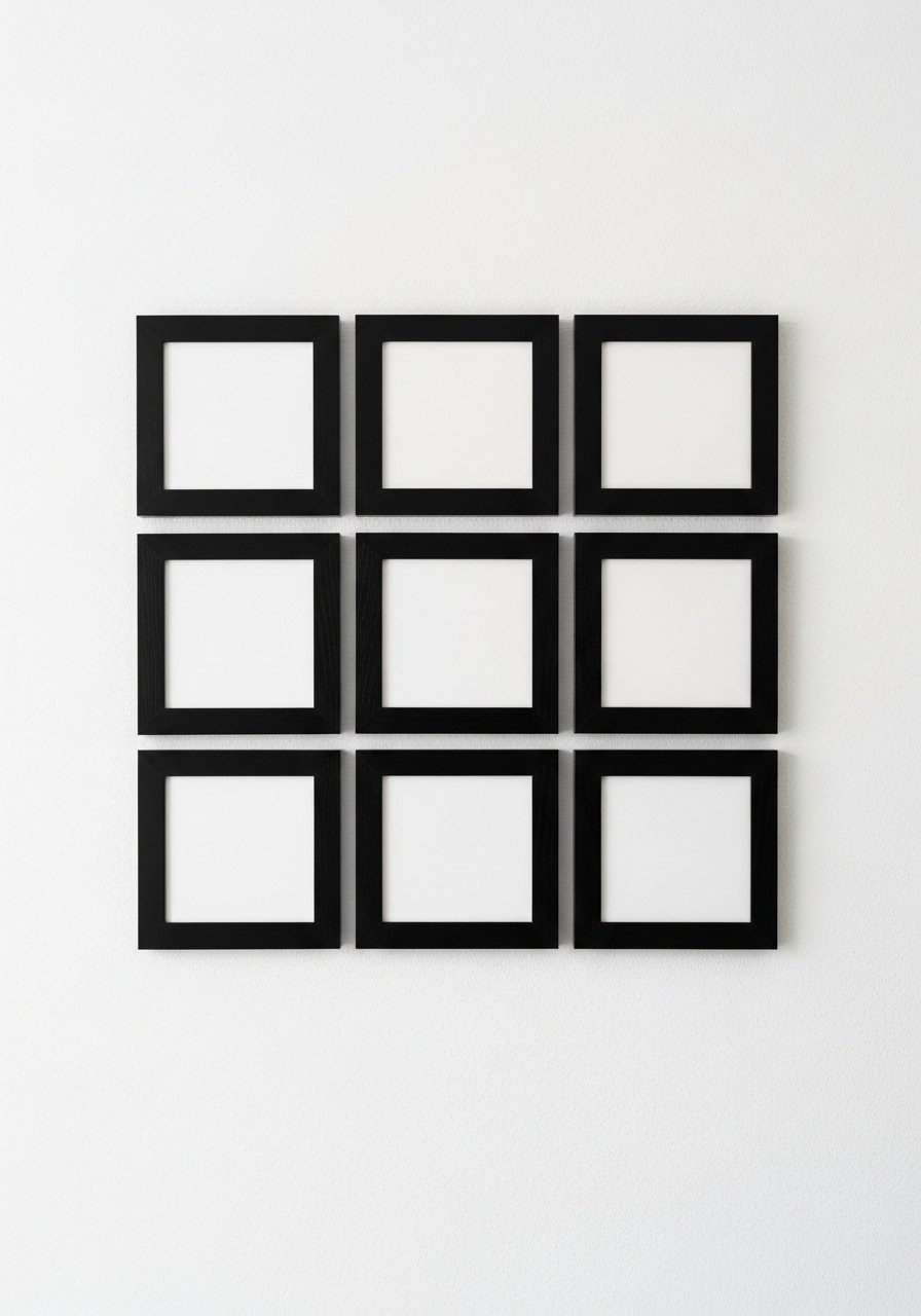
The neatest starting place is a strict grid. Use identical frames and mats, keep 2 inches between each frame, and make the outer edge form a rectangle. Grids work especially well in living rooms or offices where you want quiet order. People land on 9 to 12 frames usually, so a 3×3 or 3×4 grid feels balanced. I used simple black frames to lock everything in, but the trick is the math. Measure the entire rectangle, mark the top center, and work outward. If you rent, swap nails for washi tape when mock-upping. Try black frames that have a slim lip so the grid looks crisp.

A single large anchor piece changes everything when you want an eclectic feel. Place a 20×30 or similar as the eye’s first stop and arrange 6 to 9 smaller frames around it with 2-inch spacing. Over half go for frame mixes now, so lean into mixed metals and woods for personality. I made the mistake of varying spacing at first and the composition read as messy. Keep the gaps consistent and cap the palette to three frame finishes. For renter-friendly hanging, use command strips on lighter pieces while the heavier anchor gets a proper wall hook.
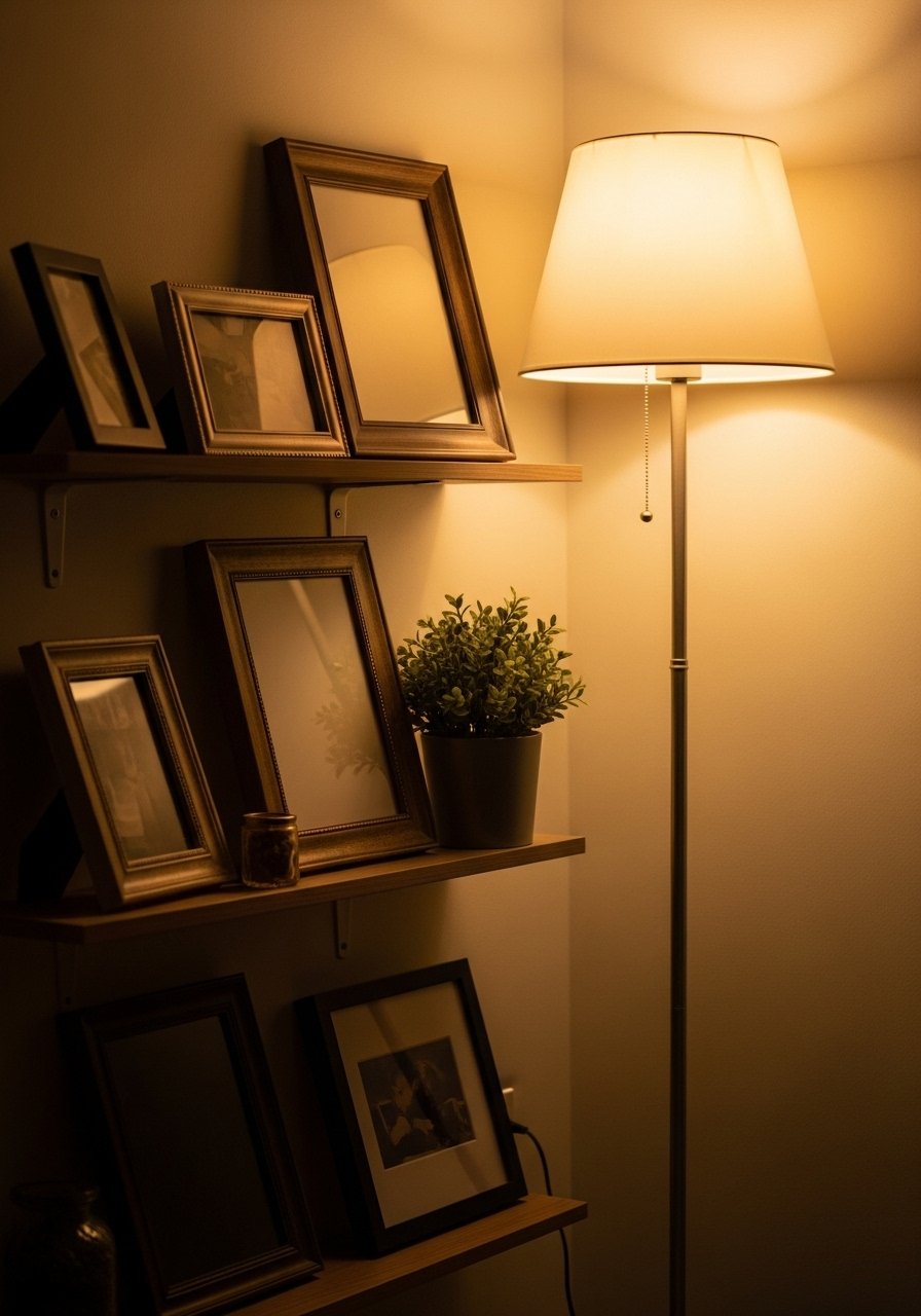
Tight vertical stacks are a lifesaver in hallways or beside doors. They trick the eye into seeing more height and keep traffic flow clear. Use 2-inch gaps and alternate portrait and small landscape frames to keep it interesting. A common mistake is hanging the top piece too low. Start the stack about 6 to 8 inches above shoulder height so the cascade feels intentional. For a renter solution, use a slim picture ledge at the base and layer two frames leaning against the wall. I like these brass picture ledges for a bit of warmth.

If perfect rectangles read stiff in your space, build an oval cluster. It softens the room and looks fresh over consoles or sofas. Start with one horizontal mid-sized frame as the long axis, then step smaller pieces around it with 2-inch spacing so the perimeter reads as an oval. A lot of guides miss that you should make the outer silhouette clean, not the inner chaos. I rotate prints quarterly on this layout to keep seasonal energy without rehanging nails. To swap easily, keep a couple of 8×10 frames in reserve.

Ledges are my go-to when I do not want holes. You can layer art, lean a mirror, and slip in books and ceramics for texture. The rule I follow is one tall object, one horizontal stack of books, and one frame leaning at each shelf level. Most renters skip nails altogether, so ledges make a gallery wall feel permanent without the damage. A common mistake is crowding the shelf edge. Leave about 2 inches from the edge so things do not look like they will tumble. I use sturdy wooden ledges and swap art seasonally, so I always have a few wood picture ledges on hand.
For tiny walls, try a closed set where frames almost touch. Use identical mats and aim for a 1.5 to 2 inch gap if you want a compact but bold block. This works over narrow furniture like console tables or bathroom walls. The mistake people make is leaving irregular gaps. Measure a single gap and copy it around. I once did this with bronze frames and it read high-end because the frames matched but the art varied. If you are nervous about placement, mock it on the floor first with paper templates taped to the wall.
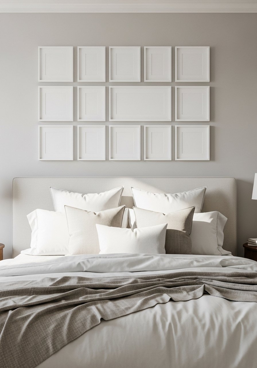
Symmetry is forgiving when you want tidy bedroom vibes. Use matching 11×14 frames, keep 2 inches between them, and center over the headboard. The visual result is calm but polished, which works for rental bedrooms or guest rooms. A tip people miss is to consider mat width. A wider mat creates breathing room and prevents prints from looking cramped under light. I spent more on prints than frames initially and learned that switching to wider mats made the same art feel elevated. Try 11×14 white frames if you want that uniform look.
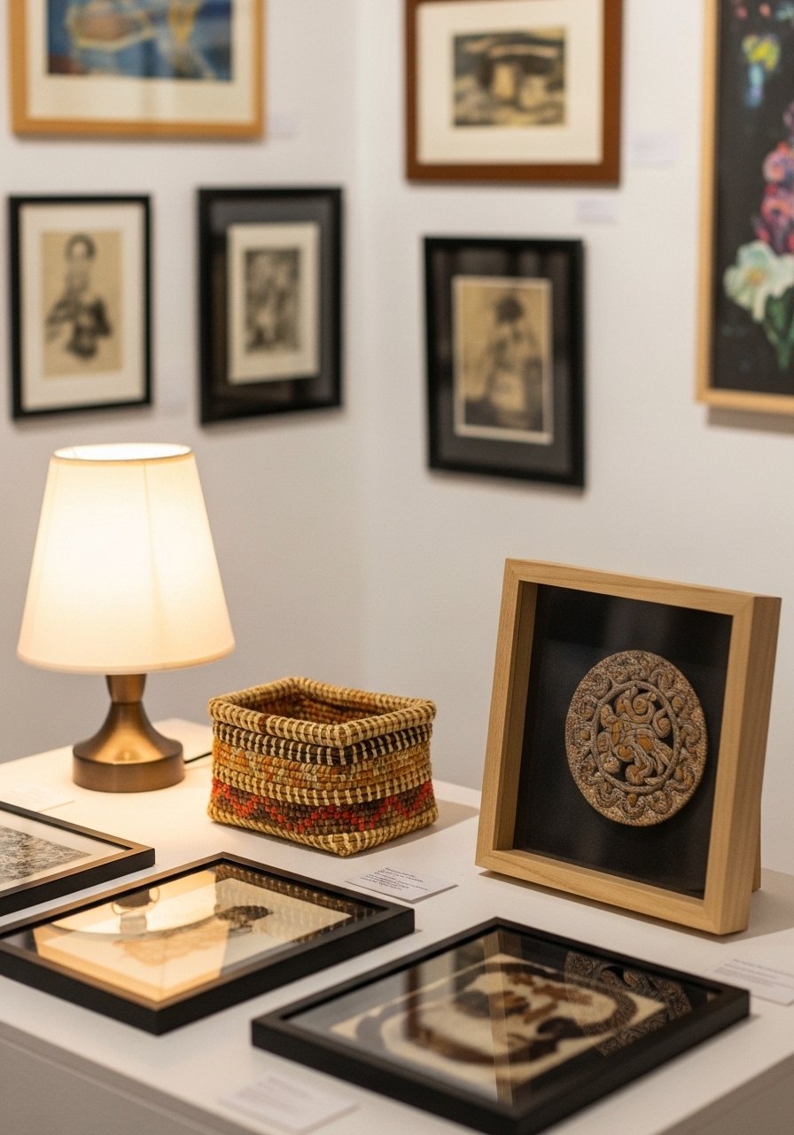
Mixing three-dimensional objects gives a real collected-over-time look. Include one shadow box or small woven basket so the wall has depth. Keep the overall outline tidy, and use 2-inch spacing to keep the mix readable. People often overstuff these walls. Pick one 3D object for every four flat pieces and you avoid clutter. I find that mixing textures, like a matte print next to a glossy photograph, makes the 3D pieces pop. For secure mounting use small picture hooks rated for the item weight.
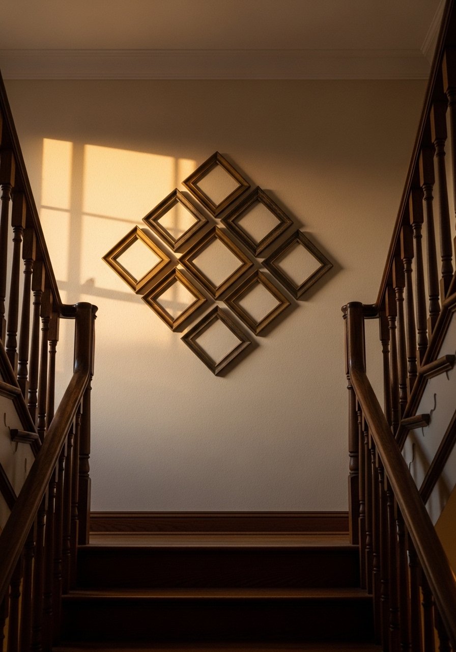
A diamond silhouette is unexpected and perfect for landing spaces. Rotate a square grid 45 degrees in your head and place mirrors and squares to form the diamond. The trick is to keep the negative space even so the diamond reads as one unit. I once installed this and people stopped walking into the hallway without looking up. If you have kids or pets, use acrylic frames for lightweight safety. I ordered a set of acrylic frames that look polished and are less likely to break.
An oval cluster over a dining table keeps conversation focused while adding interest. Start low so the bottom of the oval sits at least 6 inches above the table surface. The balance changes if the oval hangs too high and then it feels disconnected. I learned the hard way and rehung an entire setup after dinner party complaints. Use mixed wood and black frames to soften the look. For easy swaps between dinner parties, keep a pair of 8×10 framed prints on hand.

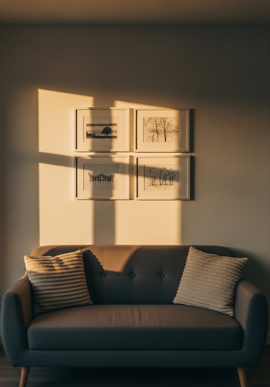
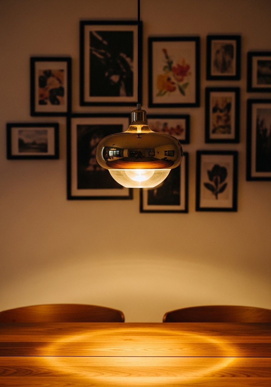
A horizontal row reads calm and deliberate in long hallways. Keep the row centered at eye level and maintain the 2-inch spacing. This layout breathes because the negative space above and below the row balances the long wall. A rookie mistake is lining the frames at the ceiling or over the baseboard. Use the middle of the wall as your anchor line. For a quick renter-friendly install, try a continuous picture rail or use command-picture-hanging-strips sized for the frame weight.
Layering frames on a freestanding shelf gives you flexibility and fewer screw holes. Alternate vertical and horizontal frames and leave 2 to 3 inches of breathing space between stacked pieces. Rotate items seasonally so the wall evolves without new holes. A detail many guides skip is the "three heights" rule. Keep one object tall, one medium, and one short per shelf to avoid a flat look. I use a tall ceramic lamp, a medium framed print, and a short vase. These wooden freestanding shelves are sturdy and renter-friendly.
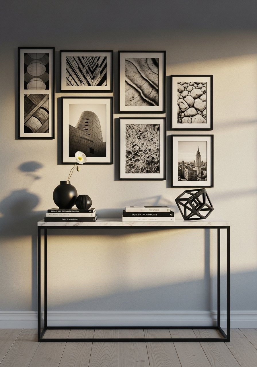
Choosing one frame color, like all black, ties mixed art together. It reads intentional even when prints vary. I once did a full-black frame wall and it turned random into cohesive. Stick to two mat widths max and keep 2-inch gaps. A trap is adding too many frame styles. Limit yourself to three frame styles or fewer and the wall will look curated instead of chaotic. For consistency, use a matched set like these matching-black-frames.
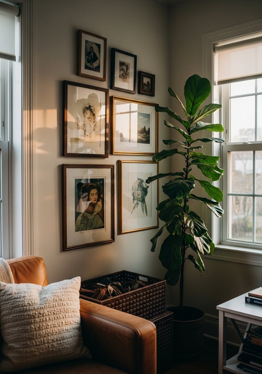
If you want height without changing ceiling lines, pair a vertical gallery with a tall plant. The plant balances vertical energy and adds life. Real plants sometimes fail in dim corners, so use a faux option where light is poor. I mix a real snake plant with a faux fiddle leaf fig in low-light spots. Over half my friends now choose a mix of real and faux for low-maintenance presence. Grab a realistic artificial-fiddle-leaf-fig for height that never sulks.
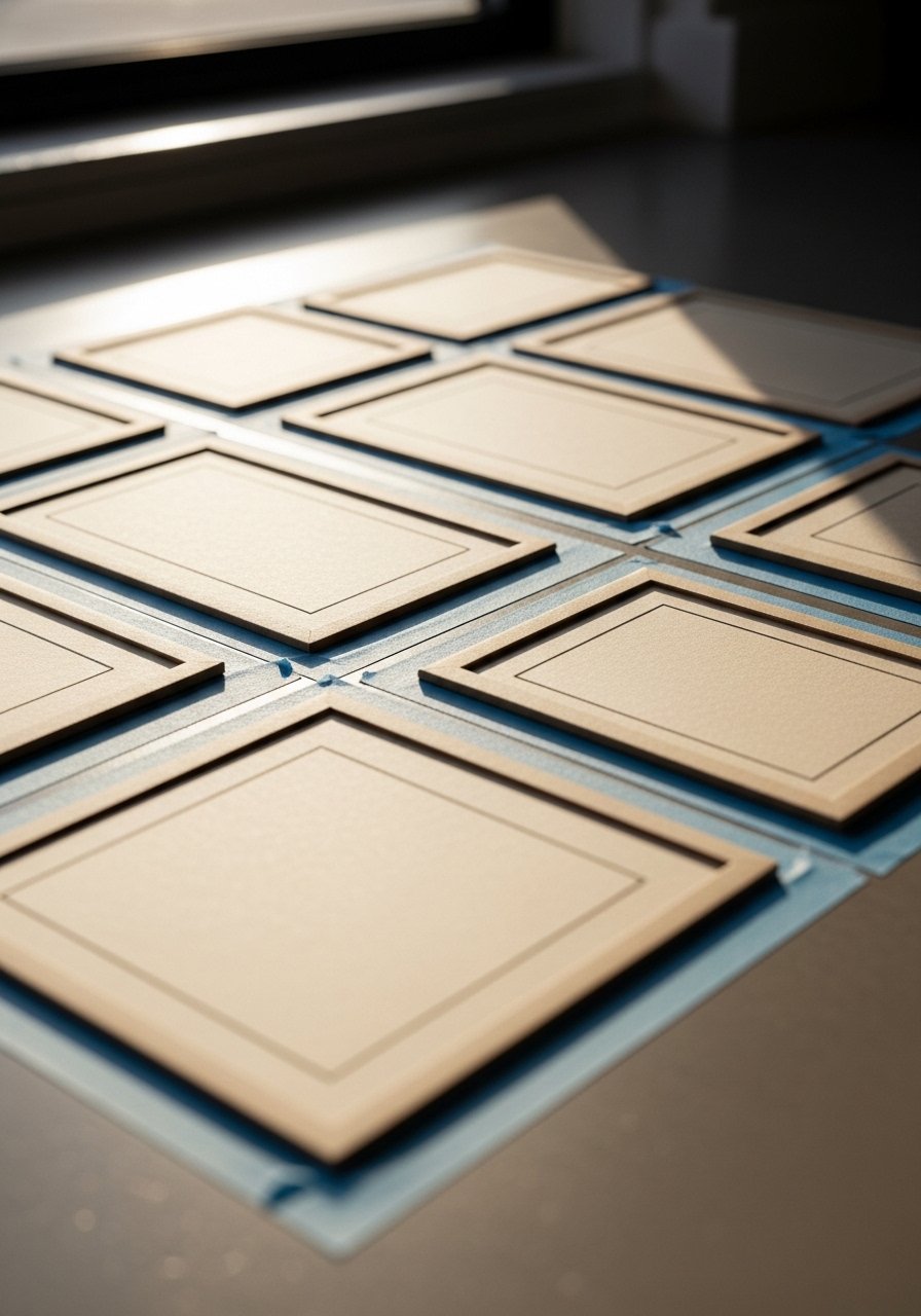
If you want to stop making extra holes, mock your entire gallery on the floor first. I trace frames on kraft paper, cut them out, and tape them to the wall until I am happy. Mocking saves time and keeps things symmetrical. Most people hate measuring everything, so this method is a life-saver. When you lift the final layout, make small pencil marks for the hanging hardware and you will get it right the first time. For small adjustments, I use washi-tape-rolls to test placements before committing.
Your Decor Shopping List
Textiles
- Honestly the best $40 I have spent. Chunky knit throw in cream for sofa layering
- 22-inch linen pillow covers, down-filled in warm neutrals, set of two
Wall Decor
- Black frames set of 6, 8×10 for grids
- Matching white 11×14 frames, set of 4 for symmetrical layouts
Shelving & Hardware
- Wood picture ledges, set of 2 for renter-friendly displays
- Brass picture ledges if you want warmth instead of black
Plants & Greenery
- Artificial fiddle leaf fig 6ft for corners with low light
- Medium snake plant in ceramic pot for easy real greenery
Budget Finds
- Command picture hanging strips variety pack for renter installs
- Washi tape rolls multi-color to mock layouts without marks
Most items have similar options at Target or HomeGoods if you prefer to see them in person.
Shopping Tips
White oak beats dark wood in 2026. Design feeds have shifted completely. White oak floating shelves look current, not dated.
Grab velvet pillow covers for $12 each. Swap them every season and the whole room feels different.
Curtains should puddle or kiss the floor, never hang halfway up. 96-inch linen panels are right for standard 9-foot ceilings.
If you are a renter, go ledges first. Wood picture ledges let you change things without patching holes.
One tall plant beats five small succulents in impact. Try a realistic artificial-fiddle-leaf-fig if light is an issue.
Frequently Asked Questions
Q: How much spacing should I leave between frames?
A: Aim for 2 inches as your default. It keeps mixed frames readable and grids crisp. For tight closed sets you can go 1.5 inches, but measure once and keep it consistent across the whole layout.
Q: Can I mix frame finishes without it looking messy?
A: Yes, but limit yourself to three finishes max and repeat them across the layout. Over half go for frame mixes now, and the trick is balance. Use one finish for anchors and sprinkle the others so the eye reads pattern not chaos.
Q: I rent and do not want holes. What are my best options?
A: Most renters skip nails altogether. Use picture ledges, command strips rated for your frame weight, or lean frames on shelves. Mock with washi tape before you stick anything permanent.
Q: How many frames should I use for a living room gallery wall?
A: People land on 9 to 12 frames usually. A single large anchor with six to nine surrounding pieces also reads well. If your wall is narrow, prioritize vertical stacks instead of adding more pieces.
Q: Do I need to match mat sizes and frame sizes exactly?
A: Not always. Matching mats help when you want a clean grid. For eclectic or mixed layouts, varying mat widths can actually add interest. The real rule is consistent spacing and an overall outer shape.
Q: How often should I rotate or update the art?
A: I rotate prints quarterly on ledge layouts and seasonally on fixed walls. Swapping one or two pieces keeps the wall feeling fresh without rehanging everything. Keep a couple of spare frames ready so changes are painless.
