

My living room had nice furniture but it still felt like a waiting room. Took me embarrassingly long to realize everything was the same height and texture. Once I played with different frame depths and added warm wood, the wall stopped feeling like a checklist and started to feel like the room belonged to us.
These ideas lean rustic, a little farmhouse, and a touch of modern. Most setups land under $150 with a few splurge pieces around $200. They work over sofas, mantels, reading nooks, or along stair runs where a curated gallery can make the whole space feel finished.
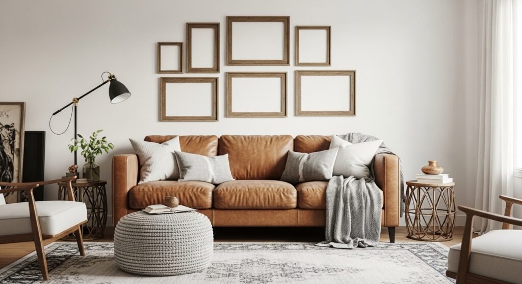
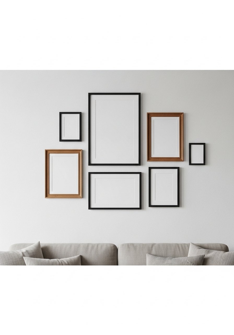
Rustic Mixed-Frame Gallery with Reclaimed Wood Ledges
I started with a single reclaimed wood ledge and everything got easier. Ledges let you layer art and swap pieces without new nail holes, which is perfect if you change seasons. Hang the bottom of the frames about 8-10 inches above the sofa back so the composition reads as one object. I used brass picture ledges for the top shelf and mixed in thrifted frames. Common mistake is spacing frames too far apart. Keep 2-3 inches between each piece and aim for an odd number of focal objects, that rule of three makes a gallery feel intentional.
Monochrome Photo Cluster for Cozy Rustic Living
Turning all artwork to black and white calms a busy wall. I printed family photos on matte paper and used 8×10 and 11×14 sizes for scale variety, then balanced with two smaller 5x7s. Black frames ground the look while woven textures in the room keep it from feeling flat. I bought a mixed metal frame set to mix tones. People often hang everything at the exact same height. Instead, stagger centers within a 6-inch band so the eye travels. The budget here is mostly frames, around $8-25 per frame if you shop smart.
Leather Sofa Backdrop with Oversized Rustic Print
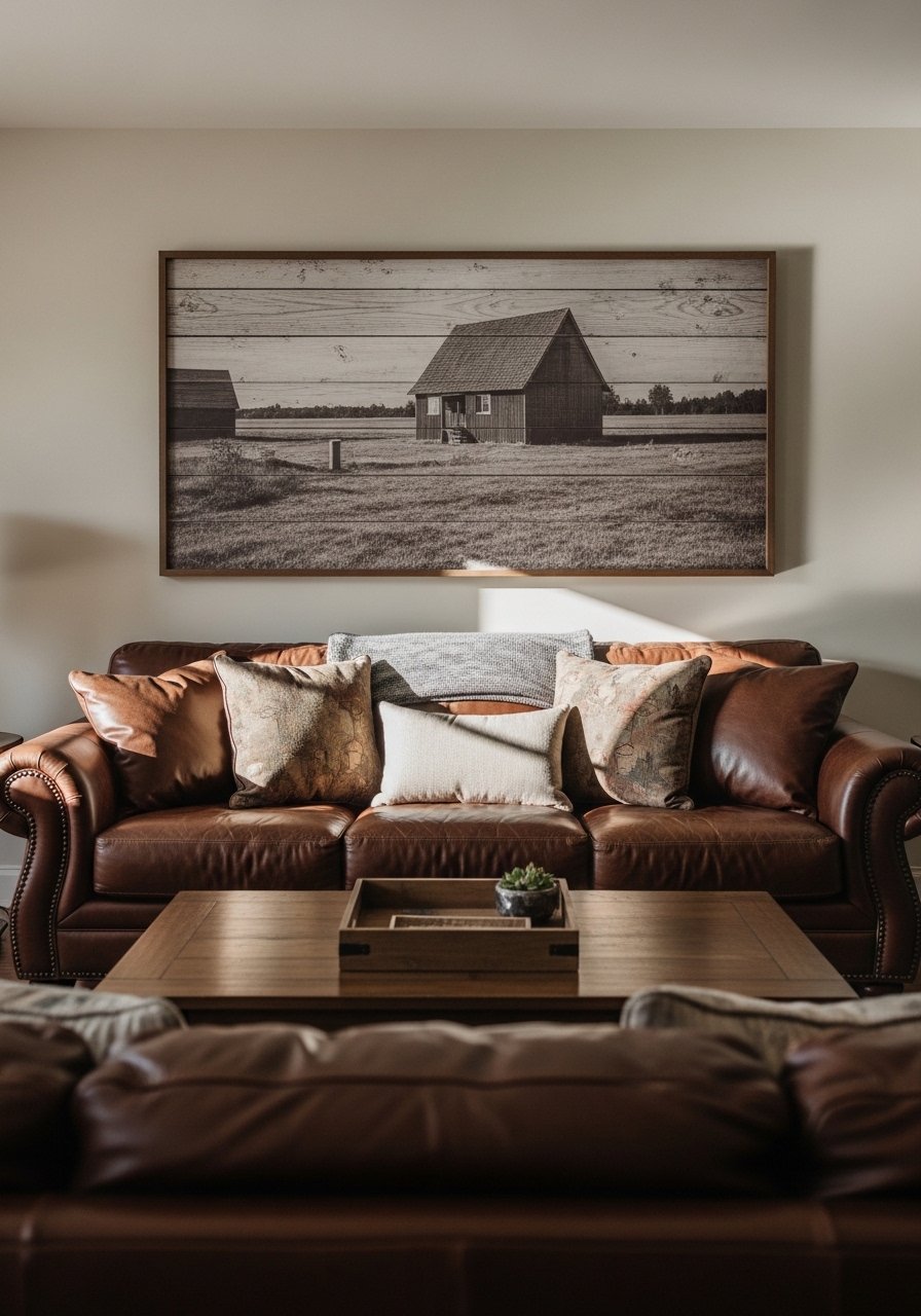
I learned oversized art stops the "floating frames" look. A single large piece above a leather sofa reads cleaner than five tiny prints fighting for attention. Aim for the art to be about two-thirds the width of your sofa. I used a statement print alongside two smaller framed pieces on either side for balance and picked up color in the throw pillows. Oversized framed prints in vintage paper tones run $60-180. Common mistake is choosing a piece that is too small. If in doubt go bigger.
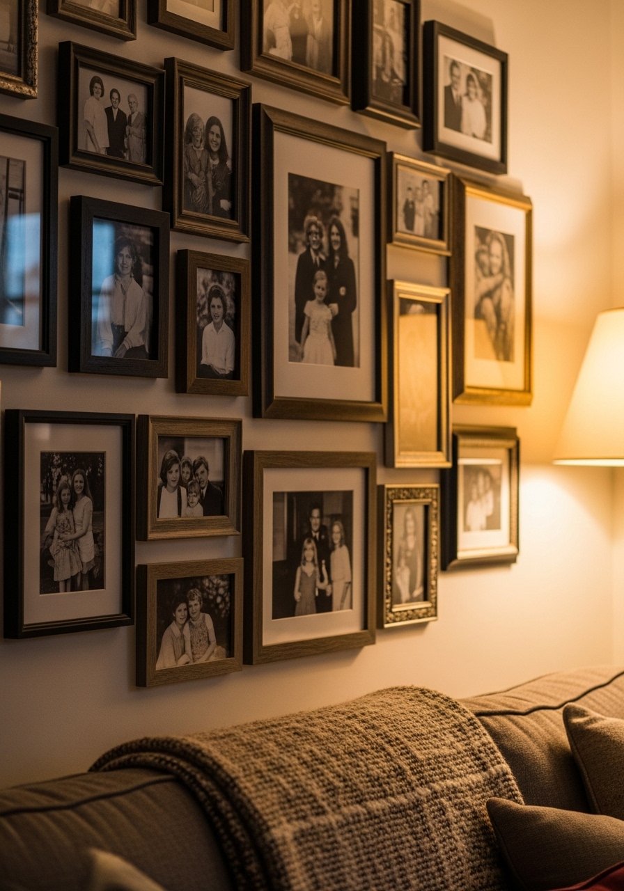
Family Photo Gallery in Vintage Wooden Frames

I grouped family photos by frame finish so the wall reads cohesive even with varied images. Use one dominant frame material, I chose walnut, then introduce one or two hung frames in black to create contrast. I hung most frames with the centers at about 57 inches from the floor for general viewing. 22-inch wood frame sets made the process faster. People complain that their gallery looks messy. The fix is to edit ruthlessly. Pick the best seven to nine photos and stick to a color filter or finish to unify them.
Woven Baskets and Rustic Objects Mixed Into Frames
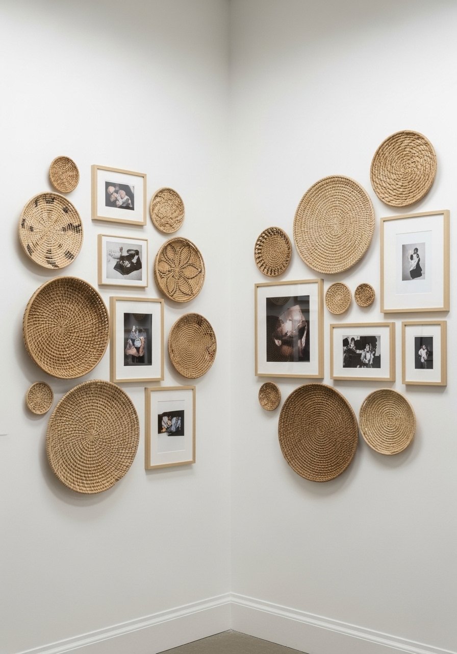
Adding woven baskets breaks the monotony of rectangular frames and brings real texture. I mixed three baskets with five framed prints and kept the color story to neutrals and one warm accent. The key is to treat baskets like art and keep spacing tight, about 3 inches. I grabbed a set of decorative woven baskets under $60. A common error is using baskets that are too shallow or too colorful. Pick depth and tone that read like part of the wall, not a separate project.
Pressed Botanical Shadowbox Gallery for Rustic Charm

Pressed botanicals give an old-house feeling without the stuffy vibe. I used 8×10 shadowboxes to protect the leaves and arranged them in a 3×3 square with 2-inch spacing. Shadowboxes add depth so include a few 3D objects like small wooden spoons or keys. I bought shadowbox frames and taped the leaves with archival corners. People often press and mount leaves too close to the glass which flattens them. Give a little depth and the gallery will glow.
Repurposed Shutter Grid for Vintage Rustic Look
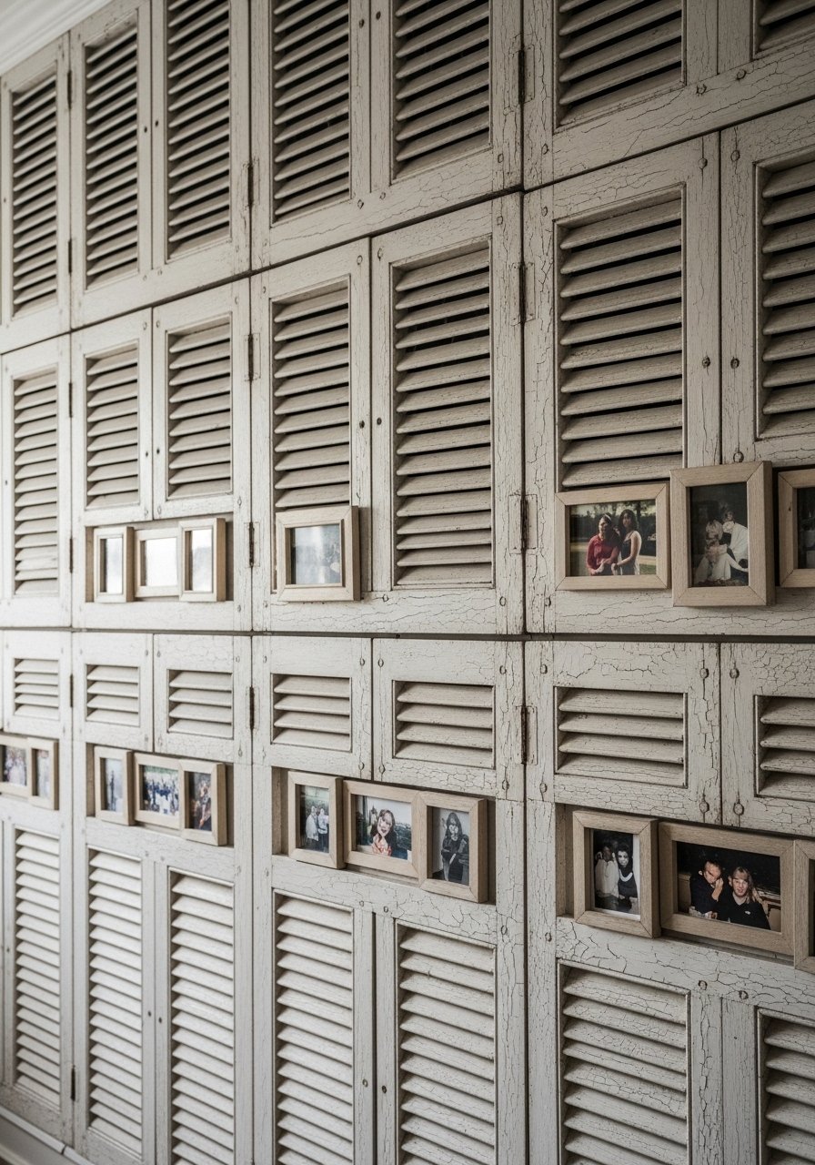
I scavenged old shutters and mounted small frames into the slats to create a window-like grid. This fills a large wall and reads as architectural more than decorative. Use 6-8 small frames and keep one strong focal piece in the center. Antique farmhouse shutters can be found affordably online. Trick people miss is not anchoring the bottom of this setup; a low console or bench ties it to the room so it does not float.
Vertical Gallery for High Ceilings and Staircases

Staircase walls are where a vertical gallery shines. I mapped out a vertical line and centered the composition on that axis, staggering frames so they guide the eye upward. Keep the spacing consistent at about 2-3 inches and increase frame sizes as you move up. I used assorted frame sets to speed the process. A common mistake is mirroring the stair angle exactly. Instead, keep frames level and form a loose column that complements the step angle.
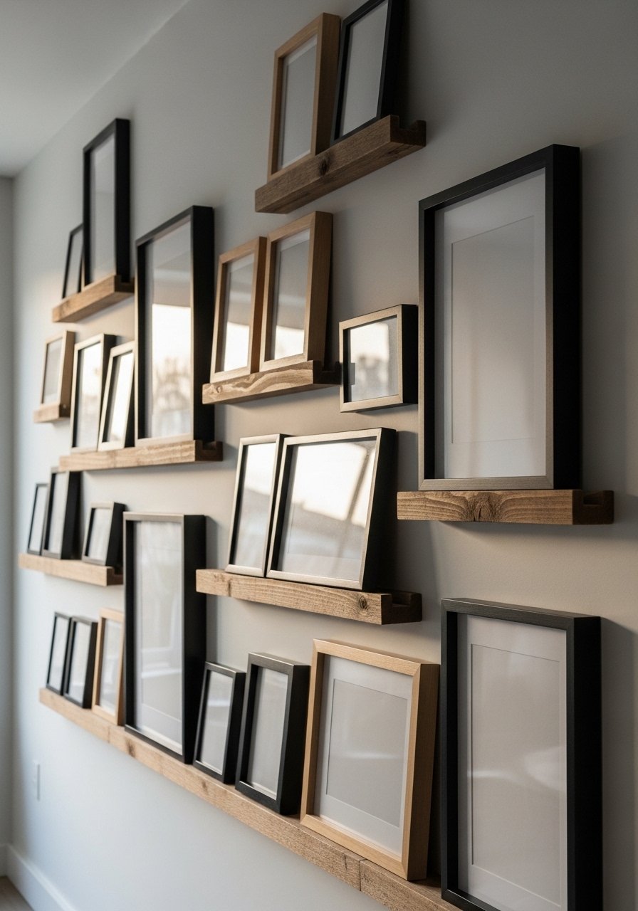
Gallery Shelf for Easy Seasonal Swaps

Shelves changed my relationship with art. I can swap prints each season and layer small objects without holes all over the wall. I use a 6-foot shelf and vary frame depths, then anchor with a taller vase in one corner. For easy swaps, get floating gallery shelves. Many people nail everything permanently. Shelves make rotating pieces painless and let you play with foreground and background relationships.
Mini-Themed Grid Over a Reading Nook

I made a mini-grid of nine small botanical prints over my reading chair and it instantly created a dedicated space. Keep all frames the same size and mat, then choose a consistent spacing of 1.5-2 inches. I used 5×7 botanical prints and cheap black frames. The budget is low but the impact is high. People often pick prints that are too busy for a small grid. Pick simple subjects so the pattern reads clean at a glance.
Textile and Macrame Mix for Rustic Texture
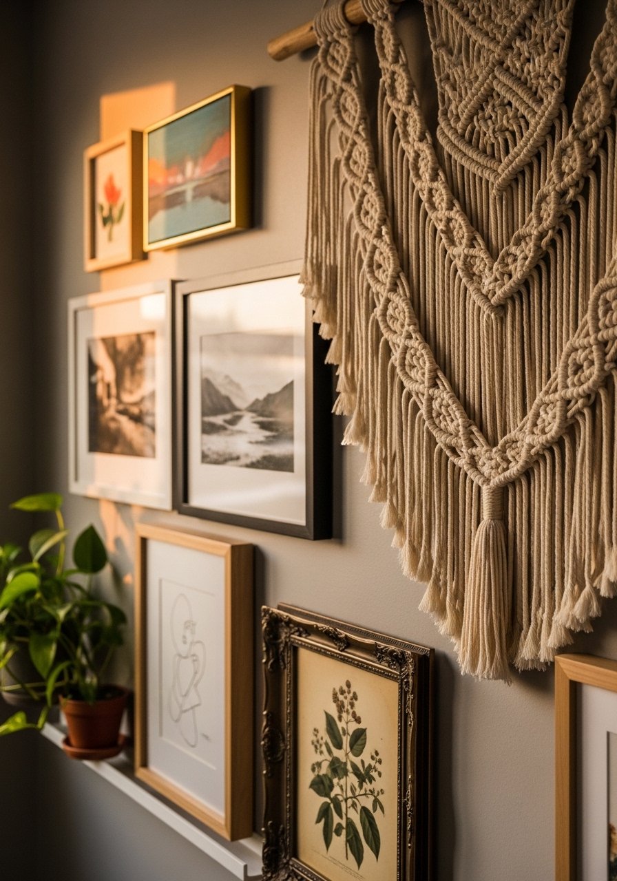
Adding one textile piece anchors a wood-and-frame gallery with tactile warmth. I paired a medium macrame with two framed sketches and three small wooden objects. The trick is scale. Make the textile roughly the size of the largest frame so it reads balanced. I ordered a handwoven macrame wall hanging for under $70. People forget textiles have weight. Use proper hooks so the piece hangs flat and does not sag over time.
Mirrors and Frames to Brighten Dark Rustic Corners

I added two small mirrors into a gallery to bounce light into a dim corner and it made the whole room feel larger. Use one round mirror and surround it with rectangular frames for contrast. Keep mirrors off-center to avoid head-on glare from windows. I like vintage round mirrors that have a bit of surface age. Mistake people make is matching mirror glass exactly. Slightly aged glass reads cozier than a glossy new reflection.
Rotating Kid Art Gallery with Changeable Frames
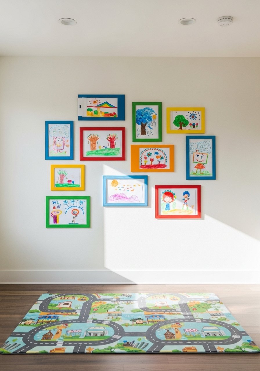
My kids' drawings used to live on the fridge and then in a drawer. I installed easy-open frames that let us swap art every week. Use one consistent frame and alternating mat colors to make rotation look deliberate. I bought easy-swap frames and labeled a storage box for archived pieces. Parents often cram everything into one frame. Curate three to five favorites and rotate. It teaches kids their art matters without turning your wall into chaos.
Black Frame Rustic Minimal Gallery with Warm Woods
When in doubt go minimal. I used five black frames in two sizes plus a thin walnut shelf and left plenty of breathing room. Stick to an 80/20 color ratio, 80 percent neutrals and 20 percent one warm accent like terra cotta. Thin black frames are inexpensive and look custom when grouped. The common mistake is filling every inch. Negative space is part of the composition and helps rustic elements read modern instead of cluttered.
Gallery Lighting for a Curated Rustic Look
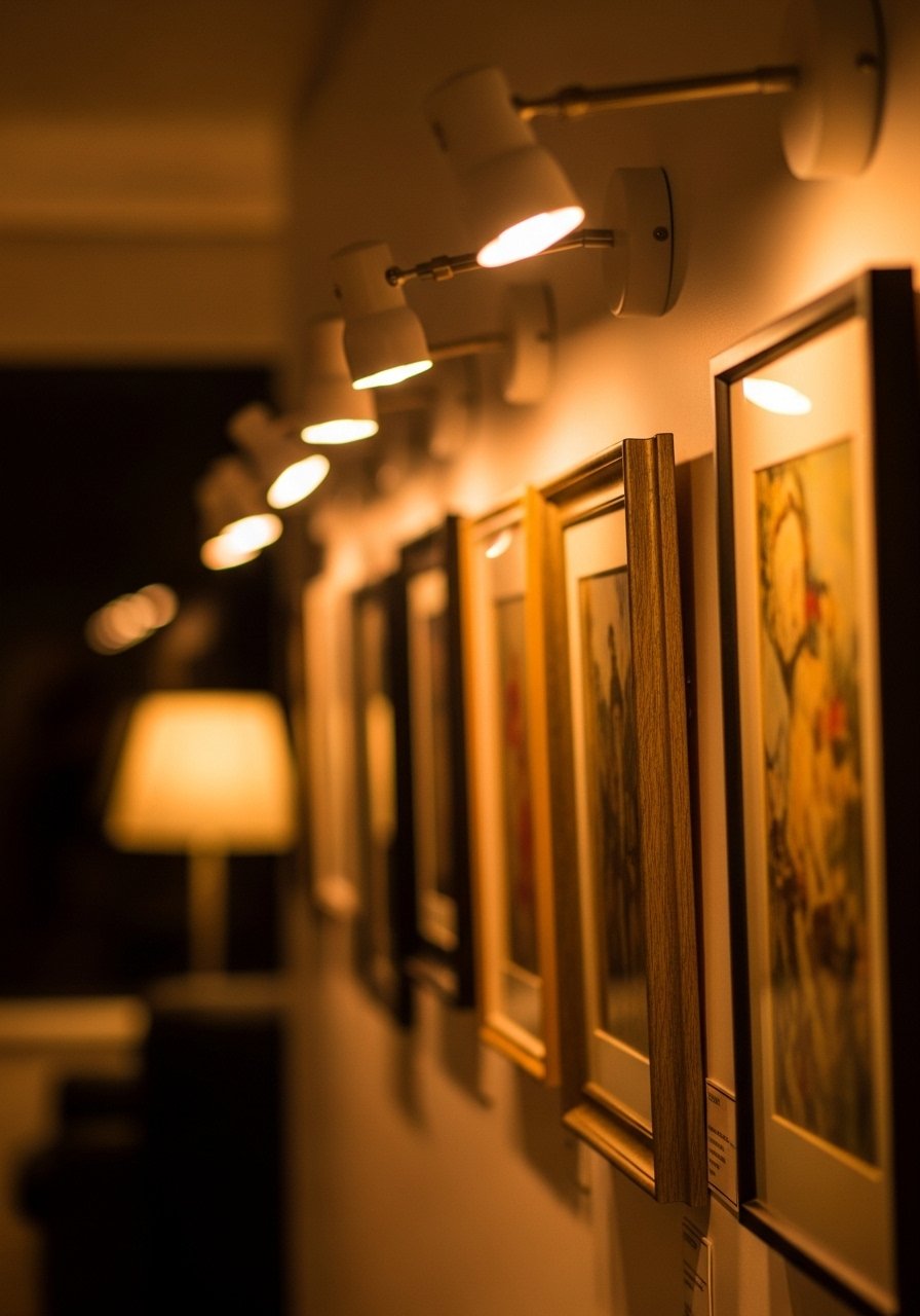
A few picture lights make a gallery feel like a curated collection rather than a patched-together wall. I installed two adjustable brass picture lights above a 6-foot cluster and used warm 2700K bulbs to keep the look cozy. Picture lights with adjustable heads run $25-70 and change the vibe immediately. People often use lights that are too bright or too cool. Pick lower kelvin bulbs and aim the light so it washes the art without creating hot spots.
Your Decor Shopping List
Textiles
- Honestly the best $45 I have spent, chunky-knit throw in cream 50×60 inches, perfect drape over sofa arm
- 22-inch linen pillow covers, set of 2 in light taupe, down-fill recommended
Wall Decor
- Thin black picture frames, set of 5 in 8×10 and 11×14
- Shadowbox frames 8×10, set of 3 for pressed botanicals
Shelving and Display
- Floating gallery shelf 72-inch in reclaimed-look finish
- Brass picture ledges for easy layering
Lighting
- Adjustable picture lights, set of 2 warm finish
Plants and Texture
- Decorative woven basket set, 3-piece for mixing into gallery
- Faux fiddle leaf fig 6-foot for height without the fuss
Budget Finds
- 5×7 botanical print set, 9 prints great for mini-grids
Notes: Many of these items have similar counterparts at Target and HomeGoods for in-person purchases.
Shopping Tips
White oak beats dark wood in 2026. Design feeds have shifted completely. These white oak floating shelves look current, not dated.
Grab velvet pillow covers for $12 each. Swap them every season and the whole room feels different.
Curtains should puddle or kiss the floor, never hang halfway up. 96-inch linen curtain panels are right for standard 9-foot ceilings.
One tall plant beats five small succulents. Fiddle leaf fig 6-foot fills space and adds scale.
Buy mixed frame sets when you start. Assorted frame pack saves hours of matching and keeps the look cohesive.
If you want to rotate kids art easily, use easy-open frames. It makes swapping weekly realistic.
Frequently Asked Questions
Q: What height should I hang art over the sofa?
A: Aim to hang the center of the whole gallery about 8-10 inches above the sofa back, or around 57 inches from the floor as a general starting point. If your ceiling is higher, nudge the center up 3-6 inches. The key is the visual connection between furniture and art.
Q: How far apart should frames be in a gallery wall?
A: I use 2-3 inches for frames that are part of the same cluster. For shelf or ledge arrangements you can get away with 4-6 inches. Tight spacing reads intentional, loose spacing reads accidental.
Q: Can I mix modern and vintage frames without it looking messy?
A: Yes. Stick to one unifying element like frame color or mat size. I mix black and warm wood finishes but keep mats white and spacing consistent. That small edit makes the mix read deliberate.
Q: What size rug do I actually need under a gallery-focused seating area?
A: Bigger than you think. For most living rooms go at least 8×10 so the front feet of seating sit on the rug. That grounds the whole gallery and furniture group.
Q: Should I match metals across the room?
A: No. Mix metals for a lived-in feel. Use one dominant metal and sprinkle a second as an accent so it does not look random. Mixed metal frames help you start that look easily.
Q: Real plants or faux in a rustic gallery?
A: Both work. Real plants like snake plants tolerate low attention and add scent and life. Faux tall plants give constant height and zero drama. Use a real plant where you can water it and a faux where you cannot.
Q: How do I keep a rotating kids gallery organized?
A: Limit the wall to a few easy-swap frames and store older pieces in a labeled portfolio box. Rotate weekly or monthly and photograph favorites before storing. Easy-open frames make rotation painless.
