


My living room had nice furniture and decent lighting but it still felt like a waiting room. Took me embarrassingly long to figure out it was missing texture. Everything was the same height and the walls were polite but forgettable. The first time I swapped out a single mass-produced frame for a hand-finished piece, the whole room stopped feeling flat.

Modern Gallery Wall for Small Living Rooms
I used to cram too many small frames into one spot and the whole thing looked busy. The trick that finally worked was a balanced grid with three horizontal rows, each frame 11×14, and 2.5 inches of space between frames. It reads cleaner and the eye rests easier. For a renter-friendly version, lean frames on picture ledges instead of nailing every piece. I like using black slim frames because they feel modern and keep the focus on the art. Common mistake, hang everything at eye level for the room, not just standing height. Pair this with idea about curtain height for a room that feels taller.
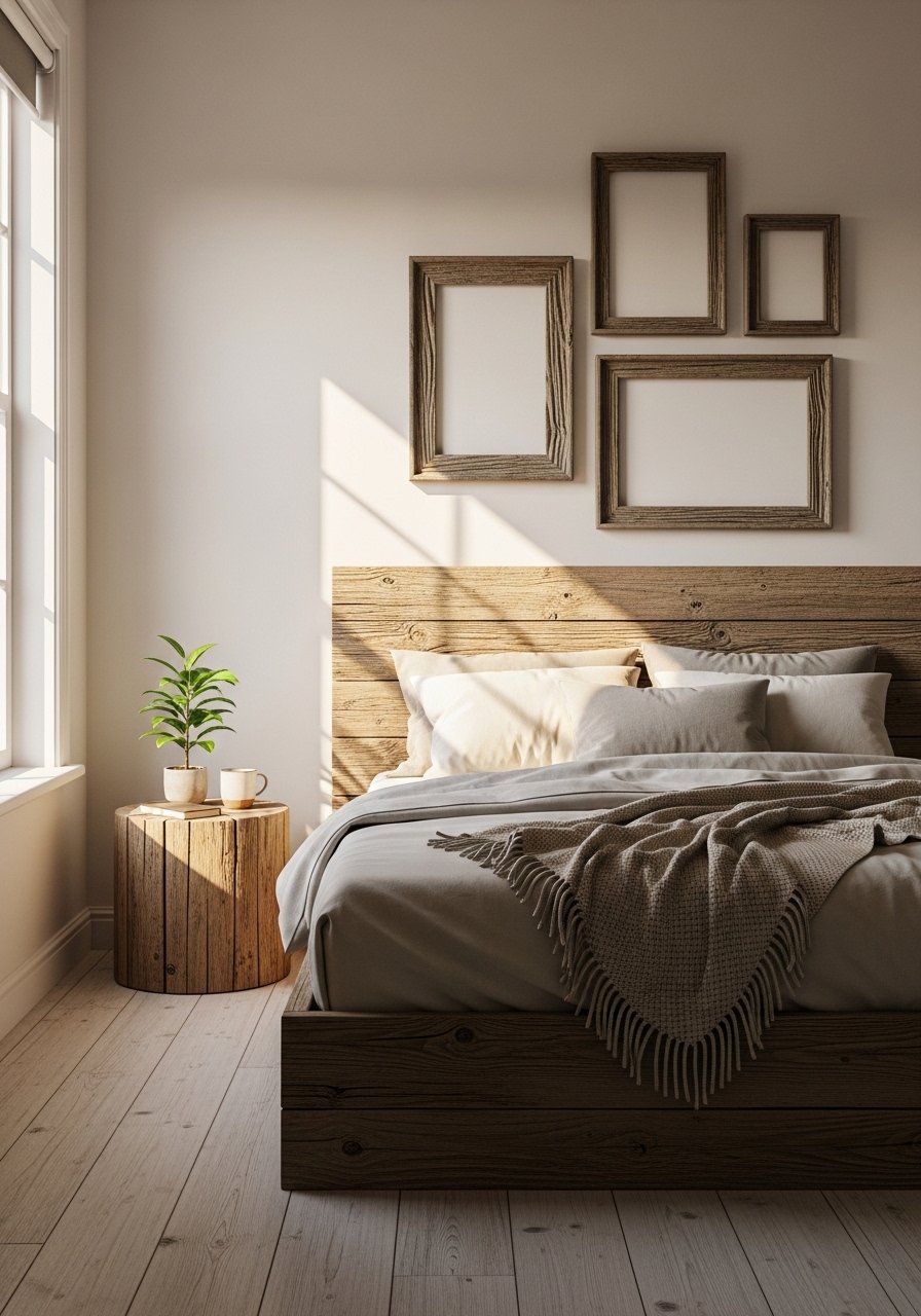
Rustic Wood Frames for Cozy Bedrooms
There is something honest about a few hand-sanded wood frames over the headboard. I made mine from pallet boards, cut to 8×10 and stained with two thin coats so the grain shows. It gives the bedroom a lived-in warmth without a lot of money. Expect to spend $10 to $25 per frame if you buy unfinished wood, or use ready-made pine frames for $15 each when you want a faster route. Biggest mistake is matching every piece exactly. Mix a raw wood with a painted white frame and it looks intentional. A specific note, aim for the top frame edge to start about 6 inches above the headboard for best proportion.

Minimalist White Frames for Bright Home Offices
My home office needed calm. Switching to thin white frames with 16×20 prints removed competing colors and increased focus. White frames make small prints read larger when you use a 2-inch mat. If you like the hands-off route, these white gallery frames are under $40 and come with mats. A common slip-up is using glossy paper that reflects desk lamps. Matte or lightly textured paper avoids glare and looks more professional on video calls. This setup works great for mid-century and Scandinavian styles, and it pairs well with floating shelves from idea 4.

Brass Ledge Display for Entryways
I hate leaving keys on the table in a random pile. Brass picture ledges give you a place to lean framed notes, the mail, and a small mirror. They take the pressure off committing to nails. I grabbed a pair of brass picture ledges for under $25 each and the entryway suddenly behaved. A common mistake is overcrowding the shelf. Leave one empty inch per frame so nothing fights for attention. For proportion, keep ledges at about chest height so plates and frames are easy to grab. This is perfect for apartments and rental entryways.
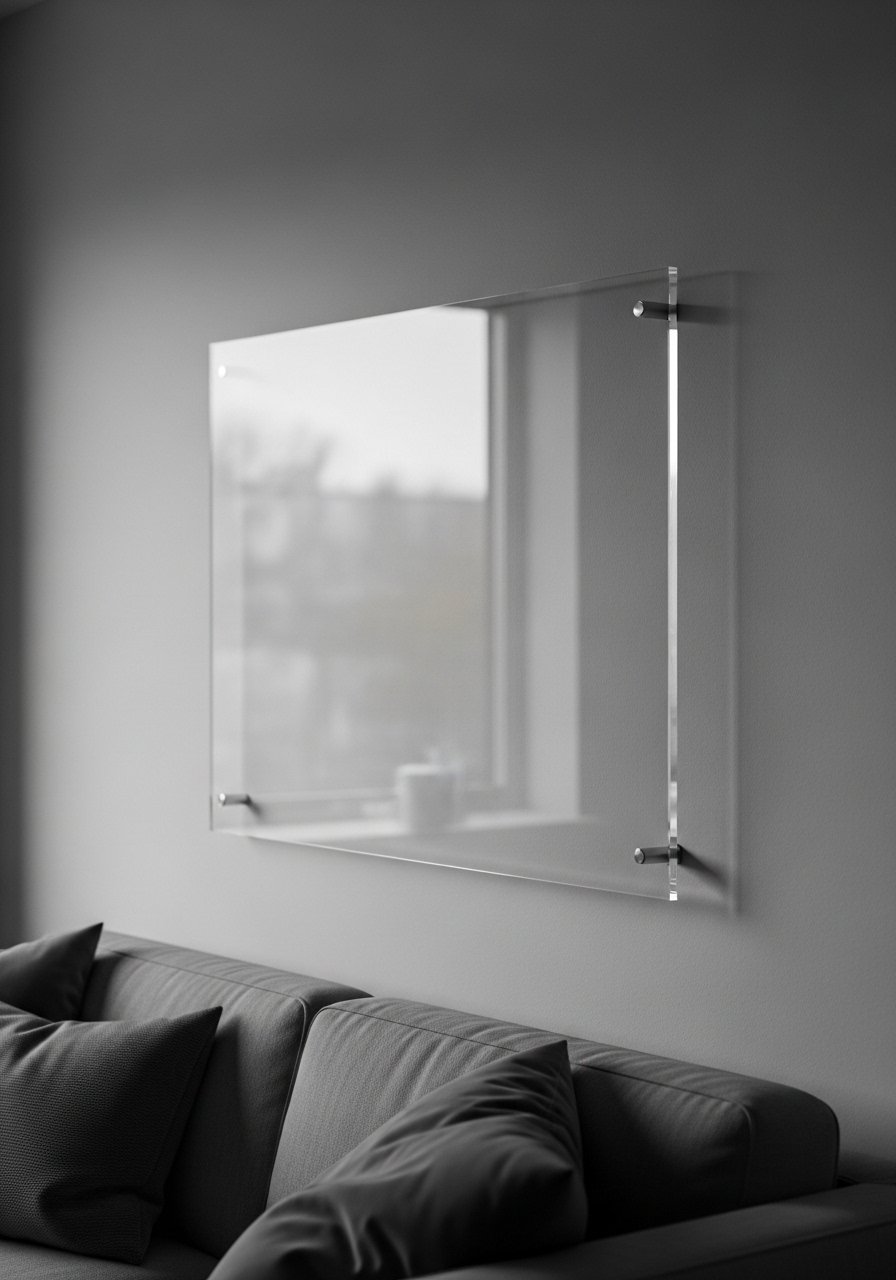
Floating Acrylic Frames for Contemporary Rooms
Floating acrylic frames make art look like it is hovering. I used a 12×16 acrylic frame for a botanical print and it felt modern without being cold. Acrylic is lighter than glass so it is better for drywall and avoids sagging in larger sizes. I ordered a clear floating acrylic frame set and hung two above a console table. People often pick frames that are too ornate for contemporary prints, which creates a mismatch. A real detail to try, show 1/4 inch of background color as a border inside the acrylic to give each print breathing room.
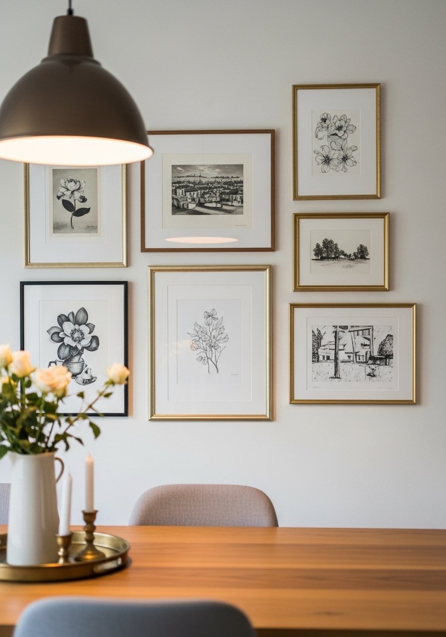
Matboard Mix for Gallery Style Dining Rooms
I used mixed mat sizes to make a collection of small prints feel curated. Use one consistent outer frame size, like 16×20, and vary the internal mats between 5×7 and 8×10. That keeps the wall cohesive while giving each image its own stage. For supplies grab a pack of acid-free matboards to keep prints safe. A common misstep is using mats that are too wide, which drowns small photos. Keep mats proportional, no more than 60 percent of the frame opening. Works well in transitional dining rooms when you want a restaurant-feel without the formality.
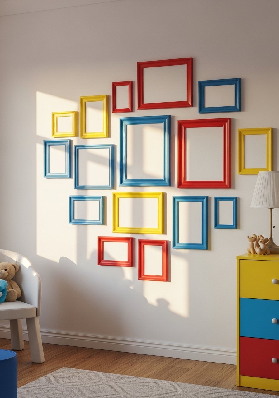
Painted Pop Color Frames for Playful Kids Rooms
My kid refused anything neutral, so I painted basic frames in primary colors. Use acrylic craft paint and tape off the glass. Bright frames make simple prints feel intentional and encourage play. I bought inexpensive wood frames for painting and sprayed a matte sealant so fingerprints wipe away. People often frame everything in white for kids rooms, which looks safe but bland. A detail that helps, paint the back edge of the frame a contrasting color for a peeking effect when hung. Budget friendly and washable, this is a quick weekend project.
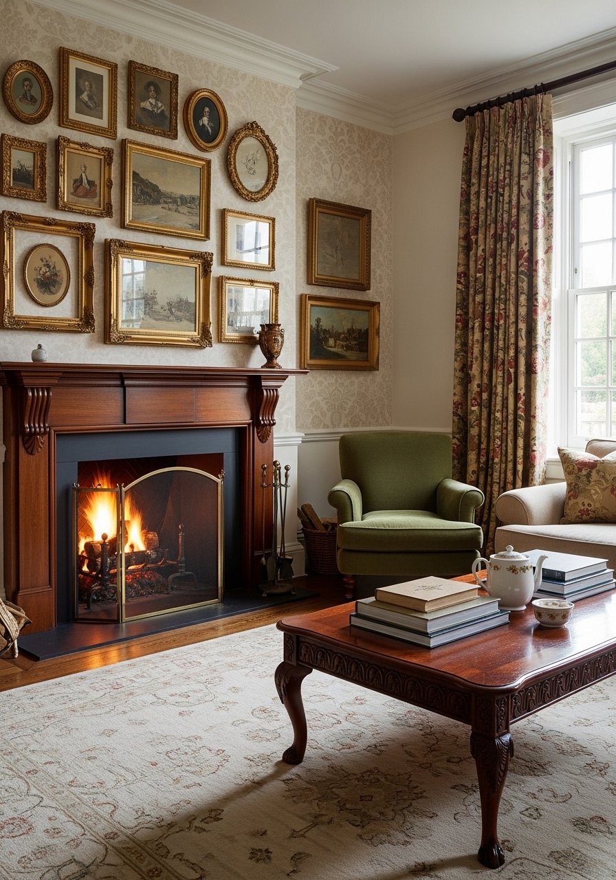
Vintage Gold Frames for Traditional Living Rooms
I scored a few mismatched gold frames at a thrift store and grouped them over the mantel. They read high-end together even though none matched. Gold frames warm up a traditional living room and work with patterned wallpaper. If you are buying new, look for ornate gold frames with a 1.5-inch lip for classic scale. One mistake, do not hang them too symmetrically unless the frames are identical. A helpful ratio is one large frame, two medium, and three small for an organic feel. Clean off old frames with a soft brush rather than harsh chemicals that strip patina.
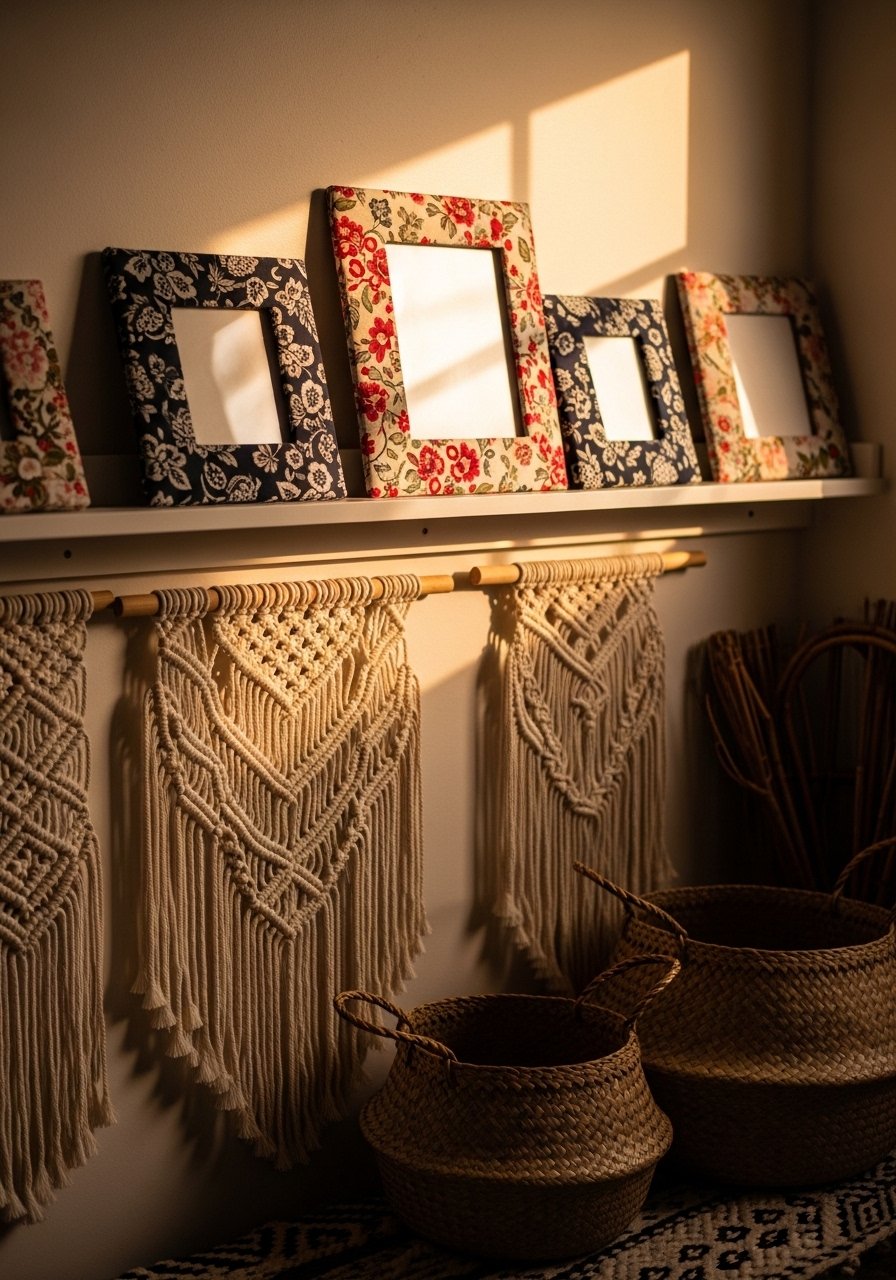
Fabric-Covered Frames for Textured Boho Corners
I wrapped cheap frames in leftover linen and upholstery scraps to add texture without buying new art. Fabric-covered frames soften a boho corner and coordinate with pillows. Use spray adhesive and wrap edges neatly, then staple at the back. These fabric-frame DIY kits make it faster if you do several. The usual error is using too thick fabric which bulks up the frame. Aim for fabric under 1.5 millimeters when possible. A tiny tip, match one framing fabric with a pillow fabric at a 80/20 ratio so the space feels tied together without being matchy.
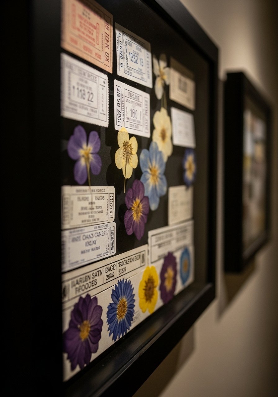
Shadow Box Memory Frames for Hallways
I made a shadow box for concert tickets and a pressed flower and hung it in the hallway. It turned a narrow walk into a series of small stories. Shadow boxes are great where depth can be celebrated rather than hidden. I used 8×10 boxes with 1.5-inch depth and found shadow box frames for a reasonable price. Mistakes include overcrowding the box. Leave negative space so the items read clearly. Pro tip, pin lightweight items to foam backing with archival tape so everything stays put for years.
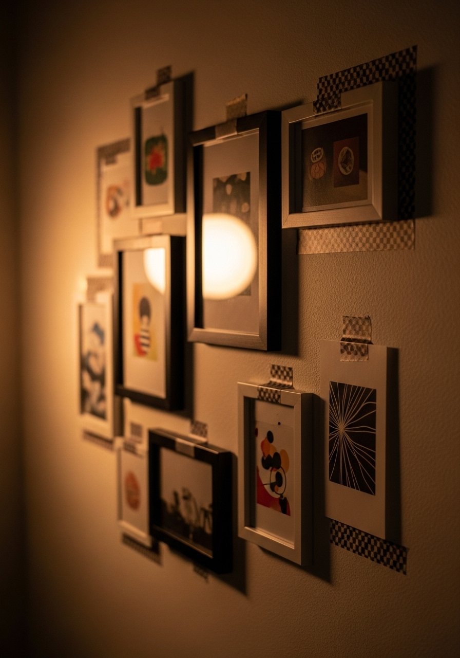
Washi Tape Friendly Frames for Renters
When I rented, I refused to hammer nails into fresh drywall. Washi tape and lightweight frames saved me. Use frames under 12×12, wrap the back with a bit of painter's tape to keep corners from peeling, and use bright washi strips to add personality. I pair the look with lightweight plastic frames so the tape holds. A common error is trusting tape with heavy frames. Always test a single piece first. This method is great for seasonal switches and photo swaps when you do not want holes.

Oversized Frame with Floor Lean for Empty Walls
There was an awkward blank wall behind my sofa that a rug felt wrong for. A 30×40 oversized frame leaning on the floor solved it. Leaning larger pieces create a relaxed, gallery-studio vibe without precise measuring. I ordered an oversized wood frame and swapped the artwork seasonally. The mistake people make is choosing something too small for the space. As a rule, a floor-leaning piece should be at least two-thirds the sofa height when placed next to it. Add a plant beside the frame and the corner reads designed, not accidental.
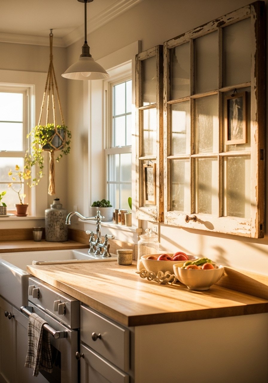
Reclaimed Window Frames for Farmhouse Kitchens
I scored old window frames and turned them into multi-photo displays above the sink. The divided panes act like built-in matting, which is a huge time saver. Clean the glass gently and leave some paint chips for character. I used reclaimed window hardware to hang heavier pieces safely. Newcomers often strip every bit of paint, which erases the vintage charm. A small measurement detail, remove panes and back them with foam core cut to 1/8 inch to protect photos from moisture near the kitchen sink.

Mixed-Metal Frames for Modern Glam Bedrooms
I used silver and brass frames together and it looked intentional, not confused. Mixed metals add depth and stop a room from feeling matched and flat. Start with one dominant metal and sprinkle the secondary metal in smaller frames, about a 70/30 visual ratio. I like mixed metal frame sets that already combine finishes. The typical mistake is overdoing the shine. Pick a matte finish and a polished finish so they play off each other. This approach works well next to plush textiles like velvet pillows.
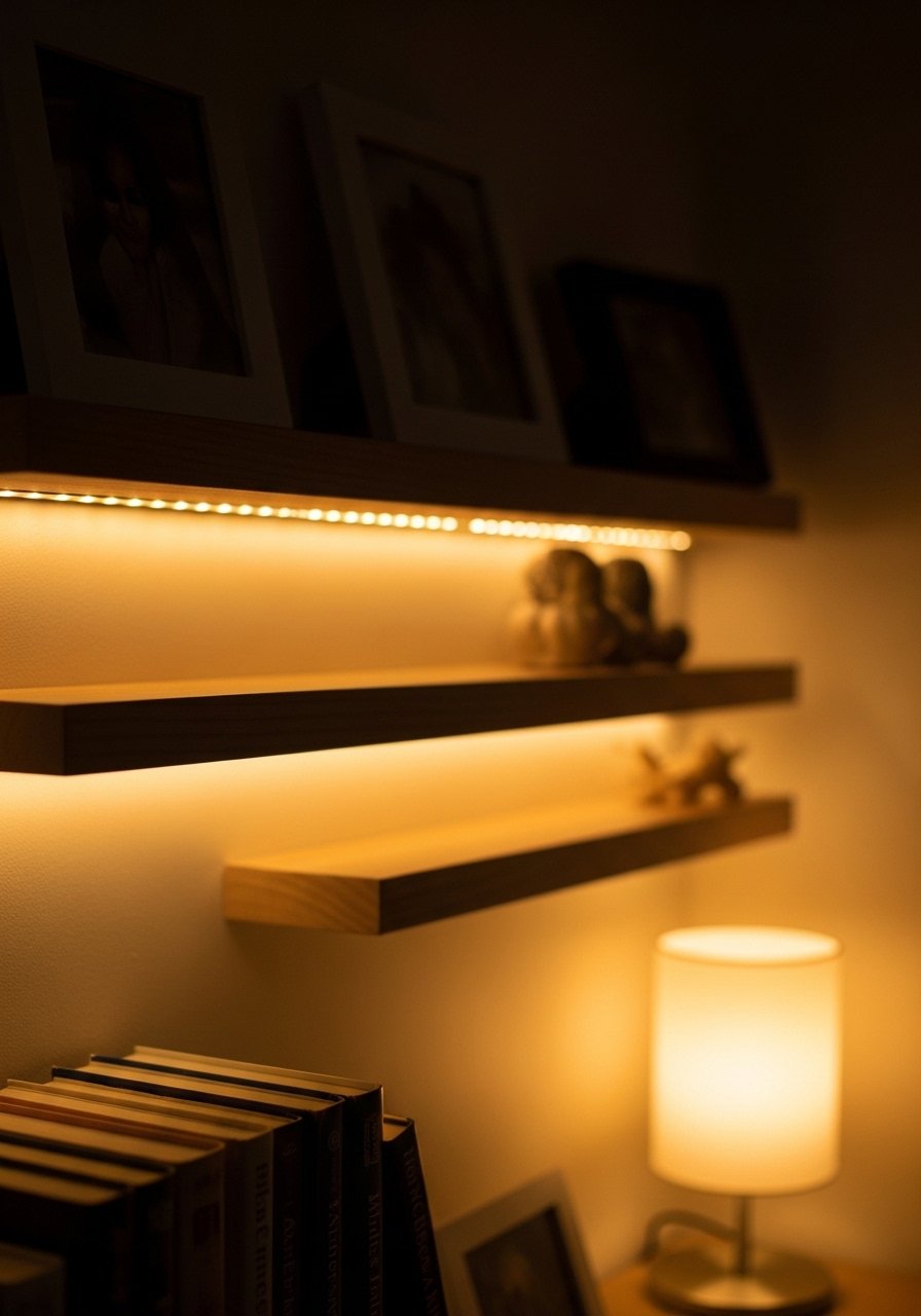
DIY Photo Ledges with Integrated Lighting for Reading Nooks
I built shallow ledges and added a thin LED strip under each shelf to highlight framed photos and save space. The lighting brings evening warmth and avoids needing another lamp. Use 4-inch deep shelves and a warm 2700K LED strip for the right glow. If you want the kit route, these LED-ready picture ledges make installation quick. People often place lights that are too cool and they make photos look clinical. A helpful note, leave a 1-inch gap behind frames for the light to halo the wall rather than wash it out. Pair with the oversized frame idea for a layered vignette.
Your Decor Shopping List
Textiles
- Honestly the best $35 I have spent. Chunky knit throw in cream 50×60 inches, perfect over a sofa arm
- For pillows, 22-inch linen pillow covers in warm neutrals, down-filled inserts separate
Wall Decor
- Brass picture ledges 24-inch set, great for renters and entryways
- Floating acrylic frame set clear, multiple sizes for contemporary prints
Lighting
- Warm LED strip light roll 2700K for photo ledges
- Adjustable wall picture light for gallery highlights
Frames & Supplies
- Assorted wood frames for painting pack of 6
- Acid-free matboard pack 16×20 cuts
- Shadow box frames 8×10 for keepsakes
Plants & Greenery
- Artificial fiddle leaf fig 6ft for low maintenance height, similar options at HomeGoods and Target
Shopping Tips
White oak beats dark wood in 2026. Design feeds have shifted completely. White oak floating shelves look current, not dated.
Grab velvet pillow covers for about $12 each. Swap them every season and the whole room feels refreshed.
Curtains should puddle or kiss the floor, never hang halfway up. 96-inch linen panels are the right call for standard 9-foot ceilings.
Everyone buys five small succulents. One single 6-foot artificial fiddle leaf fig has ten times the visual impact.
Frequently Asked Questions
Q: What height should I hang picture frames above furniture?
A: Aim for the center of the piece at about 57 to 60 inches from the floor as a starting point. For frames above sofas, leave 6 to 8 inches between the top of the sofa and the bottom edge of the frame. If you lean a piece on the floor, make it at least two-thirds the sofa height for balance.
Q: Can I mix modern and vintage frames without it looking messy?
A: Yes, mix them with a simple rule. Pick one dominant finish and use the other as accents in roughly a 70/30 ratio. Also keep frame sizes consistent or use a shared mat size so the collection reads cohesive rather than clashing.
Q: How do I hang a gallery wall without making a dozen holes?
A: Use picture ledges or lean frames, and use reusable hanging strips for frames under 12×12. For heavier pieces, install one secure anchor and balance lighter frames around it. Test weight limits first and plan spacing, a 2 to 3 inch gap between similar frames is a safe benchmark.
Q: Are faux plants okay near frames that might get sunlight?
A: Both real and faux can work. If the spot gets direct sun, faux plants avoid fading concerns and they require zero care. I use a faux fiddle leaf fig near bright windows so frames and textiles are safe from moisture and rot.
Q: What size mat should I use to make small prints look larger?
A: Use a mat that adds at least two inches to each side for a modest lift, or up to 4 inches for a gallery look. For a 5×7 print, a 2-inch mat inside a 11×14 frame reads balanced in most rooms.
Q: How can renters display frames without damaging walls?
A: Lean larger frames, use picture ledges, and use removable strips for lightweight frames. Washi tape works for temporary, playful displays but test a strip first. For a semi-permanent solution, pick a single wall and use a narrow picture rail that hooks over the molding rather than putting holes in drywall.
