

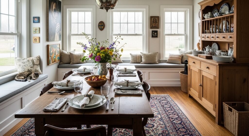
I hate setting a table that still feels unfinished. A plain napkin or a bare charger can leave the whole spread looking cold and empty.
I started making simple napkin rings because small details fix that hollow feeling. They take five minutes each, and they make a table read as intentional and lived-in.
How to Make DIY Napkin Rings Easily
This is the method I use every time a table feels unfinished. I’ll show how to pick a base, add a small sprig or ribbon, and arrange a mix so the table feels warm, simple, and deliberately layered. It works especially well with organic modern or Japandi-style settings.
What You'll Need
- Linen napkins in natural, set of 6, 20×20 (~$20–40)
- Wooden napkin rings, set of 4, oak finish (~$12–25)
- Brass napkin rings, set of 4, matte gold finish (~$20–40)
- Jute-wrapped napkin rings, set of 4, natural (~$10–20)
- Ceramic napkin rings, set of 4, speckled white (~$15–35)
- Faux eucalyptus sprigs, 6 stems, muted green (~$6–15)
- Velvet ribbon, 1/4" x 10 yd, dusty blue (~$6–12)
- Dried baby’s breath bundle, small, natural tone (~$8–18)
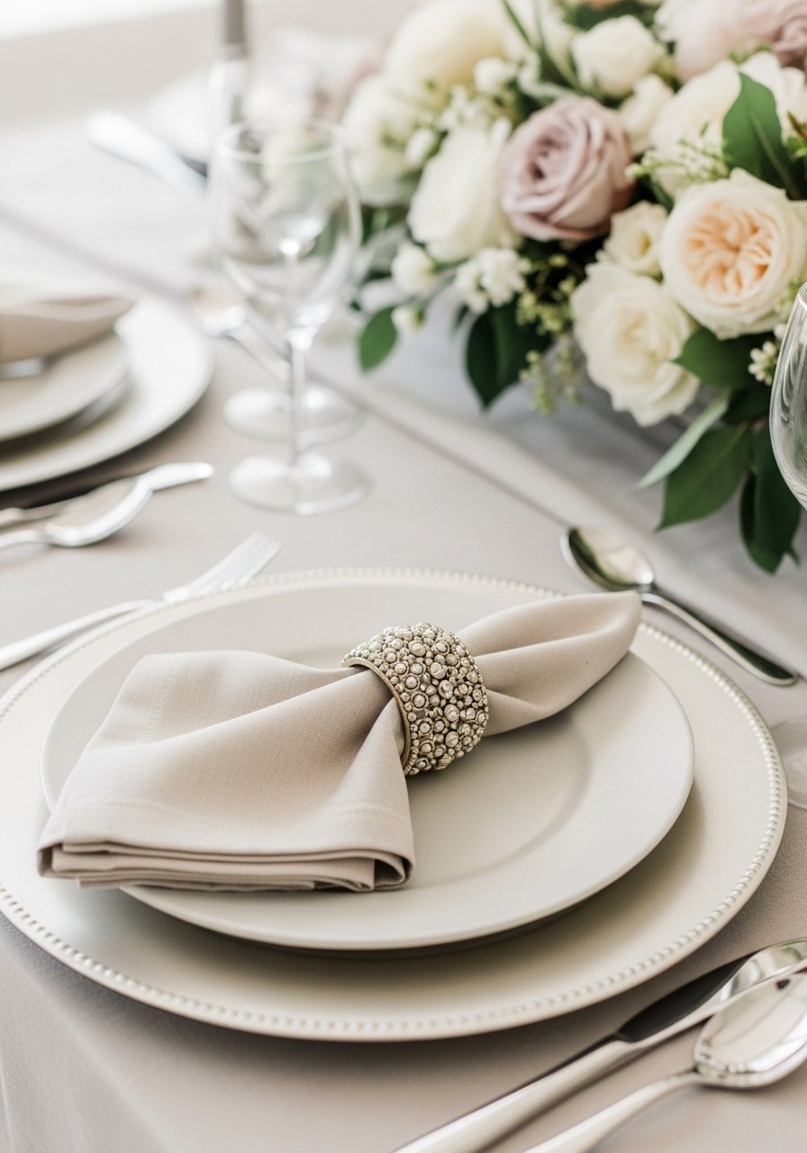
Step 1: Choose the ring that sets the mood
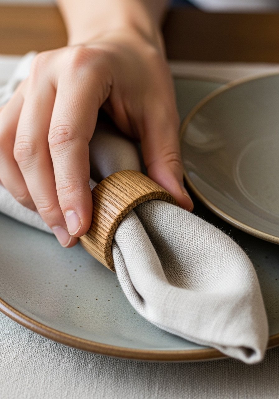
I start by choosing the napkin ring material that feels right for the meal. Wood reads warm and casual, brass adds a quiet, luxe note, and jute or ceramic keeps things organic. The ring should nod to the rest of the table—match wood to a charger, brass to flatware, linen to the napkin tone.
What changes visually is immediate: the napkin goes from an afterthought to a framed element. A common miss is scale—if the ring is too big it swallows the fold; too small it looks tight. Avoid rings that compete with your plate pattern.
Step 2: Add a soft accent (sprig or ribbon)
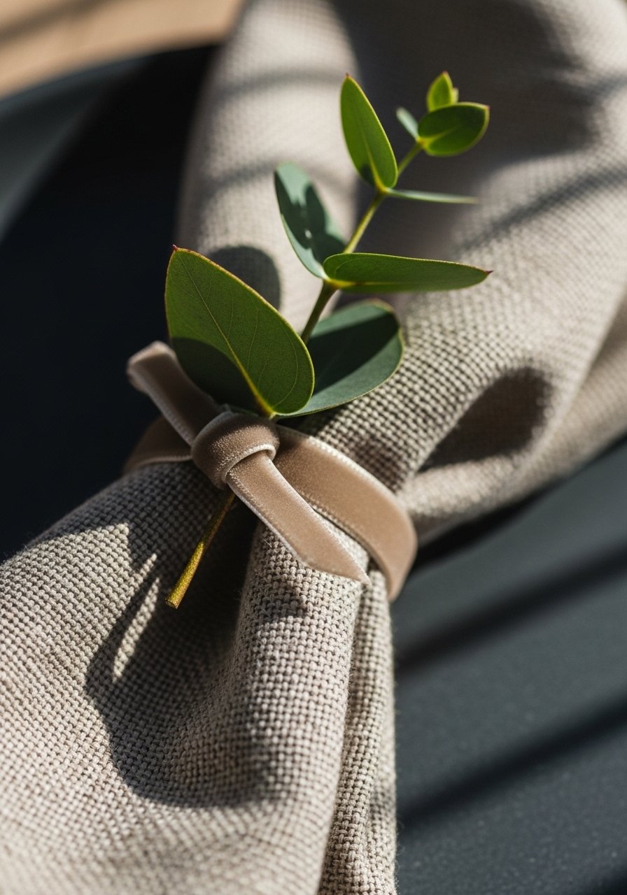
I tuck a tiny eucalyptus sprig or a short ribbon loop through the ring to add softness. I trim stems short so they don’t stick straight up; the goal is a quiet whisper of greenery. Ribbon gives color and a textile repeat when you’ve used similar tones elsewhere.
This step layers texture and gives vertical interest without shouting. People often miss scale here—use very small sprigs or narrow ribbon. Don’t overload the ring with full stems; that’s the small mistake that makes the table look fussy instead of comfortable.
Step 3: Mix materials across the table
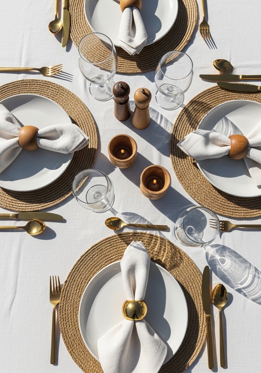
I rarely use one type of ring for every place. I mix wood and brass or alternate jute with ceramic so the eye moves across the table. It reads intentional and collected, like items picked over time. I keep balance by repeating one element every three places rather than mirroring exactly.
The visual shift is a table that feels curated. An insight people miss: odd-numbered repeats read better than strict symmetry. The mistake to avoid is random mixing—decide your two or three materials first and stick to that palette.
Step 4: Tie the rings into the whole table story
I step back and look at the table as a whole. The napkin rings should echo something else—a wicker charger, brass flatware, or the centerpiece greenery. If nothing repeats, add a small repeat: a ribbon color or a sprig picked from the centerpiece.
This makes the table feel cohesive instead of patched together. People often underestimate the power of a single repeating texture. Avoid adding too many competing focal points—keep one strong material anchor and let the rings support it.
Step 5: Final tweaks — light, feel, and imperfection
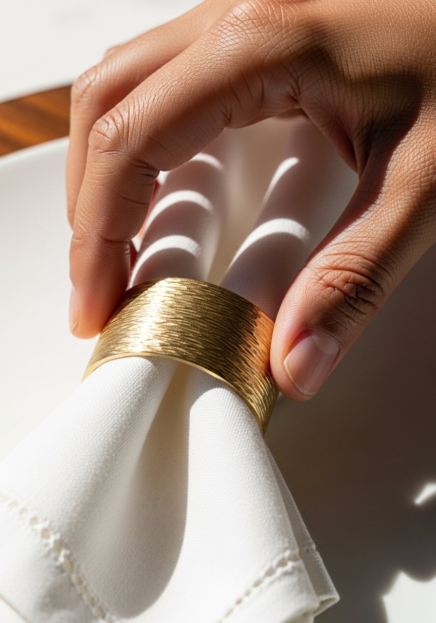
I place the finished napkin rings last, then check them in daylight and with the room lights on. I test how they feel when someone picks them up—if they slide off or pinch, I tweak the fold. I usually leave a slight tilt or imperfect tuck; it reads lived-in and welcoming.
The visual change is small but it softens the entire setting. Insight: tiny imperfections make a table approachable. Small mistake: striving for mechanical perfection that makes a spread look staged. Let the rings invite people to touch.
Common mistakes I see (and how I fix them)
I’ve watched friends choose rings that are either too ornate or too plain for the rest of the setting. Both can make a table feel off. The fix is simple: pick one repeating texture and one accent texture, then stop.
- Mistake: using huge floral stems through rings — instead, trim to small sprigs.
- Mistake: matching everything perfectly — instead, introduce one warm imperfection (a mismatched wooden ring).
- Mistake: ignoring scale — test the ring on the folded napkin before committing.
Seasonal and budget variations
I change the accents, not the method, for seasons. In fall I swap eucalyptus for dried grasses and choose jute rings. For winter I use brass rings and a velvet ribbon. These small swaps shift the mood without a big spend.
On a budget, I’ll mix one purchased set (wood or brass) with simple ribbon or a DIY string of dried baby’s breath. If you want a quieter look, stick to one neutral ring material and change only the sprig seasonally.
Mixing napkin rings with what you already own
I always audit what I already have. Chargers, flatware, and centerpiece tone guide the ring choice. If your plates are patterned, pick solid, tactile rings. If your platters are simple, try a small metallic ring for contrast.
- Use odd-number repeats for visual interest.
- Let one material lead (wood, brass, ceramic) and let the rings echo it.
- Don’t feel you need to match exactly; cohesion comes from color and texture echoes, not clones.
Final Thoughts
Start with one place setting. Make one ring, sit at the table, and see how it feels. Small changes like a linen napkin and a tiny sprig shift the whole mood.
You don’t need a full set to start—one thoughtful napkin ring makes a room feel more intentional and lived-in.
