

A real, lived-in living room showing the final result of creatively decorated candles on a coffee table and mantel. Natural daylight, soft shadows, layered textures. The space feels intentional but not staged. No text overlay. Wide angle that shows balance and flow.
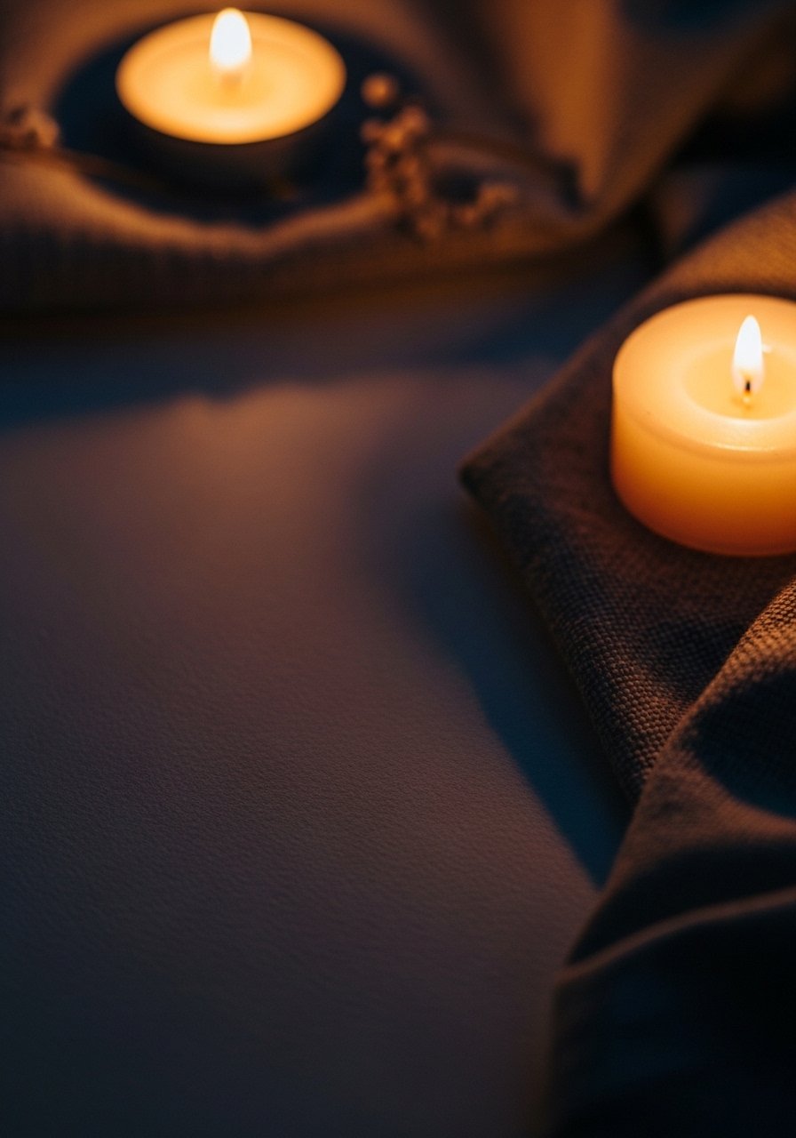
I hated how my living room felt unfinished when I’d light a plain candle and nothing else read as intentional. Candles looked lonely on a tray or crowded without purpose. I used to avoid them.
Now I edit each candle vignette like I would a small shelf—balancing height, texture, and negative space so the room reads warm, simple, and lived-in.
How to Decorate Candles Using DIY Ideas
This is the method I use every time a shelf, mantel, or coffee table needs soft focus. I’ll show how to layer candles, add natural details, and keep compositions feeling organic modern or Japandi without fuss. The result is calm, balanced, and easy to repeat.
What You'll Need
- Unscented pillar candle, white, 3×6 (~$8–15)
- Slim beeswax taper candles, set of 6, natural (~$12–22)
- Ceramic candle holder set, matte glaze, pair (~$20–40)
- Antique brass tray, 12-inch (~$25–45)
- Dried eucalyptus garland, 4ft, sage (~$10–18)
- Glass cloche, small, 6-inch dome (~$15–30)
- Decorative wooden matches, book of 3 boxes (~$6–12)
- Candle ring with natural seed pods, 4–6 inch (~$8–16)
Step 1: Choose the spot and simplify the view
I start by choosing the actual patch of space I want the candles to own. It could be a narrow mantel shelf, a bedside table, or the center of a coffee table. I clear everything and imagine the piece as a small composition, not a standalone object.
What changes visually is immediate: the candle becomes part of a deliberate scene. An insight people miss is that a candle needs room to “breathe” — negative space is as important as objects. Small mistake to avoid: cramming too many things into that square inch. If it looks fussy from three feet away, simplify.
Step 2: Group for rhythm and scale
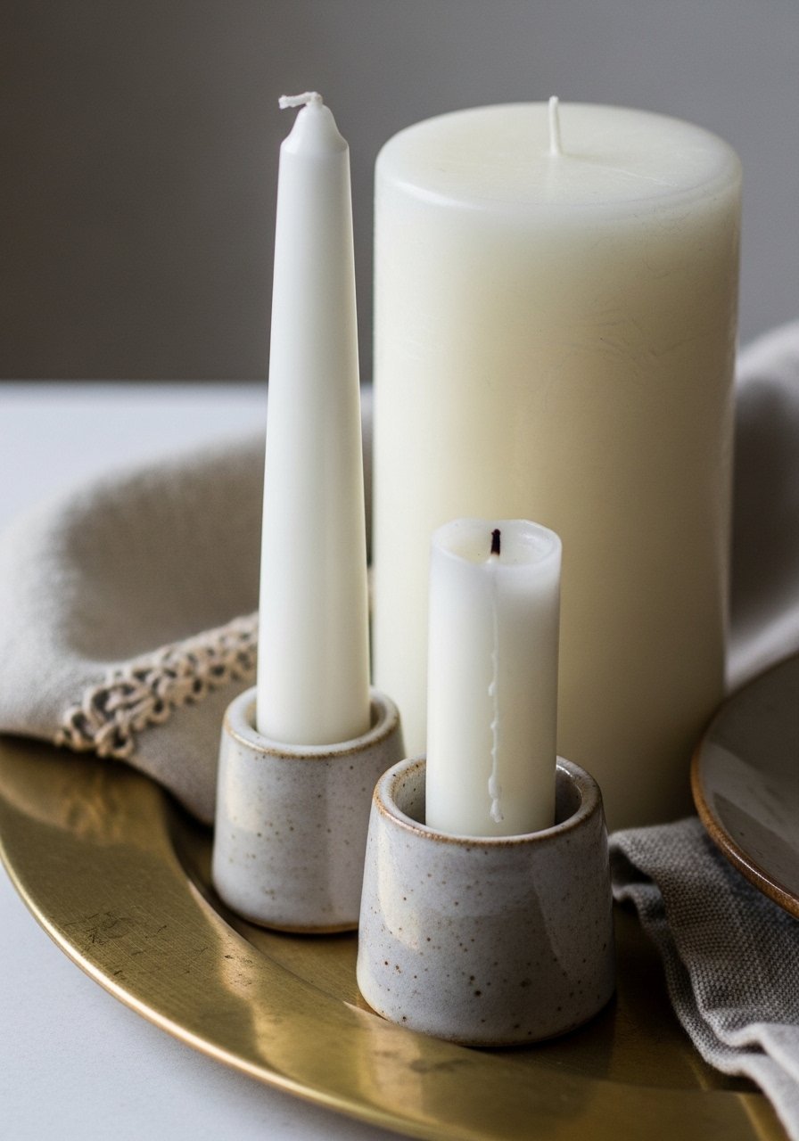
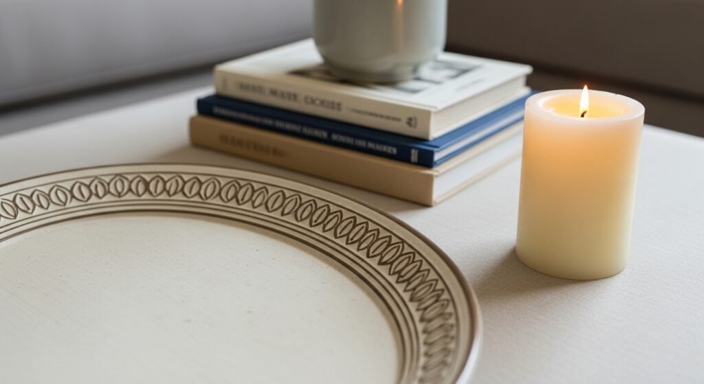
I always group candles in uneven numbers and stagger heights. I pair a tall taper with a mid-width pillar and a low votive or ceramic holder. That rhythm creates movement and feels intentional rather than matchy.
Visually, the arrangement stops being a “bunch of candles” and reads like a small vignette. One insight people miss is that height differences don’t have to be dramatic—small steps in level are calming. Mistake to avoid: lining things up in a row. Straight lines flatten the composition; curves and offsets feel lived-in.
Step 3: Anchor with a base layer
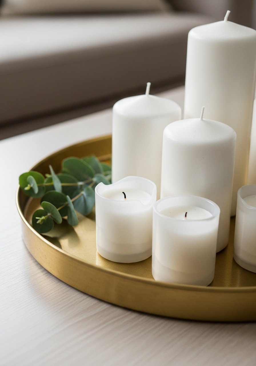
I pick a base—tray, shallow bowl, board—so the grouping reads as one object. I favor natural finishes like brass or wood for organic modern and Japandi settings. The base gives weight and keeps wax drips contained.
Once anchored, the vignette feels grounded and polished. A tip people miss: the base doesn’t need to be centered on the furniture—off-centering can anchor other elements. Mistake to avoid: letting the base be too small. If the tray is barely wider than the candle, the whole thing looks unstable.
Step 4: Layer in small natural details
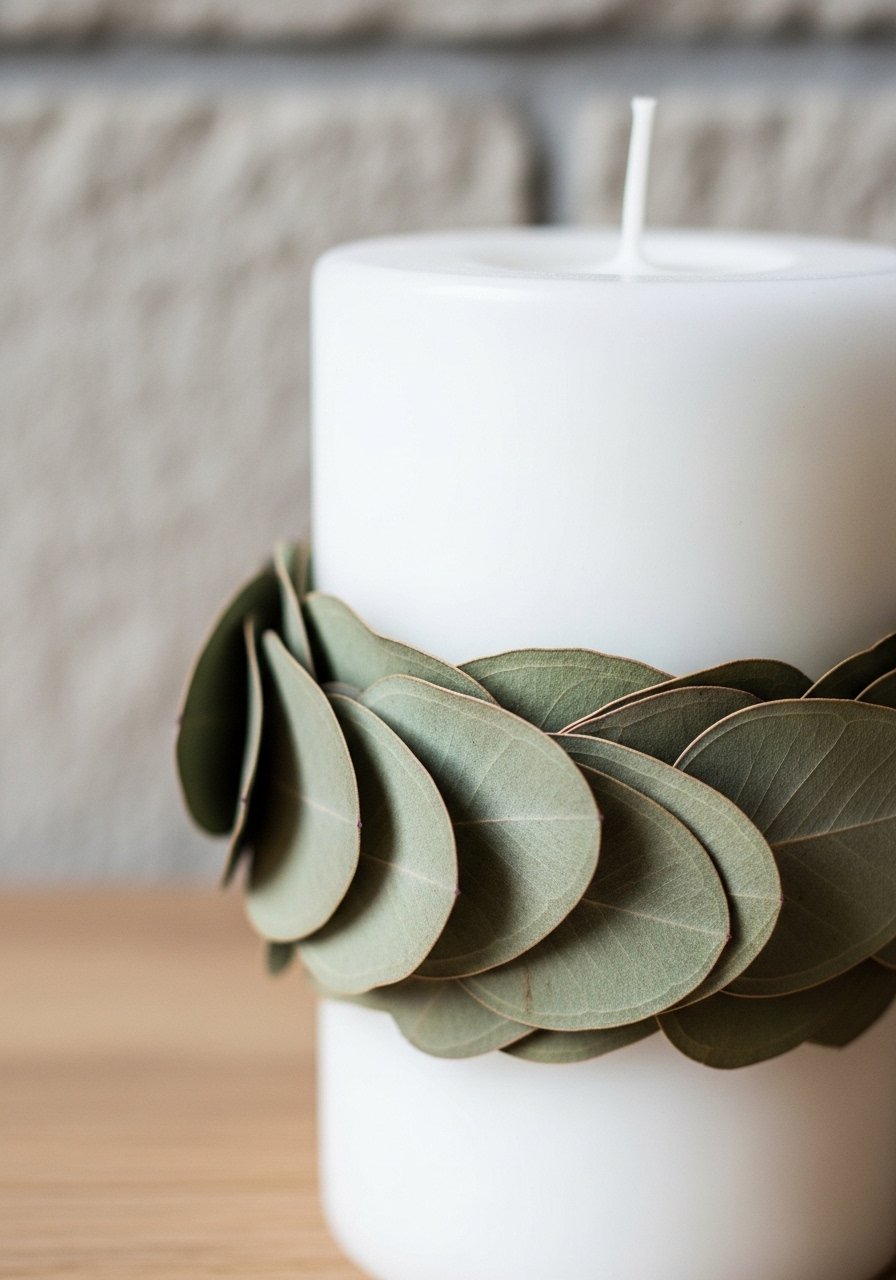
I tuck in small natural bits—dried eucalyptus sprigs, a minimal candle ring, or a few ceramic beads—to add texture without stealing attention. I keep the palette muted so the candles remain the focal point.
The visual change is subtle: the scene looks softer and feels intentional. Insight: small things close to the candle read louder than big items further away. Mistake to avoid: adding flammable clutter right next to the flame. Leave breathing room and never build a wreath that will catch fire.
Step 5: Edit with light and empty space
I always view the vignette in daylight and again at night. The balance that works by day can feel crowded by candlelight. I step back, remove one item if needed, and ensure a clean pocket of empty space to make the glow read calm.
What changes is mood—the same objects feel quiet instead of busy. Insight: negative space amplifies candlelight, so don’t fear leaving gaps. Mistake to avoid: thinking more objects equal more coziness. Often less gives you the warm, simple feeling you actually want.
Common Mistakes and How I Fix Them
I see three mistakes repeatedly: too many competing objects, mismatched scales, and ignoring safety. I fix them by editing down, measuring heights visually (I use my eye instead of a ruler), and keeping flammable elements at least a few inches from flames.
Quick fixes I use:
- Remove one item and observe for five minutes.
- Swap a tall taper for a low pillar when the space is small.
- Replace fresh foliage with dried sprigs for safety and longevity.
Adapting This Look for Rooms and Budgets
I use the same principles everywhere, but the scale changes. On a narrow mantel I use two small candles and a cloche; on a dining table I center a longer tray with repeating pillars. For tight budgets, I swap brass trays for painted wood boards and choose simple unscented pillars (they’re often $8–$15).
Room-specific tips:
- Bathroom: use one small pillar near the tub, keep it away from towels.
- Entry: a short taper with a ceramic holder reads welcoming without clutter.
- Small apartments: pick one vignette spot and keep other surfaces clear.
Seasonal and Trend Variations Worth Trying
I follow seasonal cues without overhauling the whole look. In fall I add warm-toned seed pods or a deeper tray. In spring I choose pale eucalyptus and lighter ceramics. For the organic modern or Japandi vibe, I stick to neutral tones, raw textures, and fewer decorative accents.
Try these quick swaps:
- Winter: add a handful of matte pinecones and a darker tray.
- Spring: use lighter dried flowers and a ceramic holder in sage.
- Year-round: keep candle colors neutral to allow easy mixing and matching.
Final Thoughts
Start with one small candle cluster and edit down. I trust my eye more than rules: if it feels calm and purposeful, it usually works.
Lighting a candle should make the room feel lived-in, not staged. Try a simple unscented pillar on a tray first—it's low commitment and tells you everything you need to know.
