

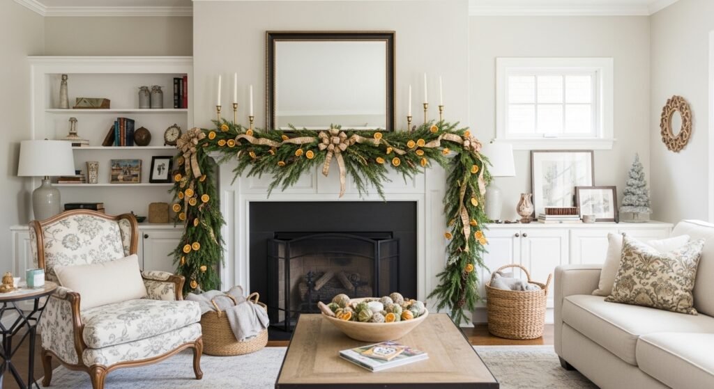
I hate a mantel that looks unfinished — the room feels cold and empty even when the rest of the room is fine. I bought hold-it-together, store-bought garlands that always looked flat and sad.
A simple DIY garland fixed that. It adds texture, a little scent, and a lived-in warmth. It takes under an hour and feels intentional.
How to Make a DIY Garland for Walls and Mantels
This is the method I use whenever a shelf or mantel needs life. I aim for a textured backbone, a few scented accents, and a balanced drape that reads purposeful in any room — from organic modern to modern farmhouse. The result looks layered and comfortable, not overdone.
What You'll Need
- Pre-lit faux eucalyptus garland, 6 ft (~$20–35)
- Floral wire roll, 26-gauge, green, 50 yards (~$8–15)
- Natural jute twine, 218 ft (~$6–12)
- Felt ball garland kit, neutral pack (~$15–30)
- Dried orange slices, 100 pieces (~$12–20)
- Tin jingle bell string, mixed sizes (~$15–30)
- Wide linen ribbon, 2.5 in x 10 yards, natural (~$8–15)
- Mini warm white LED fairy lights, battery operated (~$8–20)
Step 1: Build a textured backbone that anchors the whole look
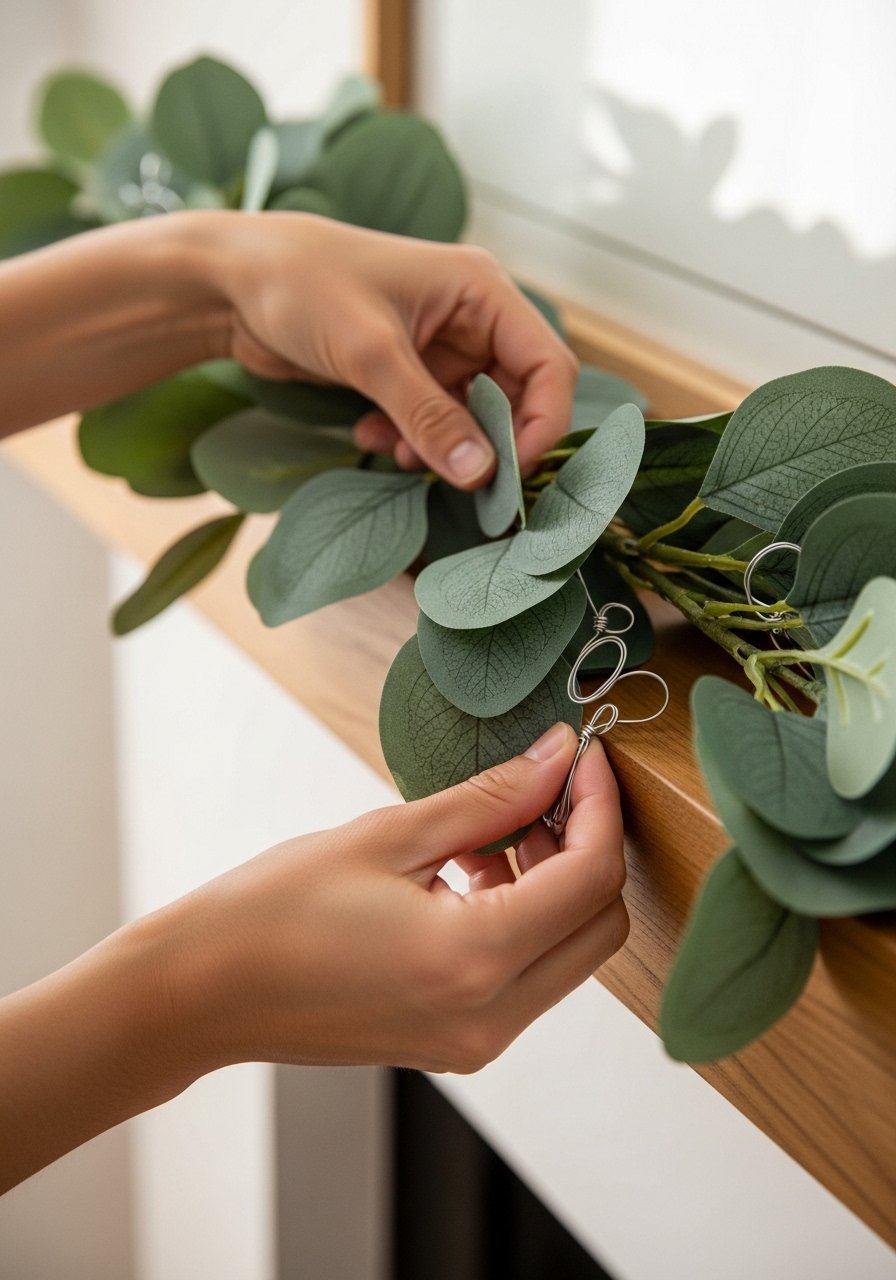
I usually start with a single greenery strand laid along the mantel. I let it drape a little—gentle sags look intentional. The base is what keeps a garland from reading flat; it gives weight and shape so other elements sit confidently on top.
One thing I miss when I rush: don’t make the base perfectly even. I tuck small sections forward or let stems cross; that slight messiness gives depth. A mistake I’ve made: using only one thin strand and expecting volume. If it looks sparse, double it up.
Step 2: Place scented accents where they'll peek, not shout
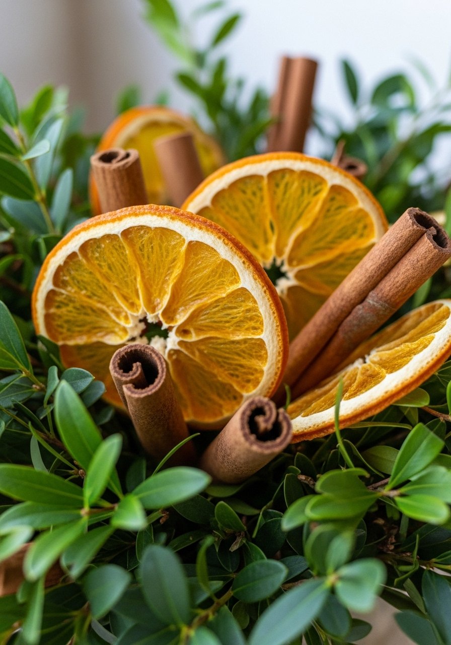
I tuck dried orange slices and a few cinnamon sticks into the greenery, spacing them in odd numbers (three or five). I position them so they peek out from the leaves rather than sit on top; that way they smell pleasant and feel integrated, not glued-on.
A detail I learned: place scent elements slightly behind the front foliage so they hover in the composition. A common mistake is clustering all scented pieces in one spot — then the garland looks lopsided and heavy.
Step 3: Weave in texture and scale for interest
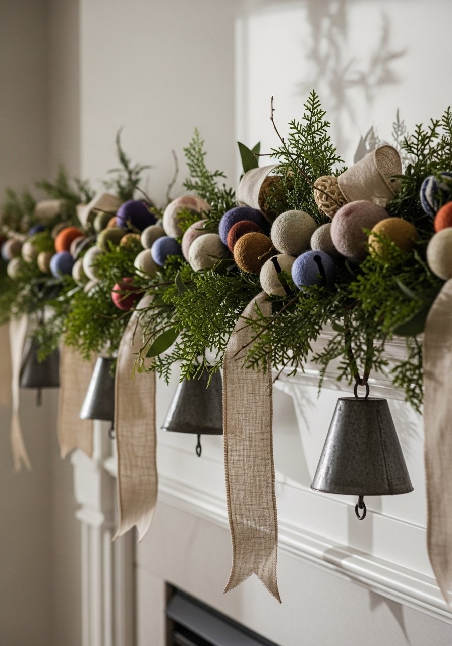
I add a mix of textures—felt balls, linen ribbon loops, and tin bells—so the eye moves along the garland. I balance scale by placing larger elements near the center and smaller ones toward the ends. That keeps the composition grounded and avoids a top-heavy look.
What I usually miss at first: repeat a texture two or three times so it feels deliberate. The mistake to avoid is using only one material—too uniform and the garland becomes visually boring. Small clusters spaced evenly make it feel curated.
Step 4: Layer light and check the drape from different heights
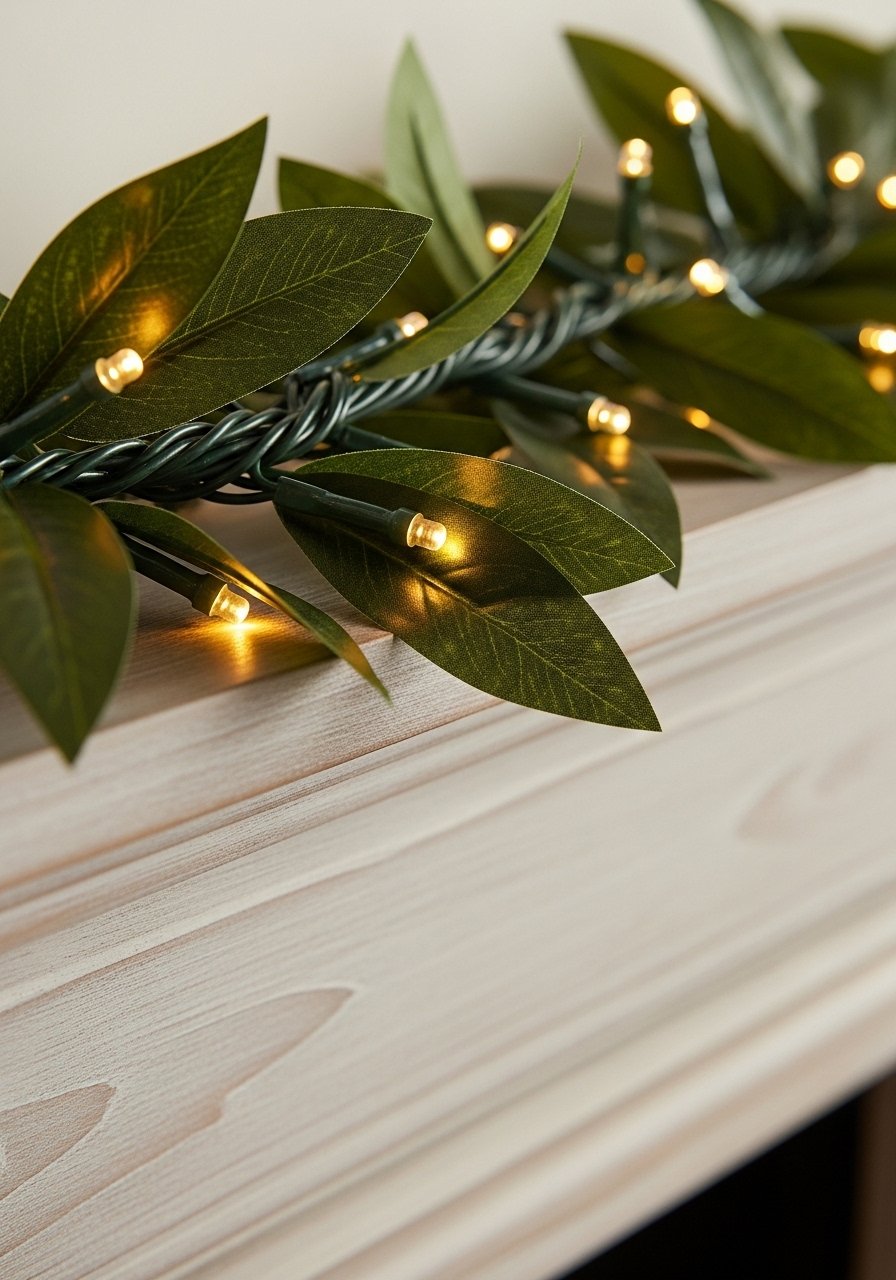
I tuck battery fairy lights under the greenery so the glow comes through, not from on top. I create one or two gentle swags along the mantel rather than a straight line—this adds movement and makes the arrangement read as relaxed, not staged.
A tip people skip: step back and look from sitting height and doorway height. That’s where the garland must read right. Don’t make the lights obvious strings; hide batteries and cords behind objects. The slip I used to make was tightening the lights so much the garland pulled straight.
Step 5: Anchor the garland and balance surrounding decor
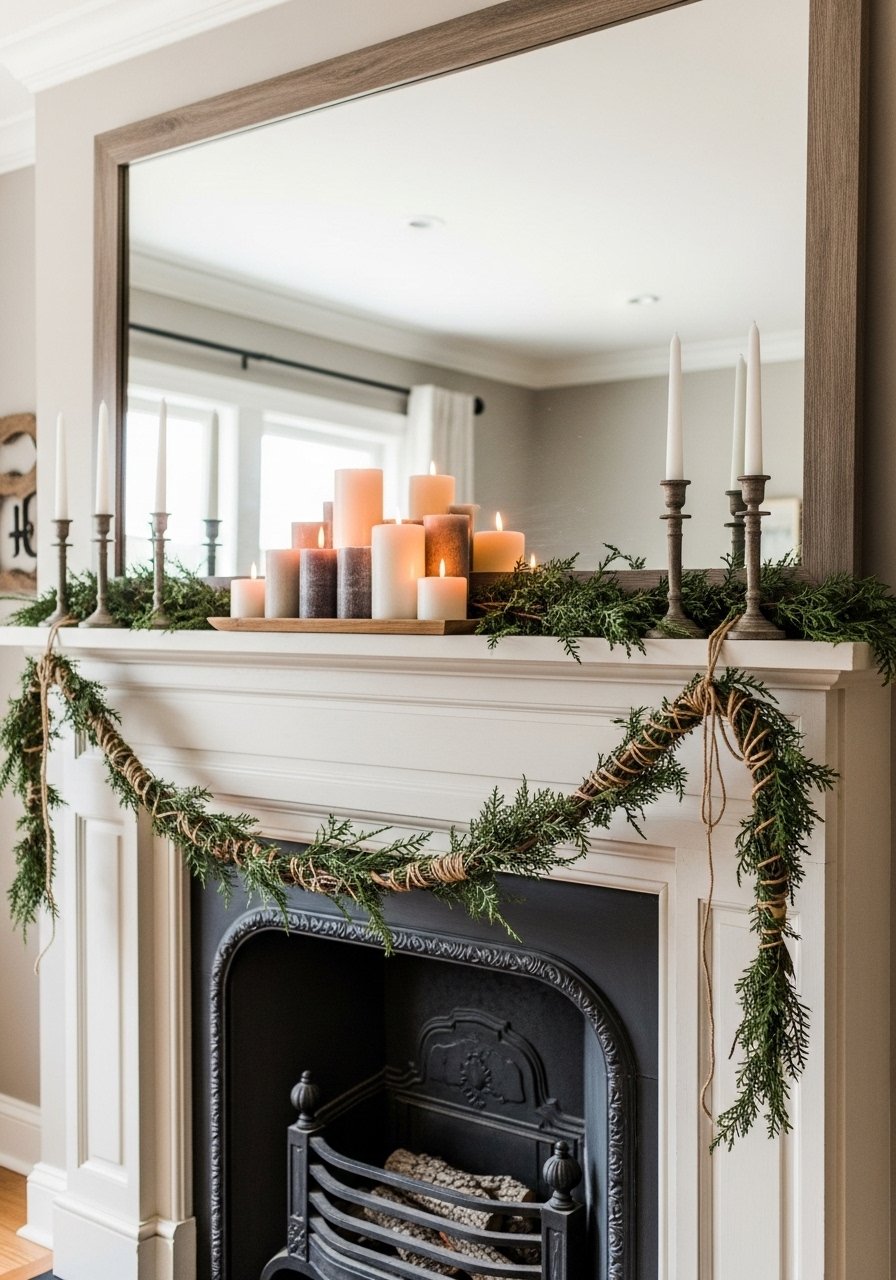
I anchor the ends with small loops of floral wire hidden in the greenery or with jute around sturdy mantel brackets. Then I style the hearth or shelf with three-to-five objects that echo the garland’s colors—candles, a small stack of books, or a framed print.
What I often miss: the space around the garland matters as much as the garland itself. A common mistake is clustering too many decorative items near one end. I re-balance by moving one object across the mantel until the whole vignette feels calm and intentional.
Common mistakes (and quick fixes)
I keep a short list of repeat offenders and how I fix them.
- Flat look: Add another layer of greenery or a line of felt balls to create depth.
- Lopsided weight: Move one large element to the opposite side; odd numbers help.
- Visible cords: Tuck lights under foliage and hide batteries behind props.
A quick habit that helps: always step back and view from across the room before calling it done.
How to adapt this for small spaces and kids/pets
Small mantels and shelves need lighter pieces. I use a single greenery strand and scale down accents—three dried orange slices and one cluster of felt balls is enough. For homes with kids or pets, I skip glass and heavy bells. Felt and ribbon reads cozy and is soft to the touch.
Budget-friendly swaps I use:
- Replace metal bells with painted wooden beads.
- Use magazine-page shapes instead of store-bought ornaments.
- Reuse last year’s ribbon, cutting it into new bows.
Seasonal variations and storage tips
I switch one dominant accent by season: citrus and spice for winter, linen ribbons and dried grasses for fall, small shells and paper stars for summer. This keeps the same backbone feeling fresh.
For storage, I strip delicate dried pieces into labeled boxes and loop the greenery into a large zippered bag so it keeps its shape. Keep tiny accents together in a single pouch so rebuilding next year is quick.
Final Thoughts
Start with a simple greenery backbone and add one new material—dried oranges or a string of felt balls—to see the effect. I promise small edits make a space look lived-in and intentional.
I usually begin with faux eucalyptus and a bit of ribbon. It’s low-commitment, cozy, and easy to tweak as I live with it.
