

A real, lived-in living room showing the final result of how to create DIY canvas art for home decor. Natural daylight, soft shadows, layered textures. The space feels intentional but not staged. No text overlay. Wide angle that shows balance and flow.
I hate when a wall looks unfinished. I’ve stood in rooms where frames felt wrong and shelves looked lonely.
Making my own canvas art taught me how to control scale, color, and rhythm so a space finally feels intentional. Start small and trust the room.
How to Create DIY Canvas Art for Home Decor
I’ll show the repeatable approach I use to make canvases that match a room’s scale, color, and rhythm. It’s about placement and feeling more than technique. The result is simple, layered art that looks intentional in an everyday home.
What This Solves
When walls felt bland or art disconnected, I needed pieces that tie a room together. Making my own canvases helped me respect furniture scale and repeat colors already in the space. The outcome makes the room feel balanced and lived-in.
What You’ll Need
- 16×20 cotton gallery-wrapped canvas (primed, white)
- Acrylic paint set (neutral earth tones, 12-pack)
- Synthetic flat and round brush set (assorted sizes, nylon)
- Palette knife set (small stainless steel)
- Low-tack painter's tape (1-inch, blue)
- Clear matte acrylic varnish spray (protective finish)
- Small foam blending roller (2-inch, lint-free)
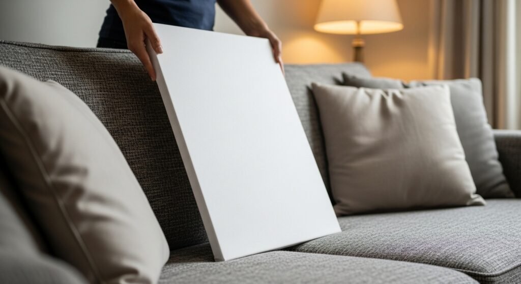
Step 1: Pick the right canvas size for the room
I hold the canvas up and let it sit against the furniture. I watch how it relates to the sofa height and the nearby shelf. I want the piece to breathe beside the furniture, not fight it.
When the size is right the wall reads intentional. The missed insight is that empty space around the canvas matters as much as the canvas itself. A common mistake is picking a canvas too small and then clustering more small pieces to compensate.
Step 2: Choose a simple color story from the room
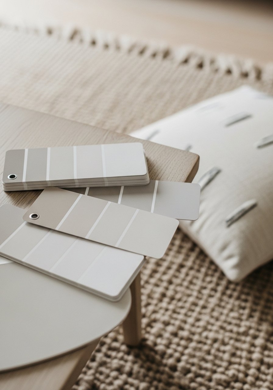
I pull two main colors and one accent from the room. I look at the rug, a throw, and a lamp finish. I want the painting to echo those tones, not match them exactly.
A limited palette makes the piece feel like it belongs. Many people miss how much texture acts like a color—matte versus glossy changes the feeling. Avoid copying exact hues from fabric; the art should complement, not mimic, other surfaces.
Step 3: Build a simple composition with broad shapes

I start by thinking in big shapes and relationships. I place a few broad blocks or washes to set rhythm and movement across the canvas. My focus is balance, not detail.
Visually, the room gains a new anchor point. The thing people miss is negative space—empty areas that let the eye rest. One small mistake is overfilling the canvas; that makes it feel cluttered rather than calm.
Step 4: Add accents and subtle layers for interest
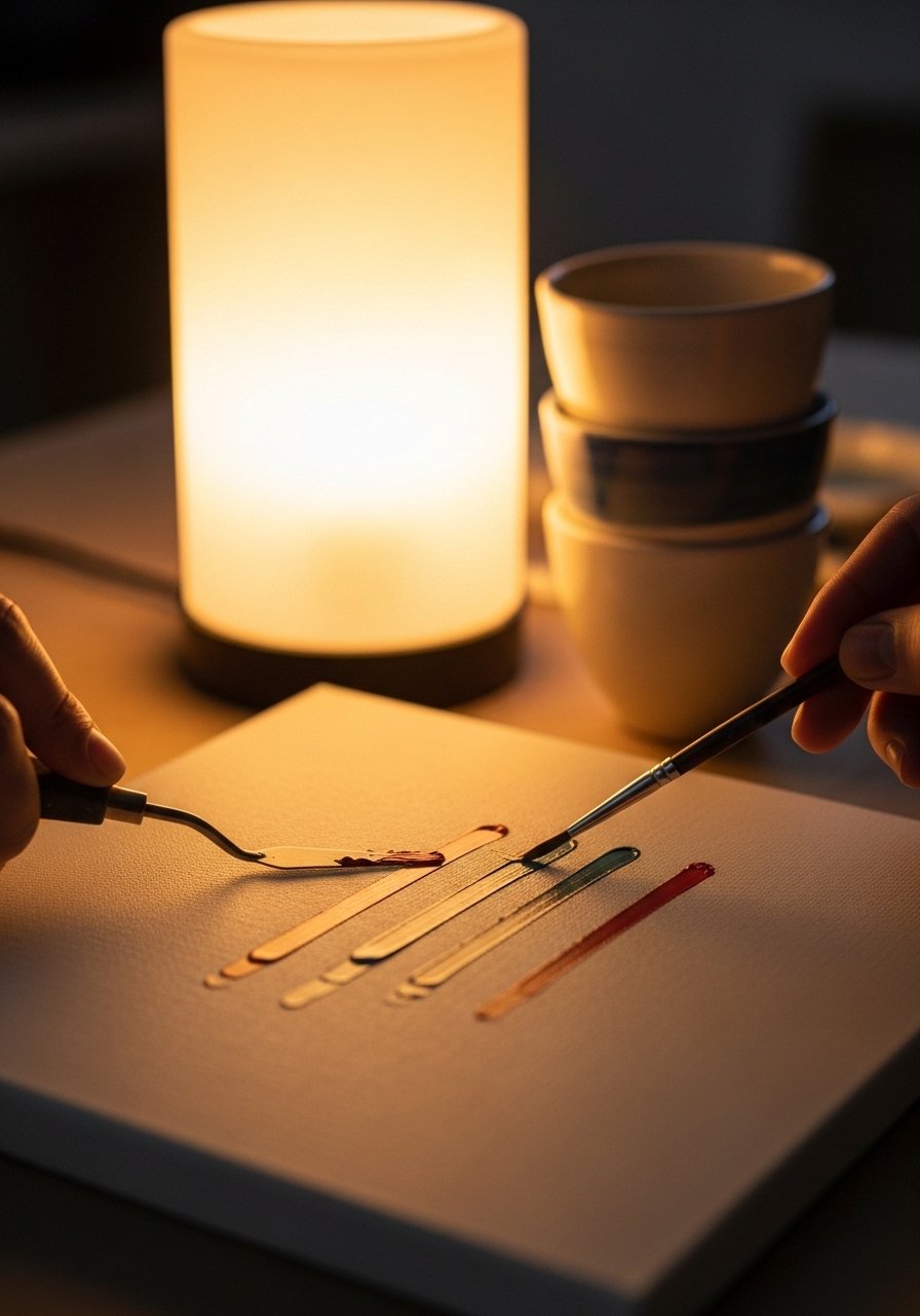
I introduce thin lines, a scrape, or a dab of the accent color to add depth. These touches should be small and purposeful so the main shapes still read clearly.
The canvas moves from “practice” to “finished.” I’ve learned that accents should reference objects in the room—metal finishes or a book spine color. A common misstep is overworking those accents until the simplicity is lost.
Step 5: Place and hang the canvas to create a conversation with furniture
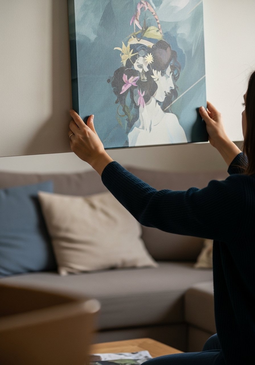
I hold the piece at eye level from standing positions and from the main seat. I look for alignment with furniture lines and sightlines from the room’s doorway. I aim for slight off-center or centered depending on nearby elements.
When hung well the painting feels like part of the furniture group. Many miss the sightline from the entry; if the piece reads odd from the doorway it will always feel off. A small mistake is hanging too high above the sofa—then the room loses a sense of connection.
Sizing and Scale
I think of canvas size as furniture for the wall. A small piece can feel precious in a hallway and lost above a sofa. Matching the canvas to the length of furniture keeps things balanced.
- A single canvas over a sofa should sit about two-thirds the width of the sofa.
- Leave breathing space around the work so it doesn't feel crowded.
I rarely stack many tiny canvases unless the pieces relate visually by color or shape.
Color and Mood
I let the room’s dominant texture guide the paint finish. Warm woods call for warm neutrals. Cool metals pull cooler tones. The painting should nod to these without copying them exactly.
- Choose two dominant tones and one accent.
- Keep contrasts gentle for a calm mood, bolder for more energy.
I aim for cohesion over exact matches. Small echoes of color can be more powerful than exact replicas.
Hanging and Grouping
I treat hanging like arranging furniture. The eye travels across the wall the same way it travels across a sofa. Consistent spacing and alignment create calm.
- Keep group spacing around 2–3 inches for a tight cluster.
- Use paper templates to test layouts before making holes.
I often live with a layout for a day or two before final placement. That patience reveals awkward alignments.
Final Thoughts
Start with one small canvas and let the room guide the rest. I keep things simple and build from there.
Making art at home is about listening to the room. If the piece belongs, the whole space feels more intentional.
